Night 7k Call Girls Noida Sector 120 Call Me: 8448380779
Advert analyses
1. Karolina Sertvytyte
Advert analyses
Rihanna:
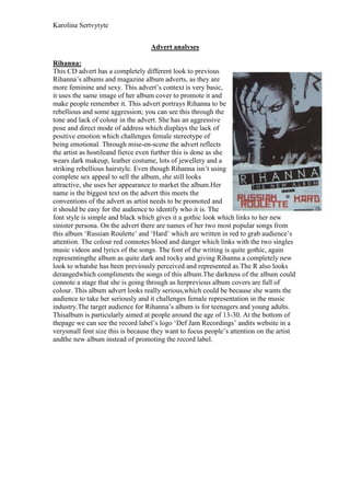
This CD advert has a completely different look to previous
Rihanna’s albums and magazine album adverts, as they are
more feminine and sexy. This advert’s context is very basic,
it uses the same image of her album cover to promote it and
make people remember it. This advert portrays Rihanna to be
rebellious and some aggression; you can see this through the
tone and lack of colour in the advert. She has an aggressive
pose and direct mode of address which displays the lack of
positive emotion which challenges female stereotype of
being emotional. Through mise-en-scene the advert reflects
the artist as hostileand fierce even further this is done as she
wears dark makeup, leather costume, lots of jewellery and a
striking rebellious hairstyle. Even though Rihanna isn’t using
complete sex appeal to sell the album, she still looks
attractive, she uses her appearance to market the album.Her
name is the biggest text on the advert this meets the
conventions of the advert as artist needs to be promoted and
it should be easy for the audience to identify who it is. The
font style is simple and black which gives it a gothic look which links to her new
sinister persona. On the advert there are names of her two most popular songs from
this album ‘Russian Roulette’ and ‘Hard’ which are written in red to grab audience’s
attention. The colour red connotes blood and danger which links with the two singles
music videos and lyrics of the songs. The font of the writing is quite gothic, again
representingthe album as quite dark and rocky and giving Rihanna a completely new
look to whatshe has been previously perceived and represented as.The R also looks
derangedwhich compliments the songs of this album.The darkness of the album could
connote a stage that she is going through as herprevious album covers are full of
colour. This album advert looks really serious,which could be because she wants the
audience to take her seriously and it challenges female representation in the music
industry.The target audience for Rihanna’s album is for teenagers and young adults.
Thisalbum is particularly aimed at people around the age of 13-30. At the bottom of
thepage we can see the record label’s logo ‘Def Jam Recordings’ andits website in a
verysmall font size this is because they want to focus people’s attention on the artist
andthe new album instead of promoting the record label.
2. Karolina Sertvytyte
Katy Perry
This advert represents Katy Perry as a fun, care-free
and bubbly artists which she is thus it meets the
audience expectations. The main image is of the
advert is a long shop of Katy Perry looking straight
at the camera which creates a direct address to the
audience and making the audience feel like the
artist is personally selling them the album. The
costume that the artist is wearing is quite girly, the
colour pink and purple further support the idea.
Thus links to the conventional female
representation of females as being seductive and
very feminine. The main image consist the theory of
Laura Mulvey as Katy Perry comes of a sexual object in this advert due to the fact
that she is showing off quite a lot of her body, this however will attract male
audiences so it’s a conventional technique. The font style that is used to write ‘Katy
Perry’ is the font that she uses on every product of hers, thus this allows
recognisability which is an effective advertisement technique. The font is bubbly and
has a candy feel to it which links to her girly and feminine persona. Moreover, her
name is the biggest text on the advert which meets the conventions of the advert as
artist needs to be promoted and it should be easy for the audience to identify who it is.
The advert has secondary text such as the date the album is out, the name of the album
and the best hit from the album this text helps to sell the album. Moreover, the CD is
placed on the advert this is done in order to let the audience know what the CD looks
like so when it comes to buying it, it’s easy to spot. At the bottom of the advert Katy
Perry’s website is placed in order to let the audience know that if they want to find out
more about Katy Perry they can do that by visiting her website. Throughout looking at
the advert it’s easy to identify that Katy Perry’s target audience are older females I
would say from 18-30 this is evident due to the use of mise-en-scene and style fonts
used on the advert. However, her secondary audience would be a small group of male
this is evident as she tries to appear a bit like a sexual object on the advert to attract
them.