
Recommended
More Related Content
What's hot
What's hot (18)
Viewers also liked
Similar to Contents Analysis 2
Similar to Contents Analysis 2 (20)
More from ShaunaN_
More from ShaunaN_ (16)
Recently uploaded
Recently uploaded (20)
Contents Analysis 2
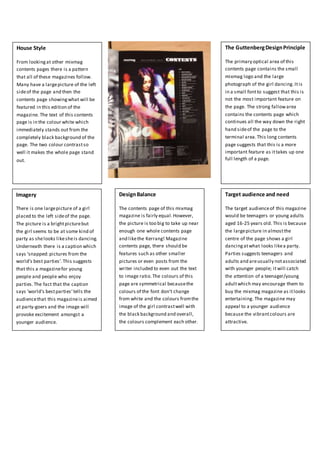
- 1. House Style From lookingat other mixmag contents pages there is a pattern that all of these magazines follow. Many have a largepicture of the left sideof the page and then the contents page showingwhat will be featured in this edition of the magazine. The text of this contents page is in the colour white which immediately stands out from the completely black background of the page. The two colour contrastso well it makes the whole page stand out. Imagery There is one largepicture of a girl placed to the left sideof the page. The picture is a brightpicturebut the girl seems to be at some kind of party as shelooks likesheis dancing. Underneath there is a caption which says ‘snapped:pictures from the world’s best parties’.This suggests that this a magazinefor young people and people who enjoy parties.The fact that the caption says ‘world’s bestparties’tells the audiencethat this magazineis aimed at party-goers and the image will provoke excitement amongst a younger audience. DesignBalance The contents page of this mixmag magazine is fairly equal.However, the picture is too big to take up near enough one whole contents page and likethe Kerrang! Magazine contents page, there should be features such as other smaller pictures or even posts from the writer included to even out the text to image ratio.The colours of this page are symmetrical becausethe colours of the font don’t change from white and the colours fromthe image of the girl contrastwell with the black background and overall, the colours complement each other. Target audience and need The target audienceof this magazine would be teenagers or young adults aged 16-25 years old. This is because the largepicture in almostthe centre of the page shows a girl dancingatwhat looks likea party. Parties suggests teenagers and adults and areusually notassociated with younger people; it will catch the attention of a teenager/young adultwhich may encourage them to buy the mixmag magazine as itlooks entertaining. The magazine may appeal to a younger audience because the vibrantcolours are attractive. The GuttenbergDesignPrinciple The primary optical area of this contents page contains the small mixmag logo and the large photograph of the girl dancing.Itis in a small fontto suggest that this is not the most important feature on the page. The strong fallowarea contains the contents page which continues all the way down the right hand sideof the page to the terminal area.This long contents page suggests that this is a more important feature as ittakes up one full length of a page.