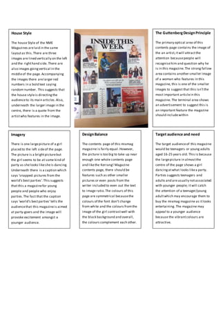
1. House Style
The house Style of the NME
Magazines arelaid in the same
layoutas this.There are three
images are lined vertically on the left
and the righthand side. There are
also images goingvertical in the
middleof the page. Accompanying
the images there arelarger red
numbers in a bold text saying
random number. This suggests that
the house styleis directingthe
audienceto its main articles.Also,
underneath the larger image in the
centre, there is a quote from the
artistwho features in the image.
Imagery
There is one largepicture of a girl
placed to the left sideof the page.
The picture is a brightpicturebut
the girl seems to be at some kind of
party as shelooks likesheis dancing.
Underneath there is a caption which
says ‘snapped:pictures from the
world’s best parties’.This suggests
that this a magazinefor young
people and people who enjoy
parties.The fact that the caption
says ‘world’s bestparties’tells the
audiencethat this magazineis aimed
at party-goers and the image will
provoke excitement amongst a
younger audience.
DesignBalance
The contents page of this mixmag
magazine is fairly equal.However,
the picture is too big to take up near
enough one whole contents page
and likethe Kerrang! Magazine
contents page, there should be
features such as other smaller
pictures or even posts from the
writer included to even out the text
to image ratio.The colours of this
page are symmetrical becausethe
colours of the font don’t change
from white and the colours fromthe
image of the girl contrastwell with
the black background and overall,
the colours complement each other.
Target audience and need
The target audienceof this magazine
would be teenagers or young adults
aged 16-25 years old. This is because
the largepicture in almostthe
centre of the page shows a girl
dancingatwhat looks likea party.
Parties suggests teenagers and
adults and areusually notassociated
with younger people; it will catch
the attention of a teenager/young
adultwhich may encourage them to
buy the mixmag magazine as itlooks
entertaining. The magazine may
appeal to a younger audience
because the vibrantcolours are
attractive.
The GuttenbergDesignPrinciple
The primary optical area of this
contents page contains the image of
the an artist,itwill attractthe
attention becausepeople will
recognisehim and question why he
is in this magazine.The strong fallow
area contains another smaller image
of a woman who features in this
magazine, this is one of the smaller
images to suggest that this isn’tthe
most important articlein this
magazine. The terminal area shows
an advertisement to suggest this is
an important feature the magazine
should includewithin