
Recommended
More Related Content
What's hot
What's hot (18)
Viewers also liked
Viewers also liked (16)
Similar to We love this 1 d contents analysis
Similar to We love this 1 d contents analysis (20)
Recently uploaded
Recently uploaded (20)
We love this 1 d contents analysis
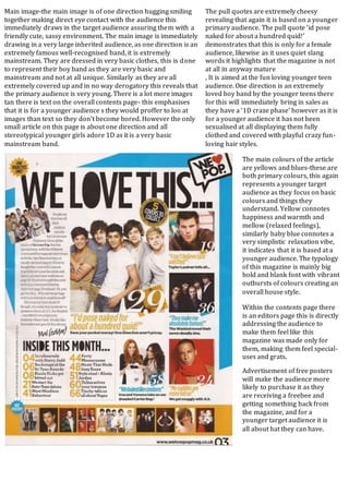
- 1. Main image-the main image is of one direction hugging smiling together making direct eye contact with the audience this immediately draws in the target audience assuring them with a friendly cute, sassy environment. The main image is immediately drawing in a very large inherited audience, as one direction is an extremely famous well-recognised band, it is extremely mainstream. They are dressed in very basic clothes, this is done to represent their boy band as they are very basic and mainstream and not at all unique. Similarly as they are all extremely covered up and in no way derogatory this reveals that the primary audience is very young. There is a lot more images tan there is text on the overall contents page- this emphasises that it is for a younger audience s they would proffer to loo at images than text so they don’t become bored. However the only small article on this page is about one direction and all stereotypical younger girls adore 1D as it is a very basic mainstream band. The pull quotes are extremely cheesy revealing that again it is based on a younger primary audience. The pull quote ‘id pose naked for about a hundred quid!’ demonstrates that this is only for a female audience, likewise as it uses quiet slang words it highlights that the magazine is not at all in anyway mature , It is aimed at the fun loving younger teen audience. One direction is an extremely loved boy band by the younger teens there for this will immediately bring in sales as they have a ‘1D craze phase’ however as it is for a younger audience it has not been sexualised at all displaying them fully clothed and covered with playful crazy fun- loving hair styles. The main colours of the article are yellows and blues-these are both primary colours, this again represents a younger target audience as they focus on basic colours and things they understand. Yellow connotes happiness and warmth and mellow (relaxed feelings), similarly baby blue connotes a very simplistic relaxation vibe, it indicates that it is based at a younger audience. The typology of this magazine is mainly big bold and blank font with vibrant outbursts of colours creating an overall house style. Within the contents page there is an editors page this is directly addressing the audience to make them feel like this magazine was made only for them, making them feel special- uses and grats. Advertisement of free posters will make the audience more likely to purchase it as they are receiving a freebee and getting something back from the magazine, and for a younger target audience it is all about hat they can have.