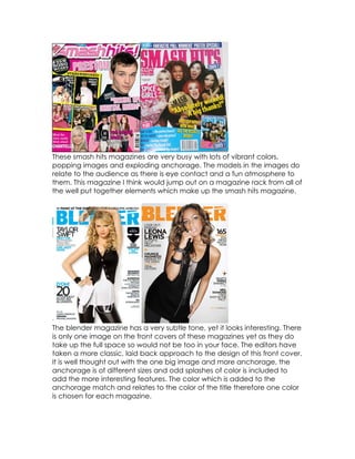
1. These smash hits magazines are very busy with lots of vibrant colors,
popping images and exploding anchorage. The models in the images do
relate to the audience as there is eye contact and a fun atmosphere to
them. This magazine I think would jump out on a magazine rack from all of
the well put together elements which make up the smash hits magazine.
The blender magazine has a very subtle tone, yet it looks interesting. There
is only one image on the front covers of these magazines yet as they do
take up the full space so would not be too in your face. The editors have
taken a more classic, laid back approach to the design of this front cover.
It is well thought out with the one big image and more anchorage, the
anchorage is of different sizes and odd splashes of color is included to
add the more interesting features. The color which is added to the
anchorage match and relates to the color of the title therefore one color
is chosen for each magazine.
2. This magazine is a grungier side of pop. It has a color scheme of red and
black. On the magazine on the right it has been edited effects onto the
guitar to make the magazine look attractive and effective, also with that
effect the anchorage below is a reflected on the image. The magazine
on the left has a clever edit of a tab with the number of pages that issue
has which is ‘196’ therefore I know that many pages are reasonable for a
music magazine.
From this research I have discovered what the biggest selling music
magazines include to attract the attention of potential customers. I would
include some of the points from these magazines to help my magazine
look great on a magazine shelf.