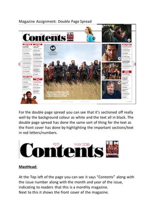
1. Magazine Assignment: Double Page Spread
For the double page spread you can see that it’s sectioned off really
well by the background colour as white and the text all in black. The
double page spread has done the same sort of thing for the text as
the front cover has done by highlighting the important sections/text
in red letters/numbers.
MastHead:
At the Top left of the page you can see it says “Contents” along with
the issue number along with the month and year of the issue,
indicating to readers that this is a monthly magazine.
Next to this it shows the front cover of the magazine.
2. Menu
On the left side of the double page spread, it has a list of all the
contents of this magazine, you can see that at the bottom of the
menu it has a picture of a famous character from the Star Wars film
who appears in the Solo: A Star Wars Story. This gives the readers
something appealing to look at instead of just a blank white page
with bland text on and also shows the page number for the story as
seen by the black circle with the number 11 inside it.
3. What the magazine have done for the menu is they have added red
borders around the white text they’ve used to section of the
contents and make it easier for the readers to find out what page(s)
they may be interested in reading. They’ve also highlighted numbers
in red making it easier for readers to find out what page number
they need to go to the story they want to read. Along with the red
numbers they’ve made the titles of the pages in that sections of the
menu bold and then added normal text style just underneath that as
a short description of the page or they might use a pull quote also.
This makes it a lot easier to find something that they might be
interested in reading inside the magazine but adding the titles in
bold, and putting a brief short description just underneath that.
4. On the right side of the double page spread they’ve done something
a little more interesting in the organization of the magazine.
What the right side of the menu have done to organize the contents
is they’ve put “Big Screen” and “Small Screen” as they’re own
section.
The reason they’ve organized it differently for this is to show readers
what films are out on the big screen that are coming out in cinema’s
soon. It appears that they’ve organized the Big Screen films to be the
most hyped and anticipated films that have recently/are coming out
whereas the Small screen seem to be the less anticipated/hyped
films that have or are coming out.
For this part of the magazine what they’ve also done is add more sub
images compared to the left side of the magazine where they only
had one small image, this side has 3 larger images which lets readers
look at something instead of just long lines of text that could be
quite boring for younger people or people who just don’t really like
to read a bunch of words in a magazine.
One thing that all these images have in common are they each have
page numbers attached to them so that if readers would like to they
can go and check out the page in the magazine to see what film the
image is associated to.
Readers can also look at the images page number to then look into
the contents page and find a brief description of the film that the
image is associated with.
For example, the image next to the masthead “contents” you can see
the image for the movie On Chesil Beach.
5. The page number is 78, if you then look at the “This issue” section on
the left hand side of the double page spread, you will be able to read
the basic information to what page 78 has to offer people to read.
This is very useful to readers to better find stories/reviews on the
films they may be interested in, or if they just want to see what a
certain image is about, they can also find it there.
Dominant Image:
6. The dominant image for the contents page doesn’t have much to
offer, but the three things it offers the readers instantly pull them
into checking out the full story that the magazine have written.
They pull the readers into the story by offering three things to
interest readers. The Sell line, the pull quote and the dominant
image itself.
Sell Line:
The sell line that this magazine uses for its main story on Avengers
Infinity War is a very compelling one.
“Chris Evans, Chadwick Boseman and co reveal the secrets of
Avengers: Infinity War.”
This pulls readers in by telling them that the two co co-stars along
with other co-stars are going to tell you inside information regarding
what’s going to happen/happened in the film.
7. They’ve done this very well by using the names of two of the main
stars of the hit film and the two words, reveal and secrets…Telling
readers that since it’s coming from them and other co-stars then it
must be true and very interesting to them.
Pull Quote:
The pull quote for this is a very interesting one that is meant to
intrigue readers into how the cast have become an oddball family
and in what way they’re an oddball family.
This pull quote isn’t as interesting as the sell line, but it still has just
as much to offer as the sell line does.
It doesn’t appear to be as of importance as the sell line and appears
to be just something more for the audience to read so that makes it
just as important as it shows that the magazine are trying to give you
as much entertainment to read as possible by making the pull quote
and the sell line completely different from one another.
Costumes (Dominant Image):
The costumes that are shown in this image are quite unique to those
who haven’t seen anything on Avengers Infinity War but have seen
previous avengers (avengers associated films)
This being the huge costume change that a couple of the characters
have gone through.
8. Black Panther’s (First on the left) hasn’t changed since his
independent film. Bucky Barnes (First on the right) hasn’t got his own
costume, he has however gotten a new arm that was provided by
the Black Panther, but sadly that has been cut off in the dominant
image for this double page spread. I’d say that is a downside
considering how much this arm has changed and is different design
wise since his previous one, so it could have been used to make
readers more curious as to why/how his arm has changed.
The two characters in this dominant image who have had costume
changes are Captain America and Black Widow, they’ve both had a
completely new wardrobe change, one being Captain America and
his beard, he never had a beard, this is to show people that he is now
a more rough guy who has possibly “seen” or “been” through some
rough times and gives his character a more scruffy look. His costume
is completely different, he used to have his costume represent
America and had a whole patriotic design on his costume, but he
doesn’t have that anymore, meaning that he has either had is
“Captain America” rights removed from him and is now an outlaw, or
that he feels like he doesn’t deserve to represent the “Captain
America” costume anymore. Either way, this shows previous avenger
film watches that something has happened that has given him a
whole new look and possibly character change.
Black Widow has also gone through a minor wardrobe change, she
previously worn a simple skin tight black leather outfit and had
medium long red hair whereas now she has shorter hair that is now
blonde. This can indicate to readers that she has gone through the
same changes that captain America has and has become a
completely new person.
Behind the dominant characters of the dominant image, it is showing
a group of people who look like warriors ready for a battle at any
moment. This is to show the readers that all of these people are
gearing up/read to head directly into battle and are prepared for a
9. war. It also tells us that there are a lot of people who are going to be
fighting in this war on both sides and there will also be plenty of
losses on both sides also.