
Recommended
More Related Content
What's hot
What's hot (20)
Viewers also liked
Viewers also liked (15)
Similar to Mise en scene
Similar to Mise en scene (20)
Recently uploaded
Recently uploaded (20)
Mise en scene
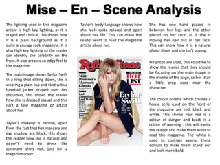
- 1. The lighting used in this magazine article is high key lighting, as it is staged and clinical, this shows how it is a plain background as it is quite a grungy rock magazine. It is also high key lighting so the reader can identify the celebrity on the front. It also creates an edgy feel to the magazine. The main image shows Taylor Swift in a long shot sitting down, she is wearing a plain top and skirt with a baseball jacket draped over her shoulders, this shows the reader how she is dressed casual and this isn’t a fake magazine or article about her. Taylor’s makeup is natural, apart from the fact that her mascara and eye shadow are black, this shows the reader how she is natural and doesn’t need to dress like someone she’s not, just for a magazine cover. She has one hand placed in between her legs and the other placed on her face, as if she is moving her hair out of her face. This can show how it is a natural photo shoot and she isn’t posing. No props are used, this could be to show the reader that they should be focusing on the main image in the middle of the page, rather than a little prop used near the character. Taylor’s body language shows how she feels quite relaxed and open about her life. This can make the reader want to read the magazine article about her. The colour palette which creates a house style used on the front of the magazine are red, black and white. This shows how red is a colour of danger and black is a colour of warning , this will excite the reader and make them want to read the magazine. The white is used to contrast against these colours to make them stand out and look more bold.
- 2. Contents page The content page is set out with the title ‘contents’ this is to show the reader that this is the page with all of the magazine contents inside. It is a red box with the text in a bold white font, this is the same colour pallet as the front cover, this will therefore inform the reader that it is the same magazine as it has the same layout. All of the images used in the contents page are to the left of the magazine, this can show how the images are the most important part of this page as they are at the dominant side for the reader. There are 3 big main images, which have numbers in the bottom corner, this shows the reader the page number they can read if they want to read about that certain person. The contents page is split into 3 categories, these are: ‘features’. ‘national affairs’ and ‘departments’. This shows that it isn’t just a music magazine. These are useful for the reader as they can show them where different articles are located within the magazine. The magazine involves lots of different articles, one about Barack Obama and one about Eminem, this means that it can suit any reader over the ages of 16+ as there will be something for someone in the magazine. Under the categories listed it has the main title for each article in a black font, this will make it stand out against the white background, and the page number is to the left of the article name, which is once again the dominant side for the reader to look at, this can therefore show the reader which page to go to for the certain article they want to read. On the contents page for the magazine, it doesn’t include the option for the reader to get a subscription, as this could show that it is already a very popular magazine with or without a subscription.
- 3. Double Page Spread One side of the double page spread is completely covered by an image of ‘Lady Gaga’, this shows how the article is going to be about her and how she is important in this part of the magazine. The text has been set out in a way which is easy for the reader to read in columns. The only title used on the page is in a bolder font on the top right of the page, which says ‘Lady Gaga’, this is there to inform the reader that the article they are reading is about Lady Gaga, if they are unsure about who she is. The colour palette is the same colours as on the front cover and the contents page, which is the red, black and white theme. The only use of red on the image is the huge ‘L’ which covers the other full page but is in the background with the text overlaying it. There is very little gutter space in-between the text, this can mean that there is a lot of information but the reader will be able to read it all. The image of Lady Gaga shows her shows her body language is confident as she is wearing nothing on her top half apart from many wired chains over her neck. This could show how it is quite an explicit article as she has very minimal clothing. Her facial expression is quite neutral, this shows how her article is true and serious. The main image of Lady Gaga is high key lighting but with a silvery tension filter, this is to make her stand out but the editors have edited it to make her appear quite dark, this could show how she has a private life but she is revealing all in the article about her. The colour palette is the same colours as on the front cover and the contents page, which is the red, black and white theme. The only use of red on the image is the huge ‘L’ which covers the other full page but is in the background with the text overlaying it.