1. Double page spread
analysis 5
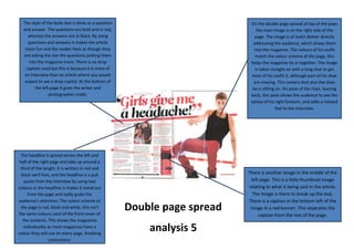
On the double page spread of top of the pops
the main image is on the right side of the
page. The image is of Justin Bieber directly
addressing the audience, which draws them
into the magazine. The colours of his outfit
match the colour scheme of the page, this
helps the magazine tie in together. The image
is taken straight on with a long shot to get
most of his outfit it, although part of his shoe
are missing. This camera shot also the chair
he is sitting on. His pose of the chair, leaning
back, this pose allows the audience to see the
tattoo of his right forearm, and adds a relaxed
feel to the interview.
The style of the body text is done as a question
and answer. The questions are bold and in red,
whereas the answers are in black. By using
questions and answers it makes the article
more fun and the reader feels as though they
are asking the star the questions putting them
into the magazine more. There is no drop
capitals used but this is because it is more of
an interview than an article where you would
expect to see a drop capital. At the bottom of
the left page it gives the writer and
photographer credit.
The headline is spread across the left and
half of the right page and take up around a
third of the length. It is written in red and
black serif font, and the headline is a pull
quote from the interview by using two
colours in the headline is makes it stand out
from the page and really grabs the
audience’s attention. The colour scheme of
the page is red, black and white, this isn’t
the same colours used of the front cover of
the contents. This shows the magazines
individuality as most magazines have a
colour they will use on every page, breaking
convections.
There is another image in the middle of the
left page. This is a little thumbnail image
relating to what is being said in the article.
The image is there to break up the text.
There is a caption in the bottom left of the
image in a red banner. This separates the
caption from the rest of the page.