
Recommended
More Related Content
What's hot
What's hot (20)
Viewers also liked
Viewers also liked (20)
Similar to Ancillary Product 1 Textual Analysis
Similar to Ancillary Product 1 Textual Analysis (20)
More from zakwinsall
Recently uploaded
Recently uploaded (20)
Ancillary Product 1 Textual Analysis
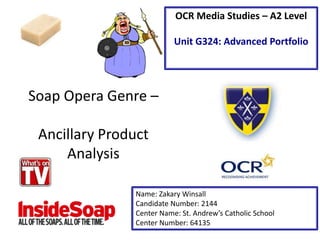
- 1. Soap Opera Genre – Ancillary Product Analysis Name: Zakary Winsall Candidate Number: 2144 Center Name: St. Andrew’s Catholic School Center Number: 64135 OCR Media Studies – A2 Level Unit G324: Advanced Portfolio
- 2. The date at the top of the magazine is very prominent. This is made very clear to the reader, in particular ‘survivors’ (Maslow), who want to be kept up to date with their favourites soaps, which also may build the hype of the upcoming episodes. The masthead is also located at the top of the page and is very obvious to the reader. The red background has various different connotations. This may include emotions such as passion, love and possibly even anger. This may insinuate that the readers will read about bad news or gossip associated with this genre. The non-verbal code of the main image clearly depicts who is involved in the crash that is shown in the main headline. These characters are clear on the front over, also overlapping the masthead which again illustrates that they are the most important feature on this magazine. The main headline illustrates to the reader what the main story is inside this magazine. By reading the magazine the reader may be given a clue about the story and build the hype for the episode. The yellow colour is very prominent and obvious on the magazine, enticing the reader to pick it up from the shelf. The lines going through the word ‘crash’ is also an advertising feature in order to gain the readers attention again. The cover lines are located at the bottom of the page in three clear bubbles, each with their own soap. These also include images from that soap to help back up the story that is shown. The use of these images and the verbal code ‘new’ may help to draw in the readers attention and cause them to watch that soap. The cross media convergence located directly under the masthead helps to promote the website for the magazine and possibly advertises that this copy of the magazine is available to read online whenever you want. There is also the ability on the website to enter competitions that are featured in the magazine as well as various different videos. The subline helps to promote the main headline. The verbal code “Who dies?” illustrates to the reader that someone will die in this crash and leaves them on a cliff hanger.
- 3. The main headline is located across the very centre of the cover, in a very prominent orange text “Funeral Bombshells!”. This illustrates to the audience that it is the most important story featured in this magazine. The word “bombshells” suggests that something really bad is likely to happen at this funeral, possibly ruining it. It leaves the reader on a cliff hanger. The masthead is located towards the top of the page, spreading across the entire width of the cover. It is written in a very bold red font with a slight shadow to add effect to it and draw attention. The colour red may have connotations of danger or possibly passion which may cause the reader to pick up a copy. The sub heading text located in the bottom left of the page is an exclusive one of a kind feature that may entice the reader to pick up a copy as these are pictures they will only see in this magazine. The strapline located directly underneath the masthead states “Every Story! Every Secret! Every Week!”. This suggests to the reader that if they want details on all their favourite soaps, they should buy this magazine because they have all the gossip about every story every single week. The sub-line Quotations that are located to the right of the main images include quotes from what some of the character have said in the coming episodes of that soap. This may also entice the reader to purchase the magazine. The cover lines are located at the bottom of the page and include an anchoring image of what actually happens. When the reader sees this shot on the shelf, it may force them to stop and think about buying the magazine. The main image is located left centre of the magazine and includes 3 characters from a soap. This is very prominent on the front cover and allows the reader to see directly who is involved in the story that is portrayed through the main headline. The price of the magazine is fairly cheap at £1.60. This is very cheap for a weekly magazine. It is also very affordable for the average working person.
- 4. When looking at the covers for both of these magazines, there are both positives and negatives for both of them. What’s on TV has a very simplistic layout and does look fairly plain. However there is a good use of fonts for the masthead as well as the usage of various different images for the cover stories. InsideSoap however has a much better format, with much more content on the front cover. Generally the InsideSoap front cover looks a lot more professional and less tacky compared to What’s on TV. If it came down to replicating features, I would most likely choose from InsideSoap as they’re generally a much better finish to their cover.