Akola Call Girls #9907093804 Contact Number Escorts Service Akola
Magazine
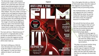
1. This is the tagline this tells us a little bit
of information about what the makes of
the magazine are promoting in this
magazine they are promoting movies.
The masthead shows us who made
the magazine this one it made by
TOTAL FILM the writer has put the
masthead in big white writing get
film lovers to buy the magazine
because it's all about films.
The dominate image is of pennywise
looking at the camera with a load of red
balloons this could have been done this
way to show that pennywise is evil and
dangerous to be around the red could
symbolize blood as he like to kill and eat
little children. The iconic clown is normal a
symbol of fun and happiness because they
make people laugh but the way the writer
has put the dominate image has made this
fun-loving clown into something terrifying
and will cause you to have nightmares.
The image is lit with low key lighting to
draw your eyes to the dominate image.
The dominate image is a closeup to the
clowns face to show that he is the main
character and he oversees everything
The main sell-line is ”World Exclusive IT”
the word IT is in big bold white writing
just like the masthead this is to lure
people in to buy the magazine just like
how pennywise lures children with his
white clown make-up.
The sub sell-line lines tell you what
else is in the magazine that isn’t just
about IT and are about other films
that they are promoting and other
films that the reader might be
interested to know about
Sub head is telling you a little bit
more info about the main sell-line
to get the reader to read more of
the magazine. It is also non-direct
address (it doesn’t use the word
you)
The plug is to promote another thing
such as another film or maybe
another type of magazine that they
have made. They have put it in the
spike circle the catch the readers eye
has they are looking at the dominate
image.
A sky-line is to once again to
promote another thing such as a
film. The writing put is at the top
the catch the readers eyes as
they are scanning the page from
top to bottom.
Digital
2. The target audience for this magazine is
mostly for male and some female. I think
this because most females don’t like to
watch horror movies and most males do
and the fact the movie has a lot of
violence in it means that the magazine is
for people aged 15 to 35 because if
people who are younger could be giving
nightmares. The social grade of the
people who will reader this is C1,C2,D and
E and the psychographics is for explorers
because they are looking for something
different from the typical movie and for
mainstreamers because of they are also
looking for something different
This magazine had not got a barcode or any
essential information like date, issue number,
price and the website this might be because it is
a digital magazine to there will not be a barcode
or price since you are not buying the magazine.
This means this magazine is challenging the
codes and conventions where they are supposed
to have the barcode that gives you all the
information
The purpose of the magazine is to entertain
the readers and to inform them of upcoming
movies and other things they may like. This is
effective because the reader will be reading
about their new favorite film which will make
them want to read on and make them more
excited to go and watch the movie. There will
also be special images and information that
will make the reader feel special and then
will go out and talk to people about the new
film that is coming out which will make more
people want to read the magazine and watch
the movie
Digital
The pull quote underneath the main sell line
gets people reading the magazine and
watching the film because it says "more
blood than the shining " this will make
people want to read more because they want
to see if the quote is true as we all know that
the shining is a very popular and well know
horror movie which has a lot of blood in it as
the main character goes crazy and goes on a
killing rampage
3. DigitalRunning head is the main
sell-line of what the
magazine to trying to tell us
about this one is about IT
chapter 2 I know this
because the running head
says cover story and we
know what the cover story
is from the front page
Drop cap is the one big letter
at the start of the text. This
magazine has done it in blood
to tell us that the body copy
is about a horror because in
most if not all horrors there is
someone dying in a horrific
way and there is blood
everywhere the drop cap
being like this is warning the
reader that the text they are
about to read is about a
horror
The dominate image is a wide shot of
the actors that's in the film. This helps
the reader see you is in the film and if
one of them is there favorite actor is in
the film or not and if they are the
reader will want to read more about
the movie and maybe go and watch the
movie themselves. The image that is at
the bottom right corner of the image is
to stay that, that is supposed to be
them younger because in the film the
character are remembering what
happened to them when they are
young so they have done the same lay
out to show that these these 2 actors
play the same characters. The writer
has made the photo look old and retro
this is to show that the film is set in the
1900's
The pull quote is where some has said
something about the topic of the magazine
and in this case it is about the film “IT chapter
2” and these are normal form someone who
is a part of the movie are making it and if it's
from some famous this will the reader want
to read more
The body copy is the bit of text that gives the reader
information about the topic . I this magazine it is
about the horror film IT. Writers put the body copy
in columns to make it easy to read and easy to
follow plus it looks a lot more professional which will
make people who have more money want to buy it.
This double page spread has a folio
which is the page number and the
date where the magazine was
published
The body copy has gaps between
each text because it will help the
reader read the columns of text
easier and these gaps are called
alleys and make the text flow better
Click to add text
The blood splatter on the top right corner is to give the
reader a better idea of what the page is about without
needing to read the body copy. The blood splatter is to
show that the page is about the horror that is being
featured in the magazine which is the Stephen King movie IT
4. Digital
The sub image on the left is showing an image of the film IT to intrigue the reader to go and
read more and to go and watch the film itself because it is an image that no one has ever seen
before this is to make the reader feel special and they will want to go and talk to other people
about it because they will want to know what other people have to say about it
This double page had only one
sub head which is telling the
reader about the story of the
young characters and the older
characters of what they were
like and what they went
through when they were young
and what they went through
when they are adults. This is
also a caption this anchors the
image to the article and gives
the reader a little more
information about the actors.
This double page doesn't have a
headline, so it challenges the codes
and conventions. I think the writers
did this because the reader doesn't
need to know what they are going
to read, they already know since it
was on the front cover and know
that this page is about the
Stephen King movie IT.
This page also doesn't have
a kicker which is supposed to give
the story an interesting start to the
text to make the reader want to
read that pit of body copy so then
they will go, tell their friends and
family about the magazine that they
have just reader this will then make
them want to go find the magazine
online this then will then get more
people to go and watch the
movie and then they will share it
with their friends and then they will
go find the magazine and then its
starts all over again. This means
more advertising for the magazine,
but this magazine does not have this
code and convention which means
they are challenging the codes and
conventions.
This double page is
1/3s covered in images and
has only 2 columns this to
appeal to the younger
audience because younger
generation has a very small
attention span so they will
meanly look at the images to
see what the magazine is
about and will really not
bother to look at the text on
the page but they will also
look at the caption to see
what the images are about
and what it says about the
actors in the image
5. PrintThe domanate image is a closeup off Freddy
Krueger's in red lighting to show that he
dangerours and his face kinda fades into the
background with all the sub images
surrounding him this is to show the reader
that Freddy likes to lurck in the shodows to
catchs his victams off guard and kills them.
The writer has done this to catch the readers
attion to the magazine and to make them
wonder what is Freddy is hiding and this
makes them pick up the magazine and read
it to find out
The sub images that surround
Freddy are there to get people to
come and read the magazine since
it's not just about one horror
movie it is about mulitypul horror
movies and ger horror loving fans
to pick up the magazine and share
it with other people and then they
will do the same. It will also get
more people to go and watch the
movies
Main sell line is about "Wes
Craven's New Nightmare Revisiting
freddy krueger" gravestone style
type of font to catch the readers
eyes and to get them to read the
magazine. The writer could have
done to show that Freddy likes to
put people into their graves
The sub sell-line lines tell you
what else is in the magazine
that isn’t just about Freddy
Krueger and are about other
films that they are promoting and
other films that the reader might
be interested to know about
The essential information in a red
balloon to show that the magazine
is all about horror as red balloon is
a symbol of the horror movie IT.
The essential information is there
to tell us the issue number, the
price, the date it was issued and
the website. Essential information
can also be found with the
barcode. The writer put the
website at the top of front page
and in yellow to catch the readers
eyes and to get them go to the
website and look around and read
more
The bottom banner is to promote
other films and things that are also
in the magazine to get more
people to read the magazine
6. print
This is the tagline this tells us a
little bit of information about what
the makes of the magazine are
promoting in this magazine they
are promoting movies.
The target audience is 80% male and 20% female. I
think this because most females don’t like to watch
horror movies and most males do and the fact the
movie has a lot of violence in it means that the
magazine is for people aged 15 to 35 because if people
who are younger could be giving nightmares. The social
grade of the people who will reader this is C1,C2,D
and E and the psychographics is for explorers because
they are looking for something different from the
typical movie and for mainstreamers because of they
are also looking for something different
The purpose of the magazine is
to entertain the readers and to
inform them of upcoming movies
and other things they may like.
This is effective because the reader
will be reading about their new
favorite film which will make them
want to read on and make them
more excited to go and watch the
movie. There will also be special
images and information that will
make the reader feel special
and then will go out and talk to
people about the new film that is
coming out which will make more
people want to read the magazine
and watch the movie
The social grade of the people who
will reader this is C1,C2,D and E
and the psychographics is for
explorers because they are looking
for something different from the
typical movie and
for mainstreamers because of they
are also looking for something
different
7. Print
The dominate image is of
Freddy's eyes and he is
looking at the camera
frowning and that is all
you can see, and his eyes
are in red glow the rest of
Freddy is in darkness this
could show that Freddy
can jump out of the
darkness at any time
Running head is
challenging the codes
and conventions by
being on the dominate
image the running head
normally runs along the
top of the page. The
writer has done this to
catch the readers eyes
and make the them find
out what this page is all
about. The writer has
put the running head in
the bloody gravestone
front to show the reader
that this page is all
about the horror movie
"New Nightmare"
The drop cap is the big letter at the
front of the text this magazine has
done the drop cap in black this is
not so the reader can see where
the text stars but because the
movie is mainly in dark settings as
Freddy Krueger likes to scares his
victims in the dark and kill them
The sub image is the same image
as the front cover but bigger and
this one you can see two other
people in the image and the
caption that says 'This Time Staying
Awake Won't save you' this is to
get the reader to go and watch the
movie. The writer is using the sub
image as navigation system to tell
the reader they are at the right
page
This double page doesn't have a
folio, and this means it is
challenging the codes and
conventions as the writer is using
the sub image to help the reader
navigate magazine instead of using
page numbers
8. The body copy is the text that tells
the reader everything they want to
know about the main sell line
which in this magazine is about the
movie "New Nightmare". The
writer put the body copy in
columns to make it easier for the
reader to read the text and it flows
better. The body copy also
has words in capital letters every
now and then this is to catch the
readers eyes
The sub image in this
double page spread are
about the movie "New
Nightmare" and is given
the reader incite of the
movie and shows the
reader parts of the movie
before anyone gets to see
it. This makes the reader
feel special because they
feel like the images are in
there for them and only
them to see
The caps in between the
columns are called alleys
this is to make the text
look neat and tidy
This double page spread is 1/3 full
of images this is to get the younger
audience to read the magazine and
only has 3 columns this is because
the younger generation tent to just
look at the image and skip through
the pages. The younger audience
will also look at the captions on the
images to see what they are about
and to see if it is worth their time
to read the text
This double doesn't have a
sub head this is challenging
codes and conventions this is
because the writer wants the
reader to only read about the
main sell line and nothing
else
Print
The byline is on the dominate image this challenging
the codes and conventions because the byline is
normal at the bottom of the page the byline is what
gives credit to the writer
This double page doesn't have a pull quote. The pull
quote gives the reader an idea of how good the movie is
because the pull quote is normal from someone famous
which would normal make the reader want to go and
watch the movie because their idle says its good
The double page doesn't have a kicker
which is supposed to give the body copy
an interesting start to the main sell line
and to make the reader go and tell friends
9. Purpose
Print
The purpose of print magazine is to get the older generation to reader more magazines as some older people like to site in
the sitting rooms and read peacefully also get away from all the things that are bothering them like technology. It also
allows people read whenever and wherever this gets people to read more often
Digital
The purpose of digital magazine is to get the younger generation to read magazines this is because the younger generation
can work technology and the older generation sometimes can't. Digital also gets them to read more often because they can
take it anywhere and everywhere without taking up spaces in their bags
10. Technical considerations of print and digital
Print
In print magazines you must consider if the magazine is the right size like A4 pages, how is the magazine is made and does it
look good enough to read or to catch the reader's eyes, you also must consider how are you going to do the text like the font
the size and colour so can you read it because if you can't the reader can't. When doing Photoshop must think about how
you ae going to do it because when you transfer the image from Photoshop the magazine it might look slightly different to
what you want it to look like you also must consider about the navigate so put a contents page so people can find what they
want to read. When making the magazine you must think about the bleed line because if you go over it will be cut off when
you print it out and make sure you have a headline so people can know what they are reading also you can't forget about
putting alleys in your text otherwise people aren't going to understand what they are reading
Digital
In digital you must consider what app you are going to put your magazine on because not all apps can support your
magazine, you also must think about the fact that computers can crash if there is too much going on at once. You must
consider how the magazine looks like both landscape and portrait. You must also consider what the text will look like when is
zooms in and out you must save you file in multilabel place in case you lose the file that you used. Not all devices can support
your magazine. You must also think about the scrolling will the magazine look ok and can you read it
11. The Distibution of the paper magazine would be by shops such as supermarket or paper shops this makes it
easy for everyone to buy and read it but the problems with this one is that it cost more money to print all the
magazines, you can lose it, it is also hard to recycle them because the pages have a glossy finish to them and
the print magazines are a fire hazard. However print is good because you can read it without the need to use
internet and you can read it when the powers out
The Distibution/ pros and cons of print and
digital magazine
Print
Digital
The Distibution of digital would be on things like phones, laptop and tablets anything that has internet this makes
it easy to get and means the younger generation will want to read it more since they can get it whenever and
wherever the only problem would be that the older generation won't be albe to read is has most
people don't like computers or can't use them you can also lose some colours because on some websites the
colour you originally had can change to a different colour and might not look the way you wanted it to look like