SlideShare a Scribd company logo
1 of 11
Unit 14: digital magazine
production
Understand the considerations, codes and conventions of a
specific genre of magazine for print and digital platforms (fashion).
Masthead / title
Dominant image
Rule of thirds
Main sell line
Tagline
Subheading
Bottom banner
This is a digital version of the front cover of the fashion magazine
called ‘vogue’. It is extremely popular and has a dedicated fan
base as it’s a very notorious magazine for featuring highly
recognized celebrities. The front cover of this digital magazine
features a lot of techniques that the designer has used to appeal
to the reader and increase the layouts appeal. The front cover
features Kim Kardashian, who is incredibly popular and one of the
most viewed people in the public eye at the minute. She is the
dominant image, and they have used a medium close up shot of
her staring directly into the camera. This is called the direct mode
of address, as she is directly engaging with the audience and
drawing us in so we directly focus on her.
The way the magazine designer has positioned Kim to stare
directly into the camera and the fact she is incredibly dominant
on this front cover as her head covers the title, which could
signify she holds mass importance (even more important than
the title itself), demonstrates her power. There is also words like
‘kings’ and ‘queens’ in the subheadings, which holds great
connotations of power and royalty. This also links in with the
tagline which is ‘taking a stand’. All of these link directly to
contextual detail about power and royalty, which could either
intimidate the readers into buying this magazine through the
direct mode of address, or it could inspire them and draw them
in by thinking by reading this it may show them how to be
powerful like Kim.
Digital front cover
The dominant image on the front cover of this magazine is very important into helping us understand the relationship between the
purpose and content of the magazine and their target audience; firstly, because the celebrity is Kim Kardashian and at the minute the
Kardashians are the most famous and influential family over pop culture and social media. Therefore using her as the front cover is very
strategic as it draws a mass amount of younger women into buy the magazine, due to the Kardashians massive influence on young people.
I think the demographics for this front cover would be women aged from as young as 15 onwards, and could be anywhere from the social
grade A to c2 due to the fact Vogue is generally very pricey and highly respected magazine. The magazine is sold only on the vogue website
and other highly recognized websites as it features so many respected celebrities and it’s main purpose is to advertise and sell high end
products, which lower graded people may not be able to afford – so their advertising is quite high end. This also links in with how pristine
the layout of the magazine is, and how recognized the famous vogue font is. The front cover of the magazine is not too ‘cluttered’ and
doesn’t give away too much information, which is really good to draw the reader in to find out more inside the magazine.
On this particular issue of vogue, Kim is linked with all the annotations of power and royalty. The camera has took a mid close up shot,
featuring her hour glass figure and her head. This is very important because showing her body can link to that same power and femininity
theme, however it can be seen as contradictory due to the fact Kim’s stance is quite weak and she’s not portraying the main sell line of
“taking a stand”. Also, she is wearing very neutral tones and the main background of the magazine is all quite neutral and dull, which is also
contrasting as you’d think if she was taking a stand she might be wearing very bold and out-there colors however she seems to be
portrayed in an almost dull way. However, we never know what the magazine designers intentions are and they may have done this for a
certain effect, as it may link with the codes and conventions of women being stereotypically soft and elegant. The codes and conventions
that have been used support the magazine really well; they have used a very famous woman who could be considered as the ideal body
image and most influential in the public eye right now which is enough to draw people in for fashion. They have also used the neutral, soft
colors and rather than dark and muddy colors that could put young women off the fashion element, and draw them more into the soft and
elegance of the front cover. This is really good because we can tell the purpose of this magazine from the front cover it to advertise brands
as you can see brands such as ‘Gucci’, words like ‘heels’ and there's events like the met featured, so this really neutral, femininity themed
front cover is really effective at drawing in young woman to be influenced into buying the magazine and buying the products inside.
Digital double page spread Drop cap to start off the columns
and to catch the readers eye with
the bold color.
The dominant
image is
extremely large
and takes up the
whole of one
page, which
shows it is very
important and
stands out.
Articles and columns give
structure to the page and
formality, the font used is
very small and the
language is very formal
and articulate which links
to elegance.
Cover line / title half is red and
half is black and a bigger font
which changes the tone of the
title, as if it is almost loud and in
our face
The pull quote can interest
the reader by catching
their eye and giving them
an insight into the article.
Sub images
that
harshens the
amount of
text on the
second page
and gives the
reader more
content.
The purpose of this double page spread is to inform the readers on one topic, this
double page spread being about Emma Watson. I love the way that Vogue has laid out
this double page spread, I think it’s been very skillfully done. A lot of the double page
has had space taken up from images of Emma Watson however it has been done in a
clever way due to there still being a large amount of text for the reader to enjoy,
however the images level this out as if there is too much text the reader could get
bored; this means there is something interesting for the reader to look at which keeps
them drawn to the magazine.
I think color has been used very effectively in this double spread as vogue has used a
repetitive bold red in certain areas and kept the rest of the page toned down. The bold
red font of the word “Watson” also grabs the readers attention due to it being
highlighted as her last name, which indicates importance. The drop cap at the beginning
of the body of text also has been highlighted, alongside the two lipstick stains. The use
of red on both sides of the double page spread merges the pages together and takes
away the divide from the image and the article by adding elements from one page to
another.
This page follows the codes and conventions of a fashion magazine to draw in the target
audience by its use of color and images. It has combined the use of the color red with
the typicality of how red lipstick on women is seen as sexy and appealing. This lipstick
stain is printed on both sides of the double spread in different places on the celebrity
Emma Watson. As the model for the page, they have used an up close shot of her face
which features her smooth skin, attractive features and also red lipstick. On the second
page they have also used sub images of her in total black and white, which presents her
whipping her hair and looking into the camera almost seductively. The running red
theme indicates vogue wants this page to be endearing and maybe give off elegant and
mysterious sex appeal, which will entice young women to read this double page due to
being sexy and attractive like a celebrity being massive in the media at the minute.
Print front cover
The masthead / title has got a
holographic effect and it stands
out from the rest of the page
incredibly well due to the color
scheme.
The dominant image is a very
close up shot of Victoria
Beckham, with her looking
directly into the camera which is
direct mode of address and she is
engaging directly with the
audience.
The essential information that
the reader needs to know etc.
the price, barcode, issue number
The additional sell lines on the
front cover give the audience a
more in depth preview into the
magazine and can spark up their
interest as there is many different
things to intrigue them. Also the
use of bright colors that fits in
with the color scheme to make
these sub headings stand out.
This is the main sell line as it promotes
the main celebrity and uses a pull quote
to promote the story about her.
Glamour has used a thinner, less bold
font for the main sell line which can be
unusual as we’d think they’d want the
main sell line to pop out. However, this
could’ve been done to show that
Victoria beckham is more fine and
elegant which reflects the font.
This border around the perimeter
of the magazine is a very bold
green and frames the models
face.
The purpose of the front cover of this magazine is to interest and entertain the reader by using a respected famous
celebrity. This is like the two step flow model, where an audience is inspired by someone they admire or look up to
(aka Victoria Beckham) to buy or do something; an audience who is a fan of the model could be influenced to buy this
magazine because of this. This magazine front cover follows the codes and conventions of a fashion magazine very
well through the color scheme and the dominant image. The mix of vibrant greens, yellows and greens promotes the
boldness and the excitement of fashion and the model as it compliments and contrasts the neutral skin tones of
Victoria Beckham. It also targets the audience perfectly because of the mix of bright colors would attract young
women and the bold phrases like ‘beauty’ and even the title which is ‘glamour’. These are effective as the codes and
conventions of the fashion magazine is to draw young women in, and the typical colors and use of Victoria Beckham is
most effective as they are things that relate closely to the fashion industries. The strong, powerful font is effective as it
connotates to strong women from fashion. By following typical codes and conventions of fashion, it manages to draw
the target audience of young women who are interested in fashion in to buy it through things like typical ‘powerful’ or
‘feminine’ color scheme, and recognized fashion idols. These are very tactful marketing methods to draw in young
women from ages 13-30 + by using the bold and feminine colors to compliment her close up shot of her looking
almost angelic and capturing the eye of beauty. The price on the front of the magazine states it is £2 which shows it is
sold in department stores and corner shops, and the demographics for this magazine could be anyone from D to A and
maybe E. This is useful as it appeals to a broad spectrum of women and makes the purpose of the advertising and
content valuable because a lot of different women will be reading it and buying it so there is a lot of different content
of all different prices for them to market.
Glamour has used a lot of direct mode of address to really engage the audience from the front cover. First of all, the
dominant image is Victoria Beckham staring right into the camera which is direct mode of address to the audience;
secondly in the sub headings and sell lines there is a lot of use of pronouns like ‘you’ and ‘you’re’ which is addressing
the audience personally and can make them feel really interested or obliged to buy it.
Dominant image
features him in black
and white and the
background in a
gradient of blue and
purple which is the
color scheme of the
whole double page
spread, featuring in
the text. This color
scheme merges the
two pages together
rather than them
looking divided. He is
positioned very laid
back and casual,
looking directly into
the camera.
print double page spread
Pull quote used as the
title for the double
page spread, giving the
audience a very clear
insight of what’s going
on inside the article.
The columns have
been split into 2 and
are organized quite
neatly. The font is
small to fit a lot of
text into which shows
this article is full with
a lot of content.
Sub images to lessen
the look of mass
amounts of text and
to give the reader
more interesting
images to entertain
them.
The purpose of this double spread is too relate to and advertise to the readers. First of all, we can see from the bottom of
the page there is sub images which have been added to advertise his cook book; however the story in the article could be
seen as quite personal and relatable for some people and if they relate to the celebrity, this could influence them to buy
the product. This is called self-identity, and it is used on the target audience very cleverly in advertisement and helps them
relate to a product and think this is what I need as they relate to the specific topic. The fact the dominant image has been
positioned using the direct mode of address as well, due to the model staring directly into the camera, can engage the
readers into wanting to buy this product and read the article further by feeling personally targeted. The dominant image is
very eye catching and puts a certain emphasis on the model, by projecting them to the front of the image with a medium
shot. They have also designed the background to be a gradient of blue to purple, however turned his silhouette into black
and white which contrasts greatly. This is to make him stand out, however could also link to the article in the connotations
of sadness and depression as the story is about a harsh break up between him and his boyfriend. Another way the
magazine could've used color to express the emotions of the article is by highlighting the word ‘overwhelmed’ in blue
which represents sadness and gloom, however the phrase ‘new world’ has been presented in a brighter purple which
could symbolize greater beginnings. This doesn’t follow the typical codes and conventions of a magazine as you wouldn’t
expect a very sad story to be used to promote the release of a cook book and as entertainment in a fashion magazine,
however it links strongly in with personal identity. Readers could read this article and feel a strong sense of comfort
knowing someone on the double page spread of a magazine is going through the same troubles as them. The page layout
and deeper use of color supports the article and the story.
Technical considerations of a digital and print magazine
Cons of digital –
• Cant access without any service or an internet connection.
• Can be hard to read, might require to zoom in and out
• If there is thing such as YouTube links, sound links, the readers
server may not accept it and that takes away the full digital
experience.
Pros of digital –
• Digital magazines are extremely cheaper to
distribute than print as they do not need to be
published and sent to millions of shops and
can easily be accessed online.
• Higher exposure to the target audience by
greater circulation around the internet.
• Very good for advertising brands
• A lot more easy to access over the internet
than print magazines from the shop.
• Extremely eco friendly compared to print
magazines that sometimes can’t be recycled
and just get disposed of.
• Easy to make and cost effective.
• Full artistic control, and good quality images.
• Can add images and sounds, etc. YouTube links
to give the audience the full digital
experience.
Pros of print –
• It’s portable with and without internet connection and can be used
as entertainment on things like plane flights.
• Can be viewed as easier to buy and read rather than having to
subscribe online etc.
• Don’t have to wait for it to download or the images to download.
• Print is superior to digital if the target audience is not online and the
advertisement fails.
Cons of print–
• Not very eco- friendly and can contribute greatly to pollution.
• A lot more expensive to print and distribute around the world.
Conclusion
In conclusion, I think the purpose of a fashion magazine is to advertise products to the target
audience through the use of popular influencers and current hot topics that appeal to audiences
of women from aged 13 to around 50 depending which magazine it is. The codes and
conventions of a fashion magazine usually feature feminine colors and attractive angles of
celebrities, as fashion and beauty magazines are all centered around promoting women to buy
things and look at things that could make them a better version of themselves; magazines use
attractive women for this reason, as the audience will admire how they look and read the
magazine so they can achieve that look as well. This is very effective marketing in the current
generation of perfect influencers on social media which can make the average woman insecure,
and want to improve themselves to look like people like Kim Kardashian etc. This is why codes
and conventions are ideal to appeal to the certain target audience and effectively sell the
purpose and content of the magazine. They use the certain aspects of a genre that will interest
the audience. This fulfils the magazines purpose of advertisement and drawing in the target
audience the buysubscribe to that edition.

More Related Content

What's hot

What's hot (20)

Magazine
MagazineMagazine
Magazine
 
Ananlysing of Magazines
Ananlysing of MagazinesAnanlysing of Magazines
Ananlysing of Magazines
 
Middle page spreads
Middle page spreadsMiddle page spreads
Middle page spreads
 
Magazine front cover analysis
Magazine front cover analysisMagazine front cover analysis
Magazine front cover analysis
 
Front cover decon.
Front cover decon.Front cover decon.
Front cover decon.
 
Target audience anaylsis
Target audience anaylsisTarget audience anaylsis
Target audience anaylsis
 
Front cover
Front coverFront cover
Front cover
 
Contents Page
Contents PageContents Page
Contents Page
 
Magazinee
MagazineeMagazinee
Magazinee
 
Research
ResearchResearch
Research
 
Appealing to the audience
Appealing to the audienceAppealing to the audience
Appealing to the audience
 
Evaluation Question 1
Evaluation Question 1Evaluation Question 1
Evaluation Question 1
 
Magazine contents page
Magazine contents pageMagazine contents page
Magazine contents page
 
Drafting Textual Analysis
Drafting Textual AnalysisDrafting Textual Analysis
Drafting Textual Analysis
 
Magazine Assignment Final
Magazine Assignment FinalMagazine Assignment Final
Magazine Assignment Final
 
Vogue Analysis
Vogue AnalysisVogue Analysis
Vogue Analysis
 
Magazine Analysis
Magazine Analysis Magazine Analysis
Magazine Analysis
 
Website Deconstructions
Website DeconstructionsWebsite Deconstructions
Website Deconstructions
 
Magazine Proposal
Magazine ProposalMagazine Proposal
Magazine Proposal
 
Pitch
PitchPitch
Pitch
 

Similar to Digital magazine production guide

Media controlled assesment Magazines
Media controlled assesment MagazinesMedia controlled assesment Magazines
Media controlled assesment MagazinesKate Hurst
 
5 media controlled assesment
5 media controlled assesment5 media controlled assesment
5 media controlled assesmentKate Hurst
 
Media Evaluation- Preliminary
Media Evaluation- PreliminaryMedia Evaluation- Preliminary
Media Evaluation- Preliminarysianmartin94
 
media studies Magazine cover analysis
media studies Magazine cover analysis media studies Magazine cover analysis
media studies Magazine cover analysis shrutiramnath1
 
Magazine Pre-production Planning Stage
Magazine Pre-production Planning StageMagazine Pre-production Planning Stage
Magazine Pre-production Planning StageGeorginaMediaStudies
 
Deconstruction front cover
Deconstruction front cover Deconstruction front cover
Deconstruction front cover abbyrevell
 
Digital magazine production
Digital magazine production Digital magazine production
Digital magazine production stephburdess
 
Amy - Media Evaluation
Amy - Media EvaluationAmy - Media Evaluation
Amy - Media EvaluationAmy Sheldon
 
As media foundation research into existing magazine products
As media foundation research into existing magazine productsAs media foundation research into existing magazine products
As media foundation research into existing magazine productsGeorginaMediaStudies
 
Evaluation question 1
Evaluation question 1Evaluation question 1
Evaluation question 1samfairhead
 

Similar to Digital magazine production guide (20)

Media magazine cover
Media magazine coverMedia magazine cover
Media magazine cover
 
Vogue
VogueVogue
Vogue
 
Presentation1 2
Presentation1 2Presentation1 2
Presentation1 2
 
Media controlled assesment Magazines
Media controlled assesment MagazinesMedia controlled assesment Magazines
Media controlled assesment Magazines
 
5 media controlled assesment
5 media controlled assesment5 media controlled assesment
5 media controlled assesment
 
How did you attract
How did you attractHow did you attract
How did you attract
 
How did you attract
How did you attractHow did you attract
How did you attract
 
Media Evaluation- Preliminary
Media Evaluation- PreliminaryMedia Evaluation- Preliminary
Media Evaluation- Preliminary
 
C1 a2
C1 a2C1 a2
C1 a2
 
media studies Magazine cover analysis
media studies Magazine cover analysis media studies Magazine cover analysis
media studies Magazine cover analysis
 
Magazine Pre-production Planning Stage
Magazine Pre-production Planning StageMagazine Pre-production Planning Stage
Magazine Pre-production Planning Stage
 
Deconstruction front cover
Deconstruction front cover Deconstruction front cover
Deconstruction front cover
 
Digital magazine production
Digital magazine production Digital magazine production
Digital magazine production
 
Amy - Media Evaluation
Amy - Media EvaluationAmy - Media Evaluation
Amy - Media Evaluation
 
As media foundation research into existing magazine products
As media foundation research into existing magazine productsAs media foundation research into existing magazine products
As media foundation research into existing magazine products
 
Name of magazine
Name of magazineName of magazine
Name of magazine
 
Magazine and online
Magazine and onlineMagazine and online
Magazine and online
 
Magazine and online
Magazine and onlineMagazine and online
Magazine and online
 
Evaluation question 1
Evaluation question 1Evaluation question 1
Evaluation question 1
 
AmEvaluation
AmEvaluationAmEvaluation
AmEvaluation
 

More from holliejoice

Personnel list (1)
Personnel list (1)Personnel list (1)
Personnel list (1)holliejoice
 
Production schedule
Production scheduleProduction schedule
Production scheduleholliejoice
 
Script house on the hill
Script house on the hillScript house on the hill
Script house on the hillholliejoice
 
Presentationofapitch1
Presentationofapitch1 Presentationofapitch1
Presentationofapitch1 holliejoice
 
Presentation of a pitch
Presentation of a pitch Presentation of a pitch
Presentation of a pitch holliejoice
 
Scriptwriting assignment
Scriptwriting assignmentScriptwriting assignment
Scriptwriting assignmentholliejoice
 
Scriptwriting assignment
Scriptwriting assignment Scriptwriting assignment
Scriptwriting assignment holliejoice
 
Advertisingunit15 201009091338
Advertisingunit15 201009091338Advertisingunit15 201009091338
Advertisingunit15 201009091338holliejoice
 
Advertising unit 15.
Advertising unit 15.Advertising unit 15.
Advertising unit 15.holliejoice
 
Cdmp u8 common answer booklet 1801 (1) 2
Cdmp u8 common answer booklet 1801 (1) 2Cdmp u8 common answer booklet 1801 (1) 2
Cdmp u8 common answer booklet 1801 (1) 2holliejoice
 
Filming production process
Filming production processFilming production process
Filming production processholliejoice
 
Meeting minutes no 2
Meeting minutes no 2Meeting minutes no 2
Meeting minutes no 2holliejoice
 
Meeting minutes no. 1
Meeting minutes no. 1Meeting minutes no. 1
Meeting minutes no. 1holliejoice
 
Production schedule 3
Production schedule 3Production schedule 3
Production schedule 3holliejoice
 

More from holliejoice (20)

Unit 2
Unit 2Unit 2
Unit 2
 
Personnel list (1)
Personnel list (1)Personnel list (1)
Personnel list (1)
 
Resource list
Resource listResource list
Resource list
 
Production schedule
Production scheduleProduction schedule
Production schedule
 
Proposal
ProposalProposal
Proposal
 
Script house on the hill
Script house on the hillScript house on the hill
Script house on the hill
 
Presentationofapitch1
Presentationofapitch1 Presentationofapitch1
Presentationofapitch1
 
Learning aim a
Learning aim aLearning aim a
Learning aim a
 
Presentation of a pitch
Presentation of a pitch Presentation of a pitch
Presentation of a pitch
 
Scriptwriting assignment
Scriptwriting assignmentScriptwriting assignment
Scriptwriting assignment
 
Scriptwriting assignment
Scriptwriting assignment Scriptwriting assignment
Scriptwriting assignment
 
Advertisingunit15 201009091338
Advertisingunit15 201009091338Advertisingunit15 201009091338
Advertisingunit15 201009091338
 
Unit 21
Unit 21 Unit 21
Unit 21
 
Advertising unit 15.
Advertising unit 15.Advertising unit 15.
Advertising unit 15.
 
Pre produc
Pre producPre produc
Pre produc
 
Cdmp u8 common answer booklet 1801 (1) 2
Cdmp u8 common answer booklet 1801 (1) 2Cdmp u8 common answer booklet 1801 (1) 2
Cdmp u8 common answer booklet 1801 (1) 2
 
Filming production process
Filming production processFilming production process
Filming production process
 
Meeting minutes no 2
Meeting minutes no 2Meeting minutes no 2
Meeting minutes no 2
 
Meeting minutes no. 1
Meeting minutes no. 1Meeting minutes no. 1
Meeting minutes no. 1
 
Production schedule 3
Production schedule 3Production schedule 3
Production schedule 3
 

Recently uploaded

Smarteg dropshipping via API with DroFx.pptx
Smarteg dropshipping via API with DroFx.pptxSmarteg dropshipping via API with DroFx.pptx
Smarteg dropshipping via API with DroFx.pptxolyaivanovalion
 
Call Girls in Sarai Kale Khan Delhi 💯 Call Us 🔝9205541914 🔝( Delhi) Escorts S...
Call Girls in Sarai Kale Khan Delhi 💯 Call Us 🔝9205541914 🔝( Delhi) Escorts S...Call Girls in Sarai Kale Khan Delhi 💯 Call Us 🔝9205541914 🔝( Delhi) Escorts S...
Call Girls in Sarai Kale Khan Delhi 💯 Call Us 🔝9205541914 🔝( Delhi) Escorts S...Delhi Call girls
 
Al Barsha Escorts $#$ O565212860 $#$ Escort Service In Al Barsha
Al Barsha Escorts $#$ O565212860 $#$ Escort Service In Al BarshaAl Barsha Escorts $#$ O565212860 $#$ Escort Service In Al Barsha
Al Barsha Escorts $#$ O565212860 $#$ Escort Service In Al BarshaAroojKhan71
 
Call Girls Hsr Layout Just Call 👗 7737669865 👗 Top Class Call Girl Service Ba...
Call Girls Hsr Layout Just Call 👗 7737669865 👗 Top Class Call Girl Service Ba...Call Girls Hsr Layout Just Call 👗 7737669865 👗 Top Class Call Girl Service Ba...
Call Girls Hsr Layout Just Call 👗 7737669865 👗 Top Class Call Girl Service Ba...amitlee9823
 
Call me @ 9892124323 Cheap Rate Call Girls in Vashi with Real Photo 100% Secure
Call me @ 9892124323  Cheap Rate Call Girls in Vashi with Real Photo 100% SecureCall me @ 9892124323  Cheap Rate Call Girls in Vashi with Real Photo 100% Secure
Call me @ 9892124323 Cheap Rate Call Girls in Vashi with Real Photo 100% SecurePooja Nehwal
 
Data-Analysis for Chicago Crime Data 2023
Data-Analysis for Chicago Crime Data  2023Data-Analysis for Chicago Crime Data  2023
Data-Analysis for Chicago Crime Data 2023ymrp368
 
Best VIP Call Girls Noida Sector 39 Call Me: 8448380779
Best VIP Call Girls Noida Sector 39 Call Me: 8448380779Best VIP Call Girls Noida Sector 39 Call Me: 8448380779
Best VIP Call Girls Noida Sector 39 Call Me: 8448380779Delhi Call girls
 
BDSM⚡Call Girls in Mandawali Delhi >༒8448380779 Escort Service
BDSM⚡Call Girls in Mandawali Delhi >༒8448380779 Escort ServiceBDSM⚡Call Girls in Mandawali Delhi >༒8448380779 Escort Service
BDSM⚡Call Girls in Mandawali Delhi >༒8448380779 Escort ServiceDelhi Call girls
 
100-Concepts-of-AI by Anupama Kate .pptx
100-Concepts-of-AI by Anupama Kate .pptx100-Concepts-of-AI by Anupama Kate .pptx
100-Concepts-of-AI by Anupama Kate .pptxAnupama Kate
 
Accredited-Transport-Cooperatives-Jan-2021-Web.pdf
Accredited-Transport-Cooperatives-Jan-2021-Web.pdfAccredited-Transport-Cooperatives-Jan-2021-Web.pdf
Accredited-Transport-Cooperatives-Jan-2021-Web.pdfadriantubila
 
Invezz.com - Grow your wealth with trading signals
Invezz.com - Grow your wealth with trading signalsInvezz.com - Grow your wealth with trading signals
Invezz.com - Grow your wealth with trading signalsInvezz1
 
Mature dropshipping via API with DroFx.pptx
Mature dropshipping via API with DroFx.pptxMature dropshipping via API with DroFx.pptx
Mature dropshipping via API with DroFx.pptxolyaivanovalion
 
BabyOno dropshipping via API with DroFx.pptx
BabyOno dropshipping via API with DroFx.pptxBabyOno dropshipping via API with DroFx.pptx
BabyOno dropshipping via API with DroFx.pptxolyaivanovalion
 
Determinants of health, dimensions of health, positive health and spectrum of...
Determinants of health, dimensions of health, positive health and spectrum of...Determinants of health, dimensions of health, positive health and spectrum of...
Determinants of health, dimensions of health, positive health and spectrum of...shambhavirathore45
 
Zuja dropshipping via API with DroFx.pptx
Zuja dropshipping via API with DroFx.pptxZuja dropshipping via API with DroFx.pptx
Zuja dropshipping via API with DroFx.pptxolyaivanovalion
 
Call Girls Bannerghatta Road Just Call 👗 7737669865 👗 Top Class Call Girl Ser...
Call Girls Bannerghatta Road Just Call 👗 7737669865 👗 Top Class Call Girl Ser...Call Girls Bannerghatta Road Just Call 👗 7737669865 👗 Top Class Call Girl Ser...
Call Girls Bannerghatta Road Just Call 👗 7737669865 👗 Top Class Call Girl Ser...amitlee9823
 
Log Analysis using OSSEC sasoasasasas.pptx
Log Analysis using OSSEC sasoasasasas.pptxLog Analysis using OSSEC sasoasasasas.pptx
Log Analysis using OSSEC sasoasasasas.pptxJohnnyPlasten
 

Recently uploaded (20)

Smarteg dropshipping via API with DroFx.pptx
Smarteg dropshipping via API with DroFx.pptxSmarteg dropshipping via API with DroFx.pptx
Smarteg dropshipping via API with DroFx.pptx
 
Call Girls in Sarai Kale Khan Delhi 💯 Call Us 🔝9205541914 🔝( Delhi) Escorts S...
Call Girls in Sarai Kale Khan Delhi 💯 Call Us 🔝9205541914 🔝( Delhi) Escorts S...Call Girls in Sarai Kale Khan Delhi 💯 Call Us 🔝9205541914 🔝( Delhi) Escorts S...
Call Girls in Sarai Kale Khan Delhi 💯 Call Us 🔝9205541914 🔝( Delhi) Escorts S...
 
Al Barsha Escorts $#$ O565212860 $#$ Escort Service In Al Barsha
Al Barsha Escorts $#$ O565212860 $#$ Escort Service In Al BarshaAl Barsha Escorts $#$ O565212860 $#$ Escort Service In Al Barsha
Al Barsha Escorts $#$ O565212860 $#$ Escort Service In Al Barsha
 
Call Girls Hsr Layout Just Call 👗 7737669865 👗 Top Class Call Girl Service Ba...
Call Girls Hsr Layout Just Call 👗 7737669865 👗 Top Class Call Girl Service Ba...Call Girls Hsr Layout Just Call 👗 7737669865 👗 Top Class Call Girl Service Ba...
Call Girls Hsr Layout Just Call 👗 7737669865 👗 Top Class Call Girl Service Ba...
 
Call me @ 9892124323 Cheap Rate Call Girls in Vashi with Real Photo 100% Secure
Call me @ 9892124323  Cheap Rate Call Girls in Vashi with Real Photo 100% SecureCall me @ 9892124323  Cheap Rate Call Girls in Vashi with Real Photo 100% Secure
Call me @ 9892124323 Cheap Rate Call Girls in Vashi with Real Photo 100% Secure
 
Data-Analysis for Chicago Crime Data 2023
Data-Analysis for Chicago Crime Data  2023Data-Analysis for Chicago Crime Data  2023
Data-Analysis for Chicago Crime Data 2023
 
Best VIP Call Girls Noida Sector 39 Call Me: 8448380779
Best VIP Call Girls Noida Sector 39 Call Me: 8448380779Best VIP Call Girls Noida Sector 39 Call Me: 8448380779
Best VIP Call Girls Noida Sector 39 Call Me: 8448380779
 
BDSM⚡Call Girls in Mandawali Delhi >༒8448380779 Escort Service
BDSM⚡Call Girls in Mandawali Delhi >༒8448380779 Escort ServiceBDSM⚡Call Girls in Mandawali Delhi >༒8448380779 Escort Service
BDSM⚡Call Girls in Mandawali Delhi >༒8448380779 Escort Service
 
100-Concepts-of-AI by Anupama Kate .pptx
100-Concepts-of-AI by Anupama Kate .pptx100-Concepts-of-AI by Anupama Kate .pptx
100-Concepts-of-AI by Anupama Kate .pptx
 
Accredited-Transport-Cooperatives-Jan-2021-Web.pdf
Accredited-Transport-Cooperatives-Jan-2021-Web.pdfAccredited-Transport-Cooperatives-Jan-2021-Web.pdf
Accredited-Transport-Cooperatives-Jan-2021-Web.pdf
 
Invezz.com - Grow your wealth with trading signals
Invezz.com - Grow your wealth with trading signalsInvezz.com - Grow your wealth with trading signals
Invezz.com - Grow your wealth with trading signals
 
Mature dropshipping via API with DroFx.pptx
Mature dropshipping via API with DroFx.pptxMature dropshipping via API with DroFx.pptx
Mature dropshipping via API with DroFx.pptx
 
BabyOno dropshipping via API with DroFx.pptx
BabyOno dropshipping via API with DroFx.pptxBabyOno dropshipping via API with DroFx.pptx
BabyOno dropshipping via API with DroFx.pptx
 
Sampling (random) method and Non random.ppt
Sampling (random) method and Non random.pptSampling (random) method and Non random.ppt
Sampling (random) method and Non random.ppt
 
Determinants of health, dimensions of health, positive health and spectrum of...
Determinants of health, dimensions of health, positive health and spectrum of...Determinants of health, dimensions of health, positive health and spectrum of...
Determinants of health, dimensions of health, positive health and spectrum of...
 
Zuja dropshipping via API with DroFx.pptx
Zuja dropshipping via API with DroFx.pptxZuja dropshipping via API with DroFx.pptx
Zuja dropshipping via API with DroFx.pptx
 
Call Girls Bannerghatta Road Just Call 👗 7737669865 👗 Top Class Call Girl Ser...
Call Girls Bannerghatta Road Just Call 👗 7737669865 👗 Top Class Call Girl Ser...Call Girls Bannerghatta Road Just Call 👗 7737669865 👗 Top Class Call Girl Ser...
Call Girls Bannerghatta Road Just Call 👗 7737669865 👗 Top Class Call Girl Ser...
 
Abortion pills in Doha Qatar (+966572737505 ! Get Cytotec
Abortion pills in Doha Qatar (+966572737505 ! Get CytotecAbortion pills in Doha Qatar (+966572737505 ! Get Cytotec
Abortion pills in Doha Qatar (+966572737505 ! Get Cytotec
 
Log Analysis using OSSEC sasoasasasas.pptx
Log Analysis using OSSEC sasoasasasas.pptxLog Analysis using OSSEC sasoasasasas.pptx
Log Analysis using OSSEC sasoasasasas.pptx
 
CHEAP Call Girls in Saket (-DELHI )🔝 9953056974🔝(=)/CALL GIRLS SERVICE
CHEAP Call Girls in Saket (-DELHI )🔝 9953056974🔝(=)/CALL GIRLS SERVICECHEAP Call Girls in Saket (-DELHI )🔝 9953056974🔝(=)/CALL GIRLS SERVICE
CHEAP Call Girls in Saket (-DELHI )🔝 9953056974🔝(=)/CALL GIRLS SERVICE
 

Digital magazine production guide

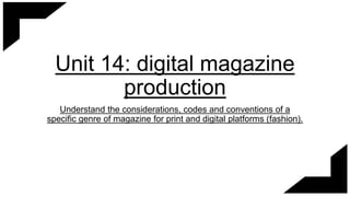
  • 1. Unit 14: digital magazine production Understand the considerations, codes and conventions of a specific genre of magazine for print and digital platforms (fashion).
  • 2. Masthead / title Dominant image Rule of thirds Main sell line Tagline Subheading Bottom banner This is a digital version of the front cover of the fashion magazine called ‘vogue’. It is extremely popular and has a dedicated fan base as it’s a very notorious magazine for featuring highly recognized celebrities. The front cover of this digital magazine features a lot of techniques that the designer has used to appeal to the reader and increase the layouts appeal. The front cover features Kim Kardashian, who is incredibly popular and one of the most viewed people in the public eye at the minute. She is the dominant image, and they have used a medium close up shot of her staring directly into the camera. This is called the direct mode of address, as she is directly engaging with the audience and drawing us in so we directly focus on her. The way the magazine designer has positioned Kim to stare directly into the camera and the fact she is incredibly dominant on this front cover as her head covers the title, which could signify she holds mass importance (even more important than the title itself), demonstrates her power. There is also words like ‘kings’ and ‘queens’ in the subheadings, which holds great connotations of power and royalty. This also links in with the tagline which is ‘taking a stand’. All of these link directly to contextual detail about power and royalty, which could either intimidate the readers into buying this magazine through the direct mode of address, or it could inspire them and draw them in by thinking by reading this it may show them how to be powerful like Kim. Digital front cover
  • 3. The dominant image on the front cover of this magazine is very important into helping us understand the relationship between the purpose and content of the magazine and their target audience; firstly, because the celebrity is Kim Kardashian and at the minute the Kardashians are the most famous and influential family over pop culture and social media. Therefore using her as the front cover is very strategic as it draws a mass amount of younger women into buy the magazine, due to the Kardashians massive influence on young people. I think the demographics for this front cover would be women aged from as young as 15 onwards, and could be anywhere from the social grade A to c2 due to the fact Vogue is generally very pricey and highly respected magazine. The magazine is sold only on the vogue website and other highly recognized websites as it features so many respected celebrities and it’s main purpose is to advertise and sell high end products, which lower graded people may not be able to afford – so their advertising is quite high end. This also links in with how pristine the layout of the magazine is, and how recognized the famous vogue font is. The front cover of the magazine is not too ‘cluttered’ and doesn’t give away too much information, which is really good to draw the reader in to find out more inside the magazine. On this particular issue of vogue, Kim is linked with all the annotations of power and royalty. The camera has took a mid close up shot, featuring her hour glass figure and her head. This is very important because showing her body can link to that same power and femininity theme, however it can be seen as contradictory due to the fact Kim’s stance is quite weak and she’s not portraying the main sell line of “taking a stand”. Also, she is wearing very neutral tones and the main background of the magazine is all quite neutral and dull, which is also contrasting as you’d think if she was taking a stand she might be wearing very bold and out-there colors however she seems to be portrayed in an almost dull way. However, we never know what the magazine designers intentions are and they may have done this for a certain effect, as it may link with the codes and conventions of women being stereotypically soft and elegant. The codes and conventions that have been used support the magazine really well; they have used a very famous woman who could be considered as the ideal body image and most influential in the public eye right now which is enough to draw people in for fashion. They have also used the neutral, soft colors and rather than dark and muddy colors that could put young women off the fashion element, and draw them more into the soft and elegance of the front cover. This is really good because we can tell the purpose of this magazine from the front cover it to advertise brands as you can see brands such as ‘Gucci’, words like ‘heels’ and there's events like the met featured, so this really neutral, femininity themed front cover is really effective at drawing in young woman to be influenced into buying the magazine and buying the products inside.
  • 4. Digital double page spread Drop cap to start off the columns and to catch the readers eye with the bold color. The dominant image is extremely large and takes up the whole of one page, which shows it is very important and stands out. Articles and columns give structure to the page and formality, the font used is very small and the language is very formal and articulate which links to elegance. Cover line / title half is red and half is black and a bigger font which changes the tone of the title, as if it is almost loud and in our face The pull quote can interest the reader by catching their eye and giving them an insight into the article. Sub images that harshens the amount of text on the second page and gives the reader more content.
  • 5. The purpose of this double page spread is to inform the readers on one topic, this double page spread being about Emma Watson. I love the way that Vogue has laid out this double page spread, I think it’s been very skillfully done. A lot of the double page has had space taken up from images of Emma Watson however it has been done in a clever way due to there still being a large amount of text for the reader to enjoy, however the images level this out as if there is too much text the reader could get bored; this means there is something interesting for the reader to look at which keeps them drawn to the magazine. I think color has been used very effectively in this double spread as vogue has used a repetitive bold red in certain areas and kept the rest of the page toned down. The bold red font of the word “Watson” also grabs the readers attention due to it being highlighted as her last name, which indicates importance. The drop cap at the beginning of the body of text also has been highlighted, alongside the two lipstick stains. The use of red on both sides of the double page spread merges the pages together and takes away the divide from the image and the article by adding elements from one page to another. This page follows the codes and conventions of a fashion magazine to draw in the target audience by its use of color and images. It has combined the use of the color red with the typicality of how red lipstick on women is seen as sexy and appealing. This lipstick stain is printed on both sides of the double spread in different places on the celebrity Emma Watson. As the model for the page, they have used an up close shot of her face which features her smooth skin, attractive features and also red lipstick. On the second page they have also used sub images of her in total black and white, which presents her whipping her hair and looking into the camera almost seductively. The running red theme indicates vogue wants this page to be endearing and maybe give off elegant and mysterious sex appeal, which will entice young women to read this double page due to being sexy and attractive like a celebrity being massive in the media at the minute.
  • 6. Print front cover The masthead / title has got a holographic effect and it stands out from the rest of the page incredibly well due to the color scheme. The dominant image is a very close up shot of Victoria Beckham, with her looking directly into the camera which is direct mode of address and she is engaging directly with the audience. The essential information that the reader needs to know etc. the price, barcode, issue number The additional sell lines on the front cover give the audience a more in depth preview into the magazine and can spark up their interest as there is many different things to intrigue them. Also the use of bright colors that fits in with the color scheme to make these sub headings stand out. This is the main sell line as it promotes the main celebrity and uses a pull quote to promote the story about her. Glamour has used a thinner, less bold font for the main sell line which can be unusual as we’d think they’d want the main sell line to pop out. However, this could’ve been done to show that Victoria beckham is more fine and elegant which reflects the font. This border around the perimeter of the magazine is a very bold green and frames the models face.
  • 7. The purpose of the front cover of this magazine is to interest and entertain the reader by using a respected famous celebrity. This is like the two step flow model, where an audience is inspired by someone they admire or look up to (aka Victoria Beckham) to buy or do something; an audience who is a fan of the model could be influenced to buy this magazine because of this. This magazine front cover follows the codes and conventions of a fashion magazine very well through the color scheme and the dominant image. The mix of vibrant greens, yellows and greens promotes the boldness and the excitement of fashion and the model as it compliments and contrasts the neutral skin tones of Victoria Beckham. It also targets the audience perfectly because of the mix of bright colors would attract young women and the bold phrases like ‘beauty’ and even the title which is ‘glamour’. These are effective as the codes and conventions of the fashion magazine is to draw young women in, and the typical colors and use of Victoria Beckham is most effective as they are things that relate closely to the fashion industries. The strong, powerful font is effective as it connotates to strong women from fashion. By following typical codes and conventions of fashion, it manages to draw the target audience of young women who are interested in fashion in to buy it through things like typical ‘powerful’ or ‘feminine’ color scheme, and recognized fashion idols. These are very tactful marketing methods to draw in young women from ages 13-30 + by using the bold and feminine colors to compliment her close up shot of her looking almost angelic and capturing the eye of beauty. The price on the front of the magazine states it is £2 which shows it is sold in department stores and corner shops, and the demographics for this magazine could be anyone from D to A and maybe E. This is useful as it appeals to a broad spectrum of women and makes the purpose of the advertising and content valuable because a lot of different women will be reading it and buying it so there is a lot of different content of all different prices for them to market. Glamour has used a lot of direct mode of address to really engage the audience from the front cover. First of all, the dominant image is Victoria Beckham staring right into the camera which is direct mode of address to the audience; secondly in the sub headings and sell lines there is a lot of use of pronouns like ‘you’ and ‘you’re’ which is addressing the audience personally and can make them feel really interested or obliged to buy it.
  • 8. Dominant image features him in black and white and the background in a gradient of blue and purple which is the color scheme of the whole double page spread, featuring in the text. This color scheme merges the two pages together rather than them looking divided. He is positioned very laid back and casual, looking directly into the camera. print double page spread Pull quote used as the title for the double page spread, giving the audience a very clear insight of what’s going on inside the article. The columns have been split into 2 and are organized quite neatly. The font is small to fit a lot of text into which shows this article is full with a lot of content. Sub images to lessen the look of mass amounts of text and to give the reader more interesting images to entertain them.
  • 9. The purpose of this double spread is too relate to and advertise to the readers. First of all, we can see from the bottom of the page there is sub images which have been added to advertise his cook book; however the story in the article could be seen as quite personal and relatable for some people and if they relate to the celebrity, this could influence them to buy the product. This is called self-identity, and it is used on the target audience very cleverly in advertisement and helps them relate to a product and think this is what I need as they relate to the specific topic. The fact the dominant image has been positioned using the direct mode of address as well, due to the model staring directly into the camera, can engage the readers into wanting to buy this product and read the article further by feeling personally targeted. The dominant image is very eye catching and puts a certain emphasis on the model, by projecting them to the front of the image with a medium shot. They have also designed the background to be a gradient of blue to purple, however turned his silhouette into black and white which contrasts greatly. This is to make him stand out, however could also link to the article in the connotations of sadness and depression as the story is about a harsh break up between him and his boyfriend. Another way the magazine could've used color to express the emotions of the article is by highlighting the word ‘overwhelmed’ in blue which represents sadness and gloom, however the phrase ‘new world’ has been presented in a brighter purple which could symbolize greater beginnings. This doesn’t follow the typical codes and conventions of a magazine as you wouldn’t expect a very sad story to be used to promote the release of a cook book and as entertainment in a fashion magazine, however it links strongly in with personal identity. Readers could read this article and feel a strong sense of comfort knowing someone on the double page spread of a magazine is going through the same troubles as them. The page layout and deeper use of color supports the article and the story.
  • 10. Technical considerations of a digital and print magazine Cons of digital – • Cant access without any service or an internet connection. • Can be hard to read, might require to zoom in and out • If there is thing such as YouTube links, sound links, the readers server may not accept it and that takes away the full digital experience. Pros of digital – • Digital magazines are extremely cheaper to distribute than print as they do not need to be published and sent to millions of shops and can easily be accessed online. • Higher exposure to the target audience by greater circulation around the internet. • Very good for advertising brands • A lot more easy to access over the internet than print magazines from the shop. • Extremely eco friendly compared to print magazines that sometimes can’t be recycled and just get disposed of. • Easy to make and cost effective. • Full artistic control, and good quality images. • Can add images and sounds, etc. YouTube links to give the audience the full digital experience. Pros of print – • It’s portable with and without internet connection and can be used as entertainment on things like plane flights. • Can be viewed as easier to buy and read rather than having to subscribe online etc. • Don’t have to wait for it to download or the images to download. • Print is superior to digital if the target audience is not online and the advertisement fails. Cons of print– • Not very eco- friendly and can contribute greatly to pollution. • A lot more expensive to print and distribute around the world.
  • 11. Conclusion In conclusion, I think the purpose of a fashion magazine is to advertise products to the target audience through the use of popular influencers and current hot topics that appeal to audiences of women from aged 13 to around 50 depending which magazine it is. The codes and conventions of a fashion magazine usually feature feminine colors and attractive angles of celebrities, as fashion and beauty magazines are all centered around promoting women to buy things and look at things that could make them a better version of themselves; magazines use attractive women for this reason, as the audience will admire how they look and read the magazine so they can achieve that look as well. This is very effective marketing in the current generation of perfect influencers on social media which can make the average woman insecure, and want to improve themselves to look like people like Kim Kardashian etc. This is why codes and conventions are ideal to appeal to the certain target audience and effectively sell the purpose and content of the magazine. They use the certain aspects of a genre that will interest the audience. This fulfils the magazines purpose of advertisement and drawing in the target audience the buysubscribe to that edition.