Đề tieng anh thpt 2024 danh cho cac ban hoc sinh
Glamour contents page analysis
1. Megan Trahearn
Media
ContentsAnalysis
Masthead:
The word ‘GLAMOUR’ isincludedinthiscontentspage toconfirmthe brand
identity.Itisprintedinredtoemphasisthe attentionof the mainimage aswell
as parts of the featuredarticles. The logowouldbe arecognisable aspectof the
magazine andso the page will appeal tothe audience. The logohashintsof
orange in certainletterswhichhelpbreakthe pagessolidcolourwhich
continuesthroughout.
Date:
Beneaththe masthead/logo, the
date has beenprintedina
mediumsize text.The ideaof
thisisfor certaincollectorsof
these specificmagazinestobe
encouragedtocontinue
purchasing.These would
typicallybeenfoundonthe
maincover,howeverif the page
istoo overcrowded,printing
inside the coverneverchanges
the outcome of circulation.
Website link:
Includingthe brandswebsitelinkallowsGlamourandotherbrandstopromote
themselvestotheirmulti- platformmediaservices,encouragingconsumersto
keepupdatedwith the restof theirproducts.Thisfurtherincreasestheironline
readershipandkeepsincreasingtheirchance of beingfoundbynew consumers.
Thisis placedunderneaththe mastheadasthe mastheadisthe firstthingthe
consumerwill see.Thisfurtherallowsthe nextclosestthingstohave ahigh
chance of beingseenand remembered.
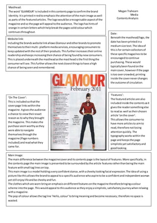
Main Image:
The main difference betweenthe magazinecoveranditscontentspage isthe layoutof features.More specifically,in
the contentspage the mainimage is presentedtobe surroundedbythe article featuresratherthanbeingthe main
feature withsmall taglinesontop.
Thismainimage isa model holdingaveryconfidentstance,withacheekylookingfacial expression.The ideaof usinga
picture like thisallowsthe brandtoappeal toa specificaudience whoaspire to be aconfidentandindependentwoman
yetstill enjoylifeandbe cheekyandfun.
The clotheswhichare worn bringan emphasisondifferentfeaturesonthe magazine thereforebringingacolour
scheme intothe page.Thiswouldappeal to thisaudience astheyenjoyasimplistic,satisfactoryjourneywhenrelaxing
witha magazine.
The pop of colour allowsthe tagline ‘Hello,colour’tobringmeaningandbecome necessary;therefore nospace is
wasted.
‘OnThe Cover’:
Thisis includedsothatthe
coverpage linkswithinthe
magazine.Itgivesthe audience
a chance to viewtheirexact
reasonas to whytheybrought
the magazine.Thismakesthe
purchase seemworthyasthey
were able tonavigate
themselvesthroughthe
magazine (Page numbers
included) andreadwhatthey
came for.
‘Features’:
The featuredarticlesare also
includedinside the contentsasit
givesthe readersomethingelse
to readas well astheirchosen
article ‘onthe cover’.
Thisallowsthe consumerto
have more articlesto aimto
read,therefore notlosing
attentionquickly. The
typographyworkswithin the
page and keepsthe page
simplisticyetsatisfactoryand
goodlooking.