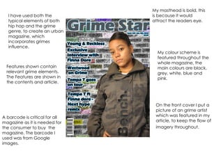
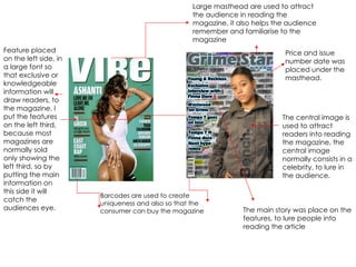
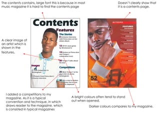
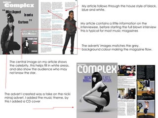
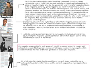
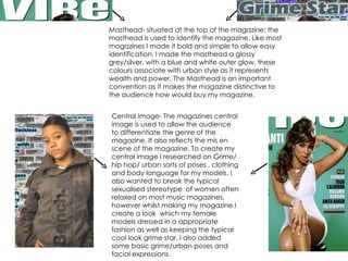
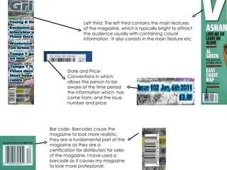
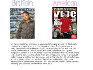
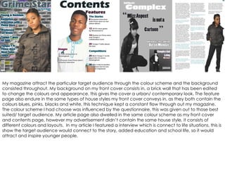
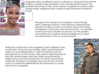
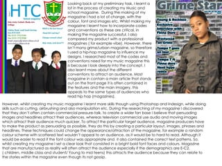
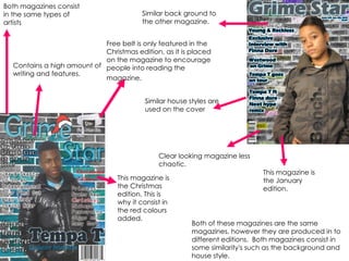
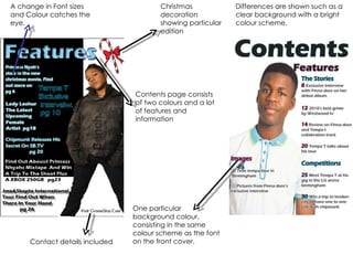
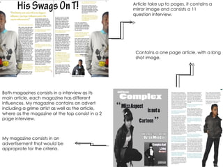
2. I have used both the typical elements of both hip hop and the grime genre, to create an urban magazine, which incorporates grimes influence. On the front cover I put a picture of an grime artist which was featured in my article, to keep the flow of imagery throughout. My masthead is bold, this is because it would attract the readers eye. A barcode is critical for all magazine as it is needed for the consumer to buy the magazine. The barcode I used was from Google images. My colour scheme is featured throughout the whole magazine, the main colours are black, grey, white, blue and pink. Features shown contain relevant grime elements. The Features are shown in the contents and article.
3. Large masthead are used to attract the audience in reading the magazine, it also helps the audience remember and familiarise to the magazine Barcodes are used to create uniqueness and also so that the consumer can buy the magazine The central image is used to attract readers into reading the magazine, the central image normally consists in a celebrity, to lure in the audience. Feature placed on the left side, in a large font so that exclusive or knowledgeable information will draw readers, to the magazine. I put the features on the left third, because most magazines are normally sold only showing the left third, so by putting the main information on this side it will catch the audiences eye. Price and issue number date was placed under the masthead. The main story was place on the features, to lure people into reading the article
4. The contents contains, large font this is because in most music magazine it is hard to find the contents page A bright colours often tend to stand out when opened. A clear image of an artist which is shown in the features . Doesn’t clearly show that it is a contents page. Darker colours compares to my magazine. I added a competitions to my magazine. As it is a typical convention and technique, in which draws reader to the magazine, which is consisted in typical magazines
5. The advert I created was a take on the nicki minaj advert. I added the music theme, by this I added a CD cover The adverts' images matches the grey, background colour making the magazine flow. The central image on my article shows the celebrity, this helps fill in white areas, and also show the audience who may not know the star. My article follows through the house style of black, blue and white. My article contains a little information on the interviewee, before starting the full blown interview this is typical for most music magazines
6. The particular target audience for my magazine is teenagers and young adults, between the ages of 13-25. This is because a lot of young adult and teenager listen to grime as they often inspire to be like the grime artists which they often read about inside of the magazine. Generally, grime magazines are mainly male dominated, this is because mainly manly topics are featured in the magazines, such as( Girls, money and groupies). However, the women audience are starting to get captivated by the grime genre, because more women grime artists are getting feature in the magazine for the music success instead of eye candy for the male audience. This attract the women audience because they inspire to be successful and be like the artist which is featured in the magazine. Also, my front cover feature a women, artist that shows that the magazine is for both gender. One technique I use to make my front cover attract to the target audience set was by adding big grime star which the audience would recognise, I also added a large font size with bold colours, this would make masthead of the magazine stand out next to other magazines. I also add features which would entices the audience into read the whole magazine. I added a contemporary looking advert to my magazine featuring a grime artist new album, most grime magazine typically contain an advert which doesn’t convey in the same themes of colours as the articles. My article is contains a plain background, like my contents page, I added the same colour palette used on my front cover and the contents page so that my magazine flows correctly. My magazine is appropriate for both genre as it consists of a equal amount of images and articles that consists of both genders. Moreover the images, consisted in my magazine which would both attract the male and female genders in to reading the magazine.
7. Masthead- situated at the top of the magazine; the masthead is used to identify the magazine. Like most magazines I made it bold and simple to allow easy identification. I made the masthead a glossy grey/silver, with a blue and white outer glow, these colours associate with urban style as it represents wealth and power. The Masthead is an important convention as it makes the magazine distinctive to the audience how would buy my magazine. Central Image- The magazines central image is used to allow the audience to differentiate the genre of the magazine. It also reflects the mis en scene of the magazine. To create my central image I researched on Grime/hip hop/ urban sorts of poses , clothing and body language for my models. I also wanted to break the typical sexualised stereotype of women often relaxed on most music magazines, however whilst making my magazine I create a look which my female models dressed in a appropriate fashion as well as keeping the typical cool look grime star. I also added some basic grime/urban poses and facial expressions.
8. Left third: The left third contains the main features of the magazine, which is typically bright to attract the audience usually with containing casual information. It also consists in the main feature etc. Bar code- Barcodes cause the magazine to look more realistic, they are a fundamental part of the magazine as they are a certification for distributors for sales of the magazine. I have used a barcode as it causes my magazine to look more professional. Date and Price-Conventions in which allows the person to be aware of the time period the information which has come from; and the issue number and price
9. Hearst Corporation would be a good institution for my magazine because they are one of the nation's largest varied media companies. Its major interests include magazine, newspaper and business publishing, cable networks, television and radio broadcasting, internet businesses, TV production and distribution, newspaper features distribution, etc. Hearst Corporation produces magazine such as seventeen, Redbook, O (the Oprah). The magazines produced by Hearst Corporation are mainly female dominated and often contain a bright and eye catching colours, which would draw in a audience . However, they also sell magazine which would attract the male market by doing this the institution cover both genders. I believe that my magazine would be appropriate for this institution because it consists of both the male and female audiences, as I have made the appearance through the images and style be appropriate for men and women. Moreover, Hearst Corporation don’t consist in selling music magazines, so my magazine would therefore be the first music magazine published by Hearst corporation. By doing this it would widen Hearst Corporation audience base. As my magazine is Grime (UK based), it would introduce the Hearst corporation (American institution) to a new fan base for there magazine. If Hearst corporation was to publish, my magazine the UK, America and the EU may become more likely to become the main audience for my magazine.
10. American British My target audience are teens to young adults, aged around 13- 25 of both genders who is enjoy hip hop and the grime genre. This is because my magazine consists of well known artists and interesting stories, which would entice the audience. Certain topics which are featured in most grime magazines consists in real life stories, this could attract audiences which inspire to be like the person in the article. Most grime magazine consist in areas such as Birmingham, Nottingham, London as well as Manchester, this attracts those from this areas as they also relate to the articles. My product also has a website which the audience can access and can become more involved by emailing and ask about information on UK tours.
11. My magazine attract the particular target audience through the colour scheme and the background consisted throughout. My background on my front cover consists in, a brick wall that has been edited to change the colours and appearance, this gives the cover a urban/ contemporary look. The feature page also endure in the same types of house styles my front cover conveys in, as they both contain the colours blues, pinks, blacks and white, this technique kept a constant flow through out my magazine. The colour scheme I had choose was influenced by the questionnaire, this was given out to those best suited/ target audience. My article page also dwelled in the same colour scheme as my front cover and contents page, however my advertisement didn’t contain the same house style, it consists of different colours and layouts. In my article I featured a interview which is connect to life situations, this is show the target audience would connect to the story, added education and school life, so it would attract and inspire younger people.
12. Magazines often use different types of software to manipulate and edit the images so create a high standard in which will help sell the product. For example airbrushing, is often used in beauty magazines to create a clear looking image, magazine which creates a high profile and standard of image. During the construction of my magazine I used to different types of software's, Photoshop and Indesign. Whilst using Photoshop I edited, cut and adding effects. I used Photoshop to edit my back ground on my front cover, I also used an airbrushing tool to give the central image a fresh look. Whilst using Photoshop I added texture and colourful element tot attract the particular audiences. Moreover, on Indesign I also used the Font and the colours to create the additional text and information to create the rest of my magazine. Throughout the making of my magazine I came through many challenge however, it took patience understand the software to make my work so successful. During the making of magazine I came over a few technical errors , for example I never knew how to feather my pictures, but the problem was rectified once I gained some knowledge once I learnt and researched on how to use the software.
13.
14.
15. However, whilst creating my music magazine I learnt more skills though using Photoshop and Indesign, while doing skills such as cutting, airbrushing and also manipulation etc. During the researching of my magazine I discovered that they don’t often contain commercial pressure-talk, to create a wider fan base I believe that persuading images and headlines attract their audiences, whereas television commercial use audio and moving images which attract their audience much quicker. To attract the particular target audience, magazine producers have to make the product as persuading as possible, they do this by creating a particular layout, images, phrases and headlines. These techniques could change the appearance/attraction of the magazine, for example a random colour scheme with scattered text wouldn’t appeal to an audience, as it would be to hard to read. Although it would be easier to read if the font colour was appropriate and it also contained the correct text patterns. So, whilst creating my magazine I set a clear look that consisted in a bright bold font faces and colours. Magazine that are manufactured as reality will often attract the audience especially if the demographics are E-C2, ( children, middle class and student/ Young to mid teens) this attracts the audience because they can relate to the stories within the magazine even though its not gossip. Looking back at my preliminary task, I learnt a lot in the process of creating my Music and school magazine. During the making of my magazine I had a lot of change, with the colour, font and images etc. Whilst making my magazine I learnt how to incorporate codes and conventions as these are critical, in making the magazine successful. I also compared my product with a professional magazines ( for example vibe). However, there isn’t many grime/urban magazine, so therefore I used a hip-hop magazine to influence my designs. I researched most of the codes and conventions need for my music magazine this is because I look deeply into the concept. I also learnt more about the different conventions to attract an audience. Most magazine in contain a main article that stands out on the front page it is often contained in the features and the main imagery, this appeals to the same types of audiences who read hip hop (magazines).
16. This magazine is the January edition. This magazine is the Christmas edition. This is why it consist in the red colours added. Free belt is only featured in the Christmas edition, as it is placed on the magazine to encourage people into reading the magazine. Similar back ground to the other magazine. Both magazines consist in the same types of artists Similar house styles are used on the cover Both of these magazines are the same magazines, however they are produced in to different editions. Both magazines consist in some similarity's such as the background and house style. Clear looking magazine less chaotic. Contains a high amount of writing and features.
17. Contents page consists of two colours and a lot of features and information One particular background colour, consisting in the same colour scheme as the font on the front cover. Christmas decoration showing particular edition A change in Font sizes and Colour catches the eye. Differences are shown such as a clear background with a bright colour scheme. Contact details included
18. Article take up to pages, it contains a mirror image and consists a 11 question interview. Contains a one page article, with a long shot image. My magazine consists in an advertisement that would be approprate for the criteria. Both magazines consists in a interview as its main article, each magazine has different influences. My magazine contains an advert including a grime artist as well as the article, where as the magazine at the top consist in a 2 page interview.