Explore beautiful and ugly buildings. Mathematics helps us create beautiful d...
Magazine analysis feminist
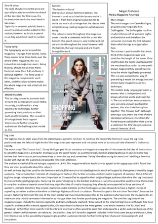
1. Megan Trahearn
MediaMagazine Analysis
Main Image:
The main image stars Carey Mulligan,
an actress starringin the film
‘Suffragette’. The Suffragette is a film
in which thrives off of women’s rights
and feminism and therefore the
consumer can make the link between
these which brings a recognisable
face.
The actress is positioned in thecentre
third of the magazine cover and
stretches the length of the cover. Only
slightly does the model overlap partof
the masthead but as this is a very well-
known magazinethey do not have to
have the whole logo freely presented.
This is a very conventional way of
presenting a model on a magazine and
almostevery magazine uses this
technique.
The models body languagepresents a
women who is independent and
knows what she wants and ready for
it. The suitand shoes worn present a
very sensibleand well put together
women; this also linksthe tag line
together ‘The Trouser Suit’. Although
wearing a suit,there arehints of more
stereotypical female styles from the
flared trousers which therefore can be
a statement for Elle’s target audience
overall;females 18-49.
Tag Lines
The taglines mostly steer away from the stereotypical women’s fashion.To continue the idea of the feminism issue,the tag lines
positioned over the left and rightthird of the magazinecover represent and introducemore of an unusual idea of women’s fashion to
society.
The words used ‘The Trouser Suit’, ‘Carey Mulligan gets feisty’ introduce an image to society which links towards the idea of feminismas
to what the magazine is aimingfor. Ellehave used the word ‘Feisty’ as a controversial attention grabbingphrase.In society some may
believe that feminists can portray themselves as over the top and sometimes ‘Feisty’ therefore usingthis word and labellinga feminist
leader with it grabs the audienceand possible feminist’s attention.
The audience in which Elleare tryingto appeal are 18-49. This magazineedition would aimto appeal to this age group as it is found that
they are most passionateaboutthis subject.
As well as these tag lines used for the feminismarticle;Ellehave also included taglines in which will appeal to their general monthly target
audience. This includes their interests of shopping and fashion;this further includes another smaller segment of exercise. These different
tag lines rangein importance, the most importantto Ellewould be to appeal to their original targetaudience therefore the tag lineabout
fashion is thelargesttypography. Featuring the word ’shopping’ as the boldest and most visual phrasewould be used to allow themselves
to vary their audience towards some that may enjoy the idea of simply shopping;they already haveappealed to three sections of
women’s interests therefore they create smaller relatableelements on the front page as separatewords to have a higher chanceof
appealingto a wider audiencetherefore achievinga higher profitand circulation. Thenext largestis the articleon ‘feminism’, becausethe
issueis featuring‘feminism’ the one of the most visibletaglines should beabout this as the audience who have seen the magazinefor an
interest in this should havemore information to intrigue them into further purchasingthe magazine. The smallesttaglines on the
magazine covers includethe exercisesegments and hair and beauty segment; these would be the smallesttaglines as although they have
a specific audiencewhich would appeal to this,Elle would want to feature the more genera l and whole interests like‘Fashion’and
‘Shopping’, rather than more specific like‘braids’and ‘exercise’as they would be seen firstand appeal to a wider audience becauseof the
general interest which women can relate to. Despite this,they still have this segment included in the front cover becausewithout it, they
limitthemselves to the possibility of appealingto another audienceinterest; further limitingtheir chanceof increased profitand
circulation.
Banner:
‘The feminism Issue’
Ellehave an annual Feminismedition. The
banner is used as to label the issueto make it
stand it from their original layoutbutnot to
make too much of a change that the idea of their
simplisticeasy readingmagazines which women
enjoy.
The colour scheme throughout this magazine
cover is made a statement with the useof the
banner. The peach colour is very limited and not
very visiblethroughoutthe cover however with
the banner, the tag lines pop and are finally
brought forward.
Date & price:
The date of publish and the priceare
typically located around the masthead
or the barcode. For this issue,itis
located underneath the mast head in
two rows.
Typically in a normal publish,there is
usually an issuenumber added to this
section,however as this is a special
issuethey would not need to number
it.
Typography:
The typography varies around the
magazine, it ranges from bold to italics.
There seems to be three fonts over the
whole of this magazine, this is a
convention on magazine covers; being
that you should not use too many
fonts (no more than 3-4) and keep it
well put together. The fonts used in
this magazinecomplements each
other, and the colour scheme makes
the whole magazine look simplistic but
effective.
#MOREWOMEN
This hashtagis used to promote both
Elleand the campaign on social media.
In society, social media is a key
essential to technology, further
promoting their products on their
multi-platformmedia. This is used in
this magazineto help support
feminismand further allowthe
audienceof the hashtagto be invited
to Elle.