
Recommended
More Related Content
What's hot
What's hot (18)
Viewers also liked
Viewers also liked (20)
Similar to Front Cover Analysis of MixMag
Similar to Front Cover Analysis of MixMag (20)
More from Josh03
More from Josh03 (17)
Recently uploaded
Recently uploaded (20)
Front Cover Analysis of MixMag
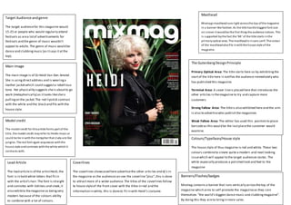
- 1. Target Audience and genre The target audience for this magazine would 15-25 or people who would regularly attend festivals as are a lot of advertisements for festivals and the genre of music wouldn’t appeal to adults. The genre of music would be dance and clubbing music (as it says it at the top). Main Image The main image is of DJ Heidi Van Den Amstel. She is using direct address and is wearing a leather jacket which could suggest a rebellious tone. Her physicality suggests she is about to go work (metaphorically) as it looks like she is pulling on the jacket. The red lipstick contrast with the white and the black and fits with the house style. Model credit The model credit for this article forms part of the ti tle, the model credit may refer to Heidis music or could be tie in with the metaphor that clubs are like jungles. The red font again acquiesces with the hous e style and contrasts with the white which it contrasts with. Lead Article The lead article is of the artist Heidi, the font is in bold white letters that fit in with the artist’s hair. The font is straight and connotes with tidiness and sleek, it also exhibits the magazine as being very modern because of the colours ability to combine with a lot of colours. Masthead Mixmags masthead runs right across the top of the magazine in a banner-like fashion. As the title has the biggest font size on s creen it would be the first thing the audience notices. This i s s upported by the fact the ‘Mi ’ of the title starts in the primary optical area. The masthead is in sans s erif. The colour of the masthead also fi ts in with the house style of the magazine. The Gutenberg Design Principle Primary Optical Area: The title starts here so by exhibiting the start of the title here it notifies the audience immediately who has published this magazine. Terminal Area: A cover line is placed here that introduces the other articles in the magazine to try and capture more customers Strong Fallow Area: The title is also exhibited here and the aim is also to advertise who publish the magazines Weak Fallow Area: The editor has used this position to place barcode as this would be the last place the customer would examine. Colours/Typefaces/House style The house style of thus magazine is red and white. These two colours combine to create quite a modern and neat looking issue which will appeal to the target audiences tastes . The white especially produces a polished look and feel to the magazine Coverlines The coverlines showcased here advertise the other articles and dj’s in the magazine as the audience can see the coverline “plus”, this is done to attract more of a wider audience. The titles of the coverlines follow te house style of the front cover with the titles in red and the information in white, this is done to fit in with Heidi’s costume. Banners/Flashes/badges Mixmag contains a banner that runs vertically across the top of the magazine which aims to self-promote the magazine as they coin themselves “the world’s biggest dance music and clubbing magazine”. By doing this they aim to bring in more sales.