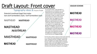
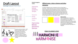
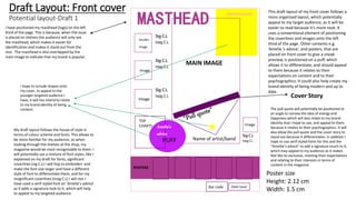
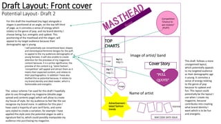
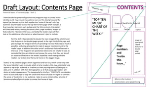
The document discusses potential layout designs for the front cover and contents page of a magazine.
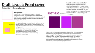
For the front cover, two draft layouts are proposed. The first is more organized with coverlines and images arranged systematically. The second has a more energetic layout with elements positioned at angles to convey liveliness. Both aim to appeal to the target audience of young females through bright colors, shapes, and previews of fashion and competition content.
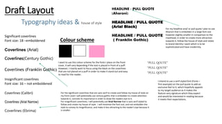
For the contents page, two contrasting drafts are also proposed. The first follows conventional rules with a logical flow of elements. The second has an unorganized, upbeat style to match the genre of pop music. Both utilize the magazine logo, artist images, and a color scheme to