1. Magazine Analysis
All magazines are constructed in a way which specifically targets and meets the
needs of the intended target audience. In order to determine how magazines
achieve this I havedeconstructed two cover pages and double page spreads
taking into consideration the text, colours, design and the genre codes and
conventions and how each of these anchor the target audience.
Elle Magazine
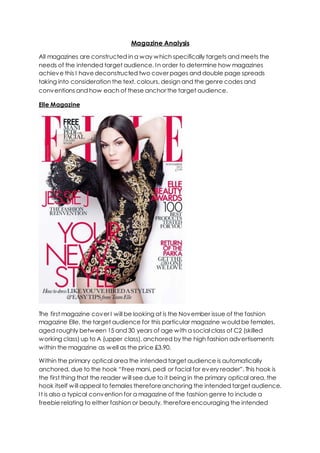
The first magazine cover I will be looking at is the November issue of the fashion
magazine Elle, the target audience for this particular magazine would be females,
aged roughly between 15 and 30 years of age with a social class of C2 (skilled
working class) up to A (upper class), anchored by the high fashion advertisements
within the magazine as well as the price £3.90.
Within the primary optical area the intended target audience is automatically
anchored, due to the hook “Free mani, pedi or facial for every reader”. This hook is
the first thing that the reader will see due to it being in the primary optical area, the
hook itself will appeal to females thereforeanchoring the intended target audience.
It is also a typical convention for a magazine of the fashion genre to include a
freebie relating to either fashion or beauty, thereforeencouraging the intended
2. target audience to buy the magazine due to the fact that they are receiving a gift
in return.
Also within the primary optical area we have the masthead, large and bold
therefore again being one of the first things the audience see when looking at the
cover which is important due to the fact that it informs them of what magazine this
is. The masthead also crosses over into the strong fallow area, in which wealso have
the issue date and the price of the magazine. The masthead on this particular cover
is red, not only does this colour have festive connotationsthereforeanchoring the
issue date November and the upcoming festiveseason but it also has connotations
of love and passion thereforecreating the ideology that the readers are going to
love the fashion and beauty within this magazine. This particular colour scheme also
anchors the audience in a way, in the sense that women are often appealed to the
themes love and passion therefore using a colour which has these connotations will
automatically attract females whomthis magazine is specifically targeting.
Also within the strong fallow area wehavethe price £3.90, again anchoring the
intended target audience who have a social class of C2-A who can afford and are
willing to pay just under £4 for a magazine. Also within both the both the primary
optical area and the strong fallow area we havethe top half of the model. It is a
typical convention for the models on the cover of Elle magazine to cover the
majority of the masthead thereforecreating the sense that Elle is such a well-known
publishing company and is instantly recognisable therefore just havinga small
proportion of the masthead visible is still enough for the audience to recognise what
magazine it is and also creates the sense that they are targeting people who
already fans of or aware of Elle magazine.
Also it is a typical convention for fashion magazines to use star theory in which the
cover will featurea star as the model, be this a musician, actor/actress model etc.
Therefore encouraging the intended target audienceto purchase the magazine. In
this case the publication company chose specificallyto feature the musician Jessie
J on the cover. This choice automatically anchors the intended target audience for
this particular magazine; females aged 15-30 due to the fact that Jessie J produces
music which targets the same demographic. Also Jessie J is seen as an icon too
many females aged between 15-30 who idolize both her and her fashion style
therefore encouraging these females to buy this magazine just to get inspiration
fromthis particular artist. By using this model it will not just attract the usual fans of Elle
magazine but also people who would not normally be interested in purchasing Elle
magazine but will purchase it just because Jessie J is featured on it.
Jessie J is very dominate, taking up a large proportion of the cover crossing into both
the weak fallow area and the terminal area as well as the aforementioned primary
optical area and strong fallow area along with the image being taken at a lower
angle, therefore creating a sense of importance and power both of which anchor
the fact that Jessie J is not only a massive star but is also the main feature of this
issue. Direct mode of address has been used having Jessie staring directly into the
3. camera therefore creating a more personal feel for the audience, encouraging
them to purchase the magazine. The producers have chosen specifically to dress
Jessie in a black and gold dress, with black also being in the hooks, black has
connotations of sophistication therefore anchoring the fact that this is a
sophisticated magazine as well as anchoring the intended target audience who
have a higher social class and a taste for sophistication. The gold also anchors this
particular social class due to its connotations of wealth and glamour whilst also
anchoring the fact that it is appealing to females due to the fact that women are
often appealed to expensive items and the glamorous lifestyle. The use of gold also
anchors the high fashion and expensive fashion and beauty products advertised
within this particular magazine.
The use of font also anchors the intended target audience due to the fact that it is
the slim type of font which appeals to females rather than males. Whilst anchoring
the intended target audience it is also a more sophisticated font anchoring the
sophistication associated with high end fashion magazines such as Elle, with this
particular style of font being a typical convention for this genre of magazine due to
them having a more upper class intended target audience. Also in terms of text the
hooks include words such as “fashion, beauty and stylist” all of which anchor the
genre of this magazine. The hooks also use direct mode of address using words such
as “your” therefore making the magazine feel more personal to the audience as
though they are appealing to them as a person directly through hooks such as
“your new style” therefore encouraging themto purchase the magazine.
Fashion magazine double page spread
I also looked at a double page spread fromthe fashion genre, firstly wehave the
masthead "survivor", big and bold therefore automatically attracting the audiences
4. attention, the font itself slim and professional looking automatically anchors both the
female and more upper class demographic that will be reading the magazine. All
the font on the page is in black, with connotations of sophistication, this again
anchors the sophisticated, professional design that high fashion magazines go for in
contrast to other genres, as well as anchoring the fact that this magazine is aimed at
a more older generation. I also feel that the use of the word survivor as the
masthead, again anchors the intended female target audience due to the fact that
women are often attracted to stories in which a woman has struggled and survived
therefore providing themwith inspiration, also this particular type of story is
conventional of a fashion magazine. Again there is a paragraph of writing which is
in a more fancy, curvy font, again anchoring the intended female target audience.
It is conventional for the double page spreads to feature a dominate image, in this
case we havean image of Cheryl Cole due to the article being an interview with
her. Again this double page spread conforms to the typical conventionsof a
fashion magazine, by featuring a dominate image of an attractive woman it
encourage the audience to read it due to the fact that they aspire to be like the
models thereforethey want to know more about them. The use of star theory also
entices the audience, by having a double page spread focusing on Cheryl Cole it
automatically encourages her fans to read the magazine weather they are or are
not a fan of the actual magazine, also the use of Cheryl Cole anchors the intended
target audience due to the fact that not only does she produce music aimed at the
same target audience, she is also seen as a role model by millions of teens and
young women who aspire to be like her.
Kerrang Magazine
5. In contrast to the previous magazine cover I deconstructed, this magazine not only
differs in the sense that it is a weekly calculative magazine in contrast to Elle which is
monthly, but also this magazine cover consists of complete different constructive
elements in terms of text, colour and genre codes and conventions due to the
difference in genre and the intended target audience, with Kerrang being a rock
music magazine with an intended target audience of predominately males, aged
roughly between 13 and 25, however it is mainly targeting the under 18’s anchored
by the fact that Kerrang magazines never consist of advertisements advertising
alcohol and features a number of advertisements and articles relating to upcoming
gigs and concerts which tend to appeal to a teenage audience. In terms of social
class Kerrang targets those within the criteria of C1 (middle class) down to E (the
lowest level of subsistence) anchored by the price £2.20.
Within the primary optical area we have a banner at the very top of the magazine,
the use of banners are conventional of music magazines within the rock genre, this
automatically engages the audience as it is the first thing they see. The use of star
theory within this automatically encourages the audience to buy this particular
magazine, due to the fact that fans of this particular band will want to purchase this
issue simply because there is a tribute to them inside, even if they are not a fan of
Kerrang itself. Also within the primary optical area we have the Masthead,
constructed in a way which automatically anchors the genre of this particular
genre, firstly due to the fact that the font which is used looks as though it is smashed,
therefore not only anchoring the chaos and disruption commonly associated with
the rock/heavy rock genre but also anchors the younger audiencethat this
particular magazine is targeting who tend to have chaotic and disruptive lives. Also
the masthead is in red, the colour red has the connotations of danger therefore
again anchoring the rock/heavy rock genre and the people who are fans of this
genre who often see danger as a thrill. Kerrang havechose specifically to have an
exclamation mark at the end of their masthead, this creates not only a sense of
importance thereforecreating the ideology that this magazine is important and fans
of this genre need to read it due to it containing all the important information
regarding the rock genre, but also almost creates an "in your face" feeling, again
anchoring the rock genre which is loud and considered in your face.
Like the previous fashion magazine I looked at, Kerrang always featurea dominate
image of stars therefore encouraging fans of these stars to buy the magazine,
however in contrast to the fashion genre which use a variety of different stars on
their covers raging fromactors/actresses to musicians, it is a common convention for
Kerrang to specifically use musicians of the rock/heavyrock genre on their covers,
be this a solo artist or a band. In this instance we have Paramore, a rock band, by
having a dominate image of these on their cover it instantly attracts fans of this
band to read the magazine although they may not actually be fans of Kerrang itself,
also the choice of using this band on the cover automatically anchorsthe younger
intended target audience for the magazine due to the fact that the band itself is
aimed at and produces music attracting pre-teensup to young adults. As you can
6. see fromthe previous Elle magazine there is a huge difference in which the images
featuring on the covershave been constructed, due to them both being of a
complete different genre. Elle has represented JessieJ in a much more feminine
and seductiveway due to this being a high end fashion magazine, in contrast to this
magazine in which the band Paramore are represented as casual, with one band
member even pulling a face, thereforeagain anchoring both the rock/hard rock
genre which prides itself in creating a sense of freedomand not caring as well as
again anchoring the younger audience whowill be attracted by a much less serious
approach that magazines such as Elle. Kerrang has also conventionally used direct
mode of address within the cover image, by having the band members looking
directly into the camera, thereforecreating a much more up close and personal
feeling for the person viewing it.
Another convention of this particular genre of magazine is the use of images within
the hooks, therefore anchoring the younger intended target audience who are
more often than the older generation to be appealed to the use of numerous
images within a cover. This again adds to the sense of disruption and chaos
therefore again anchoring the rock genre. Again another convention of this genre is
the use of posters within the magazine, which again anchors the younger audience,
particularly teenagers whooften collect posters of their favourite artist.
Within the weak fallow area and the terminal area we have the use of yet another
banner, again the use of star theory within the banner encourages the audience to
purchase the magazine, also the producers chosespecifically to havethis banner in
read therefore creating the sense that this information is very important, and having
this as the final thing the audience sees it almost like the last attempt to reel them in.
Kerrang double page spread
7. As you can see this double page spread differs hugely fromthe previous fashion
magazine double page spread I looked at. Firstly in terms of terms of imagery,
although both double page spreads feature a dominate image of a star, their is a
vast difference between the two. The model on this particular double page spread
is represented as dark and rebellious through the use of dark make up and a leather
jacket which has connotations of rebellion, thereforeanchoring the genre of this
specific magazine as well as the young intended target audience who tend to have
an appeal to rebellion, in contrast to the fashion magazine double page spread I
looked at which represents the model in a much more sophisticated manner by
having the model dressed in a white dress with the connotations of innocence. The
masthead "wild child" again automatically reinforcesthe sense of rebellion therefore
again anchoring the intended target audience as well as the rock/heavy rock
genre, also the choice to use a bold font for the masthead again creates that "in
your face" feeling commonly associated with the rock genre in contrast to the slim
sophisticated fonts seen in the previousfashion genre. Again this article is an
interview, with Taylor Momsen again the choice in intervieweeanchorsthe genre of
this particular magazine due to her being in a band of this specific genre, in contrast
to the previousfashion magazine which used a more sophisticated artist Cheryl
Cole. The producers chose specifically to havea close up of Taylor Momsen,
therefore creating a much more up close and personal feeling for the person
viewing it, as well as anchoring the fact that the article is an up close interview and
she will be revealing some personal information.