
Recommended
More Related Content
What's hot
What's hot (18)
Viewers also liked
Viewers also liked (9)
Similar to Advert Anaylsis
Similar to Advert Anaylsis (20)
More from Kiera_Herbert
More from Kiera_Herbert (18)
Recently uploaded
Recently uploaded (20)
Advert Anaylsis
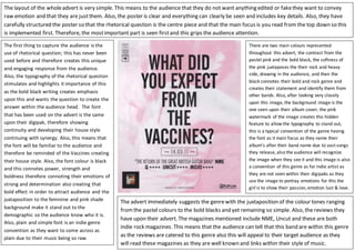
- 1. The first thing to capture the audience is the use of rhetorical question; this has never been used before and therefore creates this unique and engaging response from the audience. Also, the typography of the rhetorical question stimulates and highlights it importance of this as the bold black writing creates emphasis upon this and wants the question to create the answer within the audience head. The font that has been used on the advert is the same upon their digipak, therefore showing continuity and developing their house style continuing with synergy. Also, this means that the font will be familiar to the audience and therefore be reminded of the Vaccines creating their house style. Also, the font colour is black and this connotes power, strength and boldness therefore connoting their emotions of strong and determination also creating that bold effect in order to attract audience and the juxtaposition to the feminine and pink shade background make it stand out to the demographic so the audience know who it is. Also, plain and simple font is an indie genre convention as they want to come across as plain due to their music being so raw. The layout of the wholeadvert is very simple. This means to the audience that they do not want anything edited or fakethey want to convey raw emotion and that they are justthem. Also, the poster is clear and everything can clearly be seen and includes key details. Also, they have carefully structured the poster so that the rhetorical question is the centre piece and that the main focus is you read from the top down so this is implemented first. Therefore, the mostimportant part is seen firstand this grips the audience attention. The advert immediately suggests the genrewith the juxtaposition of the colour tones ranging fromthe pastel colours to the bold blacks and yet remaining so simple. Also, the reviews they have upon their advert. The magazines mentioned include NME, Uncut and these are both indie rock magazines. This means that the audience can tell that this band are within this genre as the reviews are catered to this genre also this will appeal to their target audience as they will read these magazines as they are well known and links within their style of music. There are two main colours represented throughout this advert, the contrast from the pastel pink and the bold black, the softness of the pink juxtaposes the their rock and heavy side, drawing in the audience, and then the black connotes their bold and rock genre and creates their statement and identify them from other bands. Also, after looking very closely upon this image, the background image is the one seen upon their album cover; the pink watermark of the image creates this hidden feature to allow the typography to stand out, this is a typical convention of the genre having the font as it main focus as they name their album’s after their band name due to vast songs they release, also the audience will recognize the image when they see it and this image is also a convention of this genre as for indie artist as they are not seen within their digipaks as they use the image to portray emotions for this the girl is to show their passion, emotion lust & love.