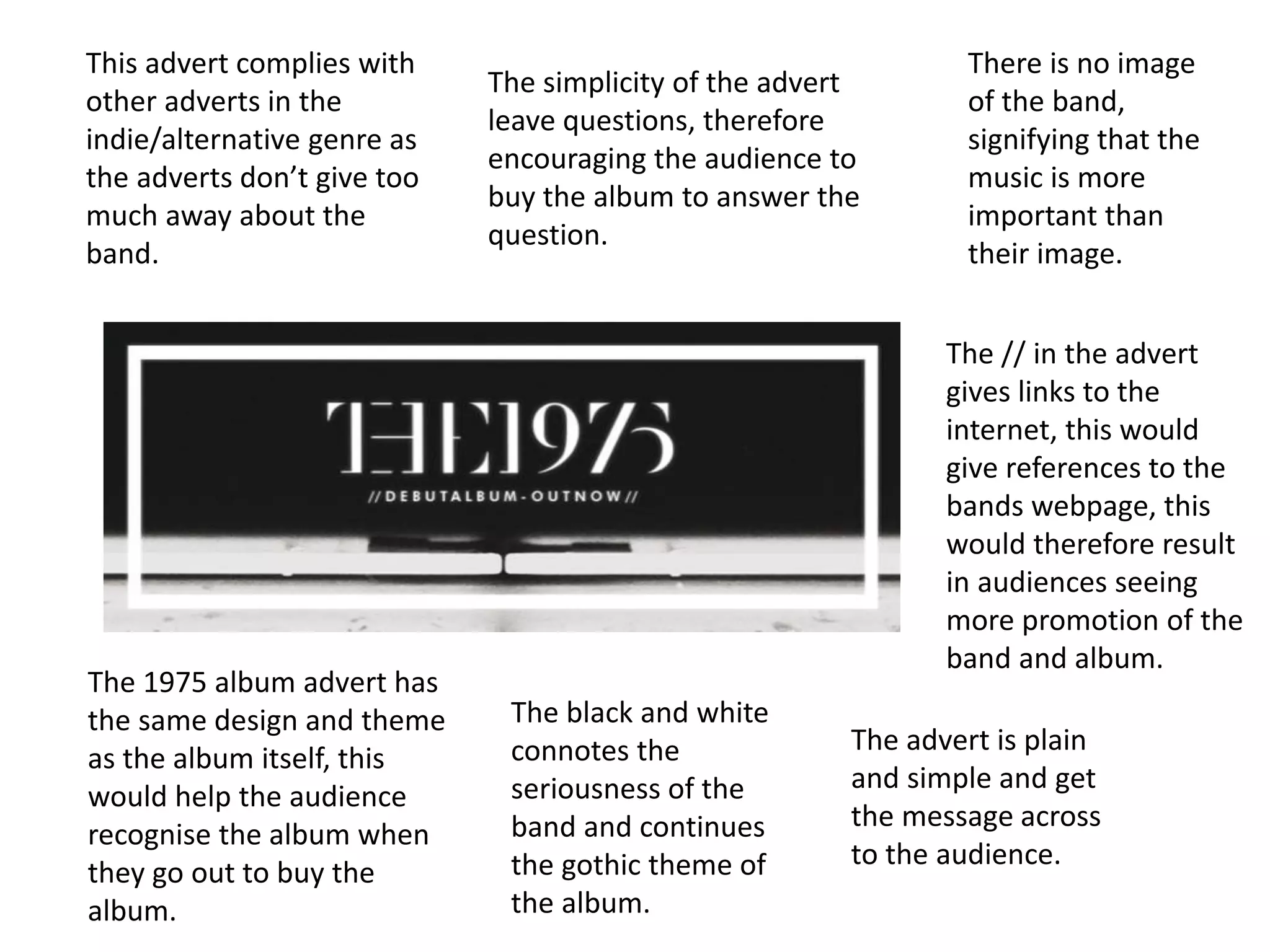
The album advert uses the same design as the album to help audiences recognize it. It is a plain and simple design that gets the message across while leaving some questions unanswered to encourage buying the album. The black and white color scheme and lack of images of the band signify that the music is more important than their image and complies with typical indie/alternative genre ads that don't give too much away.