
Recommended
More Related Content
What's hot
What's hot (20)
Viewers also liked
Viewers also liked (15)
Similar to Digipak Ben Howard 'Every Kingdom'
Similar to Digipak Ben Howard 'Every Kingdom' (20)
More from Kiera_Herbert
More from Kiera_Herbert (18)
Recently uploaded
Recently uploaded (20)
Digipak Ben Howard 'Every Kingdom'
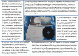
- 1. BenHoward releasedthisalbuminthe UKon the 30th of September2011. The frontcover artworkwas designedbythe artistOwenTozer.EveryKingdomisthe firststudioalbumbythe British,indie-artistBen Howard.His musicfallsunderthe genresof Indie/Folkandacoustic.Ibelievethe conceptof hisfrontcover (artwork) wasto conveyhismessage of the albumandthe lyricsashisseendeepinthe oceanportrayshis love forthe nature and howhisemotionsare drowninghimashislyricsare emotional andgripping.Also, BenHowards hasa passionforsurfingandlivingfree thisisconveyedthroughhisartworkillustratinghislove for the ocean. Also,we are presentedwiththe force of nature,the ocean.Thisconnectiontonature andthe earthportrays the indie andfolkgenre,beingunique andone withnature. This cover shows a hybrid between the artist and the ocean. As Ben Howard is within the depths of the ocean (as a figure). However, the artist is on the cover, but the front cover is not focused on him, he is seen as a small figure showing how nature is his main focus. Although this cover uses a photograph, the artistic features and effects create a painting effect. The composition is focussed on the sea opposed to Ben Howard himself. On the back cover the name of the songs, ‘Old Pine’ / ‘The Wolves’ and ‘Black Flies’ all show genre conventions of indie as it’s about nature, the earth and nature is the centre of this genre. The connotations of pine: woods, forests and wolves are animal and mysterious. They attract the audience via leaving mystery within the simplicity of the back, the purity of the white background relates to the genre how clearand pure this music is, then contrasted with the deep and black writing to make his song titles stand out and show two sides, two different meanings. The reception, the artist target audience would receive this album cover (front and back) in a positive way as they would love the simplicity and ambiguity of the design and the way that nature and the freedom of the ocean is the main focus with the artist being the figure showing how nature is more important and it being his inspiration. Also, the font on the back is black to show his deeper meanings compared to the front it white and open showing his feeling and emotions are hidden and deeper. The coloursusedin the covershowdeepermeaning.The lightercoloursshowhowatthe top(the end) brighter,the sun shiningthrough,the lightthroughthe seaisa connotationof brightandclear future.Thisisa genre conventionasindie and folkmusicisrelatedwithdeepanddarkmeaningswithintheirlyricsseenonthe darktonal coloursat the bottomof the image (depths of the ocean) andanotherconnotationof the darknessof the waterisrepresentingthe unknownand mysteriousplaces.The lightercolours(white glow) interpretedbeginningsandpurity. Throughthisdigipak,aspectsof the theoryBarthes’enigmacode can be recognisedasitmeansmysteryandallowingambiguitytherefore the audience can interpretthe coverindifferentways, asthe artist(the figure withthe ocean) createsenigmaandasense of mysteryasthe audience istoperceive thisindifferent,as towhat he isdoing.Divingdeeperintothe depthsof the ocean,orconnotationof hisemotionssurroundinghim. The font, ben Howard is written in large and white font this shows his importance and value of the artist as he is a solo artist the name is made to stand out and show he is one within nature (the ocean) this is important as he is making his name bold within the music industry, attracting the audience. Yet the use of the colour white portrays his purity and clearemotions, how he is open and free. Also, the colour white is a reflection of his music genre (folk/acoustic) as white is bright and high key like his music bright and open, simplistic and wholesome, in comparison to black associated with dark and deeper meanings.