
Recommended
More Related Content
What's hot
What's hot (17)
Viewers also liked
Viewers also liked (13)
Similar to Analysing 3 Pop Music Magazines
Similar to Analysing 3 Pop Music Magazines (20)
Recently uploaded
Recently uploaded (20)
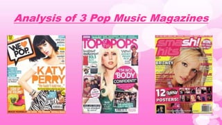
Analysing 3 Pop Music Magazines
- 1. Analysis of 3 Pop Music Magazines
- 2. WE <3 POP – Pop Genre Music Magazine
- 3. Bright and bold colours consistent throughout the front cover. This also creates a happy feeling associated with pop. Cover line to tempt the audience into buying. Makes people want to see how the quote finishes. This is also in bold and bright colours usually to stand out from other text as it has high importance. A well-known pop artist to further entice and excite the audience and convince them to buy the magazine. The celebrity usually wears fashionable and up to date clothing.Bright and bold masthead standing out to the consumers eye line. This mix creates a happy feeling which is associated with pop. The title of the magazine also demonstrates the genre as it says ‘Pop’. The heart abbreviation instead of love will appeal to teenagers, the target audience, as it is almost like using slang. More quotes to entice the audience. Also has a different background colour than the rest of the front cover which draws specific attention to it. The colour scheme of the whole front cover is very consistent and regular, just like the pop music is. The colours are bright as well which promotes happiness, also like the pop music. Barcode and pricing. Advertising and promoting of other products not associated with the magazine. Also mentions fashion which may intrigue the target audience, teenagers, as this is an important feature for their lives in modern society. Teasing the audience again by saying what's included inside the magazine. Lots of information and detail, not very minimalistic. White background is associated with perfection and is very common in pop music magazines. ‘Gossip + Fashion + Boys’ – This is a technique to intrigue the target audience of young teenage girls who are likely to be interested in all three of these things.
- 4. Just like all contents pages, there is page numbers which combine with what's on that page for easy findings for readers. Loads and loads of images to tease the reader by showing them what’s to come in the rest of the magazine. Also includes page numbers next to the images so the reader can choose what they want to see. Images are also of very well known celebrities and pop artists specifically. This will definitely intrigue pop fans. Page number. Makes the reader feel special and unique. The masthead shown again to remind the reader. The masthead also shows the heart abbreviation once again which is associated with the target audience. It is something recognisable by young teenage girls and therefore the page may gain their attention. Consistent colour scheme which once again links with the genre music itself (a constant beat). Blue, yellow and black. Quotes which once again tease the reader by showing them what's to come. May also convince pop fans to purchase the magazine if browsing through it in the store. Almost tricking the reader by saying everyone else loves this, so why wouldn’t you? The colour blue produces a calming effect which is nicely associated with the pop music genre, calming and peaceful. Images of lots of famous pop artists to lure the reader. The layout of the pages also resemble, once again, that of a girls diary. The pages almost overlap like overlapping pieces of paper. This may feel recognisable to them causing their attention to be gained.
- 5. Well known artist for the Q&A double page spread. This, once again, will convince most pop fans to purchase the magazine as it will intrigue them. The picture will always fill most of one side of the spread which draws attention to them. Once again, like the front cover, the double page spread includes many bright vibrant colours and fonts. These vibrant colours further demonstrate how the magazine is trying to portray a happy attitude associated with the pop music genre. The interview/q&a feature on the double spread page will intrigue pop fans as Cher Lloyd is a well-known and very popular artist. Like all double page spreads, the page crosses the binding. The way the artist poses and what she is wearing can relate to the target audience, teenage girls. She looks like she is having fun which is the purpose of the pop music genre. A small image to entice readers to see what is happening. Also a large quote which aims to do the same by interesting pop fans into seeing the meaning behind the quote. Page number. Also, the consistent colour scheme further portrays the pop music genre due to its constant and regular beat. The colours pink, black and white also suit the target audience well. White background once again representing purity and perfection. Associated maybe with the artist and saying she is perfect. The colour pink is also a strong connotation of love which is a key feature of the pop music genre. Most pop songs feature the theme of love and therefore using the colour pink tries to promote this.
- 6. TOP of the POPS – Pop Genre Music Magazine
- 7. The masthead is very bold and bright which again links with the style of pop music, happy and exciting. It also includes the word pop in the title indicating it is a magazine for lovers of this genre. The pink also can link with the target audience which is young teenage girls as this colour is a stereotype associated with them. A well-known pop artist on the front once again symbolising it’s a pop genre music magazine. She is also wearing current trendy clothing. Images of what's to come inside the magazine in an attempt to tease pop fans and convince them into buying it. Quotes from articles inside the magazine to further try and convince pop fans to buy. Advertising new trends on the front. Fashion is very relatable and interesting to young teenage girls who is the target audience. Interactive features inside to occupy young teenage girls (the target audience) who stereotypically will have a short attention span. These features are included in hope to keep them interested. The advertising of this on the front aims to convince them to buy. Like most pop music magazines, the colour scheme of this is very consistent just like the consistent beat of pop music. This specific magazine mainly features pink which is associated with the target audience and aims to make people happy and excited just like pop music. Pink is also a colour associated with calm which this magazine is trying to portray by saying the read will be relaxed and chilled out. Barcode and pricing. White background is associated with perfection and purity, essentially saying that the pop music genre represents this, along with the magazine itself. Once again, the use of the colour pink aims to represent the pop music genre as this type of music is strongly associated with love which the colour pink demonstrates.
- 8. Once again, a consistent and vibrant colour scheme associating to the style of music. The pink links again to the target audience which is young teenage girls. The page numbers are paired with what’s on the page to make easy navigation to suit the reader’s interests. Fashion advice and information on fashion in general which is included for the purpose of interesting the target audience, being young teenage girls who are stereotypically intrigued by fashion. Images of what is to come which once again aims to interest the reader. The fact the image is of a well known pop band will also please the target audience. Once again, a white background represents the purity of the magazine, trying to indicate how the articles in this read are unique and perfect. The abbreviation of the word magazine represents a sort of slang tone almost like language that a teenager would use. This applies well to the target audience as they may feel they can relate to the language used. Also the font is very informal and messy, again, could be related to the personality and attitude of a teenager. This heading clearly represents the target audience is probably girls only. Interactive features shown to keep reader occupied if bored. For the target audience, which is young teenage girls, this is a good feature as stereotypically people at those ages have short attention spans. Page number. Structure is not very neat and has almost a messy feel to it with the rotated magazine in the top left and font at the top. This could interest the target audience as they may be able to relate to the layout as stereotypically, this age group is rather messy.
- 9. Once again, a well known pop artist on the double page spread which will intrigue and excite pop fans. She is wearing fashionable clothes which will interest the target audience, young teenage girls. The colour scheme on this double page is once again consistent and vibrant. This represents the excitement and continuity of the pop music genre. Also, the glamorous pink and purple contrast will appeal greatly to a young teenage girls target audience as this is the most likely age group that enjoy these colours. A quote of what’s to come in the article. Used to tease readers into continuing the read. White background once again gives the idea of purity and perfection. Trying to represent the uniqueness of the article and how it is a one of a kind read. An image used to try and convince the reader into continuing to read the article on this pop sensation. The image will intrigue fans and make them want to understand what it’s about. Like all double page spreads, the page crosses the binding. Page number. The font is bright pink which contrasts nicely with the white background to represent a pure and unique effect. Also, the colours can be associated easily with the target audience. ‘Celeb Secrets’ will interest the target audience as young teenage girls are the most likely age to be intrigued by secrets. This will interest them specifically as well, as it has relation to a pop star who is probably a role model to them.
- 10. Smash! Hits – Pop Genre Music Magazine
- 11. The masthead is the brightest, boldest and most vibrant feature of the magazine. Therefore, the producers are trying to make people draw attention to it. The name ‘Smash! Hits’ also reinforces the fact this is a music magazine. Once again, the front cover features a very well known pop artist which will attract and intrigue fans of the pop genre. The constant colour scheme on this front cover again replicates the genre of music it is representing. Also, the excessive use of pink attracts the target audience which is young teenage girls. Barcode and pricing. There is loads of information packed onto one page which is a common feature of pop music magazines. This specific magazine features much brighter colours than some others. The bright yellow background contrasted with the pink text makes for a very vibrant front cover. This aims to excite consumers and intrigue them into reading about the pop music genre. Free items and a chance to win something may interest people and convince them to buy the magazine. Also, the posters are of very well known pop artists which also contributes to the association with pop and will most definitely interest fans of that genre. Some teasers of what’s to come in the rest of the magazine. This aims to interest the consumer and excite pop fans as the stories are linked with the genre. The word secret makes it seem like this is the only place to find out about this specific pop story. This prospect should excite pop fans and tempt consumers into purchasing the magazine. Banner which promotes what is inside the magazine. Slogan of the producer.
- 12. The repetition and constant use of the masthead represents how the brand are trying to promote their magazine as unique and different. The page numbers are paired with what’s on the page to make easy navigation to suit the reader’s interests. Images of famous pop artists further represent the genre of this magazine and aims to convince and entice pop fans to purchase it. The layout of this contents page is almost somewhat a replica of a young teenage girls diary (paperclips, torn paper), who as we know, is the target audience of pop music magazines. Therefore, the layout of this may feel relatable to them and encourage them to purchase or continue reading this magazine. The colour scheme in this contents page is not too consistent, yet still, it includes bright vibrant colours commonly associated with happiness which the pop genre aims to promote. The fonts included on the page also somewhat link with the target audience. The non formal and almost pen drawn font could be relatable to young teenage girls and once again replicates the feel of a diary. ‘Everybody’s talking about’ – The emphasis on the word everybody makes people, especially pop fans, feel left out if they do not know about the news. This aims to convince people to either continue reading or purchase the magazine. Sounds like gossip which will appeal to the target audience, young teenage girls, as stereotypically gossip is enjoyed by them.
- 13. Just like all other double page spreads, a well known pop artist is featured which excites and intrigues pop fans. Masthead repeated in the top corner to remind people of the producer. Also states this is an interview page. The contrast of the masthead and this gives the impression the interview is exclusive to this magazine which will interest people. A quote regarding the artist and a bit of what's to come during the read. This will excite pop fans and readers as they will want to continue the read so the quote can gain some meaning and purpose. The colour scheme on this double page spread is less consistent than others, yet it still consists of very bright colours which can be associated with happiness and positivity which is what the pop genre aims to promote. A chance to win something will excite most readers and give them a purpose for continuing the read. An image with relation to what is included inside the interview. This will motivate most pop fans to see why the image is on there and what it’s purpose and background story is. Like all double page spreads, the page crosses the binding. The blue colour is very peaceful and calm and aims to relax the reader. Just like the pop genre aims for. This colour mixed with the pink creates a relaxing yet happy vibe. Modern fashion and jewellery will excite the target audience, as stereotypically, young teenage girls are interested in different types of fashion.