
Recommended
More Related Content
What's hot
What's hot (18)
Viewers also liked
Similar to Digipak Arcade Fire
Similar to Digipak Arcade Fire (20)
More from Kiera_Herbert
Recently uploaded
Recently uploaded (20)
Digipak Arcade Fire
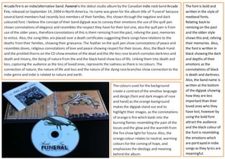
- 1. Arcadefire is an indie/alternative band. Funeral is the debut studio album by the Canadian indie rock band Arcade Fire, released on September 14, 2004 in North America. Its name was given for the album title of ‘Funeral’ because severalband members had recently lost members of their families, this shown through the negative and dark coloured font. I believe the concept of their band digipak was to convey their emotions the use of the quill pen shows connotations of elegance and resembles the respect they have for their lost one, also the quill pen is from use of the older years, thereforeconnotations of this is them remising fromthe past, reliving the past, memories to entice. Also, the song titles are placed over a death certificates suggesting there songs haverelations to the deaths fromtheir families, showing their grievance. The feather on the quill pen show connotations of peace and resembles doves, religious connotations of love and peace showing respectfor their losses. Also, the Black Hand and the prickled thorns on the CD show emotive of the dead and the life-less rose branch connotes darkness and death and misery, the dying of naturefrom the and the black hand show loss of life. Linking them into death and loss, capturing the audience as the loss of loved ones, represents the sadness as there is no colours. The connection of nature, the nature of life and loss and the nature of the dying rosebranches show connection to the indie genre and indie is related to nature and earth. The colours used for the background create a contrastof the emotive language and design (font and dark images of rose and hand) as the orange background makes the digipak stand out and to highlight their images, as the connotations of orangeis fire which leads into the burning flames resembling the pain of the losses and the glow and the warmth from the fire show light for future. Also, the orangecolour relates to neutral, warming colours for the coming of hope, and emphasises the ideology and meaning behind the album. The font is bold and written in the style of medieval fonts. Relating back to remising on the past and the olden style shows this and, reliving their memories. Also, the fontis written in black showing the dark and depths of their emotions as the connotations of black is death and darkness. Also, the band name is written at the bottom of the digipak showing how they are less important than their loved ones who they have lost, however by using the bold font attract the audience and the black colour of the fontis resembling the emotions which are portrayed in indie songs as they lyrics are meaningful.