
Recommended
More Related Content
What's hot
Similar to Subtitles (checked)
Similar to Subtitles (checked) (20)
More from JackAbsFab20
More from JackAbsFab20 (20)
Recently uploaded
Recently uploaded (20)
Subtitles (checked)
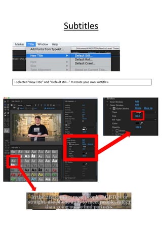
- 1. Subtitles I selected “New Title” and “Default still…” to create your own subtitles.
- 2. Before After After I selected new title, I used the font called “Georgia Regular Black Outline” because that had black thick outline of text to make easier to cover from bright background which could difficult to read it. So, I decided to choose white colour to make look nice and bright. As you see two subtitles before and after, I put outline size about 60 and its look thick and firm to make look better to read them. Also the part of interviews in my film, they had white screen background and I still use the black outline to protect from white text because both same colour will be invisible. So, that’s why I keep used black outline on every each subtitles. Also I like white text because I want to my subtitles look professional in my film. If I use different colour its will difficult to read it or they look informal in my film. Before I create white and black subtitles, I had original idea to create rainbows subtitles but I decide to not use them because I know they will look difficult to read. Some had dark colour not match to black outline and I decided to change my mind to use white for easier to read and suit with black outline.