Pre-Production
Ellie Jones
Style sheet
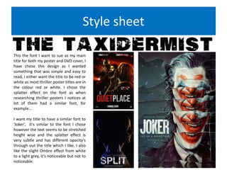
This the font I want to sue as my main
title for both my poster and DVD cover, I
have chose this design as I wanted
something that was simple and easy to
read, I either want the title to be red or
white as most thriller poster titles are in
the colour red or white. I chose the
splatter effect on the font as when
researching thriller posters I notices at
lot of them had a similar font, for
example…
I want my title to have a similar font to
‘Joker’, it’s similar to the font I chose
however the text seems to be stretched
height wise and the splatter effect is
very subtle and has different opacity's
through out the title which I like, I also
like the slight Ombre effect from white
to a light grey, it’s noticeable but not to
noticeable.
Style sheet
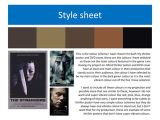
This is the colour scheme I have chosen for both my thriller
poster and DVD cover, these are the colours I have selected
as these are the main colours featured in the game I am
basing my project on. Most thriller poster and DVD cover
have at least one main colour in their production that
stands out to their audience, the colour I have selected to
be my main colour is the dark green colour as it is the most
vibrant colour out of the five I have selected.
I want to include all these colours in my projection and
possible more that are similar to these, however I do not
want and super vibrant colour like red, pink, blue, orange
anything of that sorts, I want everything to be subtle as
thriller poster have very simple colour schemes but they do
always have one vibrate colour to stand out, but I don’t
want that for my production, these are example of some
thriller posters that don’t have super vibrant colours.
Style sheet
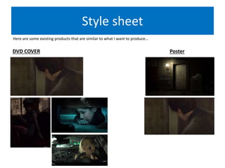
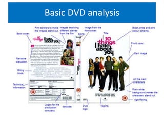
Here are some existing products that are similar to what I want to produce…
PosterDVD COVER
Basic DVD analysis
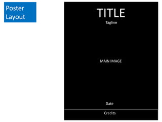
Poster
Layout
MAIN IMAGE
Credits
TITLETagline
Date
DVD cover
layout
FRONT COVER
AGE
RATING
DVD
LOGO
TITLE
BACK COVER
TECHNICAL INFORMATION
IMAGES FROM THE FILM
BILLING BLOCK
MAIN IMAGE NARRATIVE
DESCRIPTION
SPINE
Resources
Props:
Knife.
Fake blood.
Phone.
Costume
Madison(The reporter): Leather jacket,
black top, black or blue jeans, black
shoes.
Dead woman 1: Pink party dress, white
shoes.
Dead woman 2:Green cardigan, blue
jeans, black shoes.
Locations:
Car.
Bedroom.
Living room.
Hallway/landing.
Kitchen.
Equipment:
Camera.
Lighting.
Make up effects:
Blood.
Pale skin.
Cuts.
Stitching.
Bruises.
Camera angles:
Mid shots.
Close up.
Zoom out.
Low angle.
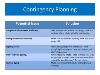
Contingency Planning
Potential Issue Solution
The photos I have taken are blurry. Take multiple shot’s while shooting to pick out
the least blurry photo with the best quality.
Losing the work I have done. Make sure I constantly save my work and make
a copy of it.
Lighting issues. When taking my photos make sure I have
enough light so they car clear and you can tell
what's happening.
Don’t reply on editing. When I take my photo I need to make sure they
are as close as they can be to what I want them
to look like as editing can’t fix everything.
Camera dying. Make sure my camera is fully charged before
shooting.
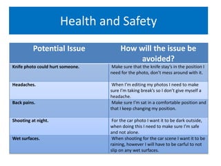
Health and Safety
Potential Issue How will the issue be
avoided?
Knife photo could hurt someone. Make sure that the knife stay’s in the position I
need for the photo, don’t mess around with it.
Headaches. When I’m editing my photos I need to make
sure I’m taking break’s so I don’t give myself a
headache.
Back pains. Make sure I’m sat in a comfortable position and
that I keep changing my position.
Shooting at night. For the car photo I want it to be dark outside,
when doing this I need to make sure I’m safe
and not alone.
Wet surfaces. When shooting for the car scene I want it to be
raining, however I will have to be carful to not
slip on any wet surfaces.

pre production

  • 1.
  • 2.
    Style sheet This thefont I want to sue as my main title for both my poster and DVD cover, I have chose this design as I wanted something that was simple and easy to read, I either want the title to be red or white as most thriller poster titles are in the colour red or white. I chose the splatter effect on the font as when researching thriller posters I notices at lot of them had a similar font, for example… I want my title to have a similar font to ‘Joker’, it’s similar to the font I chose however the text seems to be stretched height wise and the splatter effect is very subtle and has different opacity's through out the title which I like, I also like the slight Ombre effect from white to a light grey, it’s noticeable but not to noticeable.
  • 3.
    Style sheet This isthe colour scheme I have chosen for both my thriller poster and DVD cover, these are the colours I have selected as these are the main colours featured in the game I am basing my project on. Most thriller poster and DVD cover have at least one main colour in their production that stands out to their audience, the colour I have selected to be my main colour is the dark green colour as it is the most vibrant colour out of the five I have selected. I want to include all these colours in my projection and possible more that are similar to these, however I do not want and super vibrant colour like red, pink, blue, orange anything of that sorts, I want everything to be subtle as thriller poster have very simple colour schemes but they do always have one vibrate colour to stand out, but I don’t want that for my production, these are example of some thriller posters that don’t have super vibrant colours.
  • 4.
    Style sheet Here aresome existing products that are similar to what I want to produce… PosterDVD COVER
  • 5.
  • 6.
  • 7.
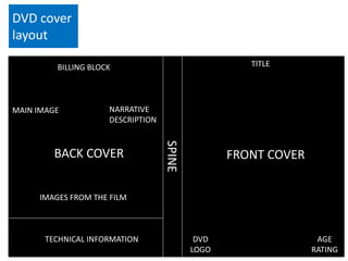
    DVD cover layout FRONT COVER AGE RATING DVD LOGO TITLE BACKCOVER TECHNICAL INFORMATION IMAGES FROM THE FILM BILLING BLOCK MAIN IMAGE NARRATIVE DESCRIPTION SPINE
  • 8.
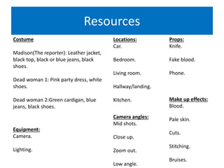
    Resources Props: Knife. Fake blood. Phone. Costume Madison(The reporter):Leather jacket, black top, black or blue jeans, black shoes. Dead woman 1: Pink party dress, white shoes. Dead woman 2:Green cardigan, blue jeans, black shoes. Locations: Car. Bedroom. Living room. Hallway/landing. Kitchen. Equipment: Camera. Lighting. Make up effects: Blood. Pale skin. Cuts. Stitching. Bruises. Camera angles: Mid shots. Close up. Zoom out. Low angle.
  • 9.
    Contingency Planning Potential IssueSolution The photos I have taken are blurry. Take multiple shot’s while shooting to pick out the least blurry photo with the best quality. Losing the work I have done. Make sure I constantly save my work and make a copy of it. Lighting issues. When taking my photos make sure I have enough light so they car clear and you can tell what's happening. Don’t reply on editing. When I take my photo I need to make sure they are as close as they can be to what I want them to look like as editing can’t fix everything. Camera dying. Make sure my camera is fully charged before shooting.
  • 10.
    Health and Safety PotentialIssue How will the issue be avoided? Knife photo could hurt someone. Make sure that the knife stay’s in the position I need for the photo, don’t mess around with it. Headaches. When I’m editing my photos I need to make sure I’m taking break’s so I don’t give myself a headache. Back pains. Make sure I’m sat in a comfortable position and that I keep changing my position. Shooting at night. For the car photo I want it to be dark outside, when doing this I need to make sure I’m safe and not alone. Wet surfaces. When shooting for the car scene I want it to be raining, however I will have to be carful to not slip on any wet surfaces.

Editor's Notes

  • #3 Explore colours, fonts and image styles similar to what you want to produce. Discuss all three elements in relation to why you chose them and where you may use them in your project. Go over as many pages as you need to
  • #4 Explore colours, fonts and image styles similar to what you want to produce. Discuss all three elements in relation to why you chose them and where you may use them in your project. Go over as many pages as you need to
  • #5 Explore colours, fonts and image styles similar to what you want to produce. Discuss all three elements in relation to why you chose them and where you may use them in your project. Go over as many pages as you need to
  • #7 Mock up of a potential design using the colours and fonts established in your style sheet and sourced images Alter this slide to make it appropriate for your planned product types. Add further layout slides to create at least one for each product you plan to make.
  • #8 Mock up of a potential design using the colours and fonts established in your style sheet and sourced images. Alter this slide to make it appropriate for your planned product types. Add further layout slides to create at least one for each product you plan to make.