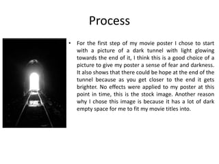
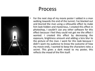
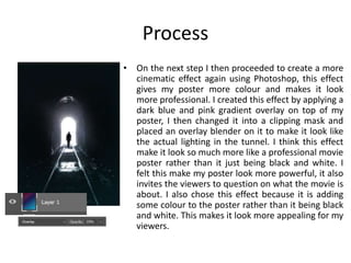
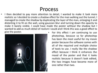
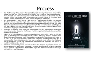
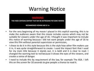
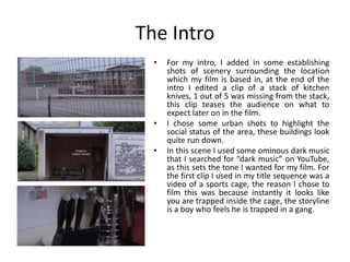
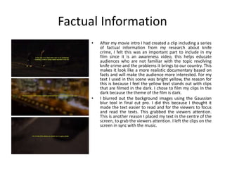
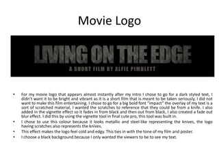
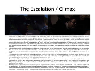
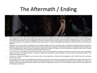
The document describes the process of creating a movie poster for a film called "Living on the Edge" about knife crime. It discusses the various steps taken: starting with an image of a dark tunnel with light at the end; adding a blurred silhouette of a man walking; applying color gradients for a cinematic effect; adding a shadow for realism; including the movie logo, title, and credits; and choosing fonts and layout for key information. It also covers creating a warning notice and introducing factual information and the main character in the film through close-up shots and lighting effects.
Welcome to TechSoup New Member Orientation and Q&A (May 2024).pdfTechSoup
In this webinar you will learn how your organization can access TechSoup's wide variety of product discount and donation programs. From hardware to software, we'll give you a tour of the tools available to help your nonprofit with productivity, collaboration, financial management, donor tracking, security, and more.
The French Revolution, which began in 1789, was a period of radical social and political upheaval in France. It marked the decline of absolute monarchies, the rise of secular and democratic republics, and the eventual rise of Napoleon Bonaparte. This revolutionary period is crucial in understanding the transition from feudalism to modernity in Europe.
For more information, visit-www.vavaclasses.com
This is a presentation by Dada Robert in a Your Skill Boost masterclass organised by the Excellence Foundation for South Sudan (EFSS) on Saturday, the 25th and Sunday, the 26th of May 2024.
He discussed the concept of quality improvement, emphasizing its applicability to various aspects of life, including personal, project, and program improvements. He defined quality as doing the right thing at the right time in the right way to achieve the best possible results and discussed the concept of the "gap" between what we know and what we do, and how this gap represents the areas we need to improve. He explained the scientific approach to quality improvement, which involves systematic performance analysis, testing and learning, and implementing change ideas. He also highlighted the importance of client focus and a team approach to quality improvement.
2024.06.01 Introducing a competency framework for languag learning materials ...Sandy Millin
http://sandymillin.wordpress.com/iateflwebinar2024
Published classroom materials form the basis of syllabuses, drive teacher professional development, and have a potentially huge influence on learners, teachers and education systems. All teachers also create their own materials, whether a few sentences on a blackboard, a highly-structured fully-realised online course, or anything in between. Despite this, the knowledge and skills needed to create effective language learning materials are rarely part of teacher training, and are mostly learnt by trial and error.
Knowledge and skills frameworks, generally called competency frameworks, for ELT teachers, trainers and managers have existed for a few years now. However, until I created one for my MA dissertation, there wasn’t one drawing together what we need to know and do to be able to effectively produce language learning materials.
This webinar will introduce you to my framework, highlighting the key competencies I identified from my research. It will also show how anybody involved in language teaching (any language, not just English!), teacher training, managing schools or developing language learning materials can benefit from using the framework.
How to Make a Field invisible in Odoo 17Celine George
It is possible to hide or invisible some fields in odoo. Commonly using “invisible” attribute in the field definition to invisible the fields. This slide will show how to make a field invisible in odoo 17.
Read| The latest issue of The Challenger is here! We are thrilled to announce that our school paper has qualified for the NATIONAL SCHOOLS PRESS CONFERENCE (NSPC) 2024. Thank you for your unwavering support and trust. Dive into the stories that made us stand out!
Unit 8 - Information and Communication Technology (Paper I).pdfThiyagu K
This slides describes the basic concepts of ICT, basics of Email, Emerging Technology and Digital Initiatives in Education. This presentations aligns with the UGC Paper I syllabus.
Ethnobotany and Ethnopharmacology:
Ethnobotany in herbal drug evaluation,
Impact of Ethnobotany in traditional medicine,
New development in herbals,
Bio-prospecting tools for drug discovery,
Role of Ethnopharmacology in drug evaluation,
Reverse Pharmacology.
Synthetic Fiber Construction in lab .pptxPavel ( NSTU)
Synthetic fiber production is a fascinating and complex field that blends chemistry, engineering, and environmental science. By understanding these aspects, students can gain a comprehensive view of synthetic fiber production, its impact on society and the environment, and the potential for future innovations. Synthetic fibers play a crucial role in modern society, impacting various aspects of daily life, industry, and the environment. ynthetic fibers are integral to modern life, offering a range of benefits from cost-effectiveness and versatility to innovative applications and performance characteristics. While they pose environmental challenges, ongoing research and development aim to create more sustainable and eco-friendly alternatives. Understanding the importance of synthetic fibers helps in appreciating their role in the economy, industry, and daily life, while also emphasizing the need for sustainable practices and innovation.
Students, digital devices and success - Andreas Schleicher - 27 May 2024..pptxEduSkills OECD
Andreas Schleicher presents at the OECD webinar ‘Digital devices in schools: detrimental distraction or secret to success?’ on 27 May 2024. The presentation was based on findings from PISA 2022 results and the webinar helped launch the PISA in Focus ‘Managing screen time: How to protect and equip students against distraction’ https://www.oecd-ilibrary.org/education/managing-screen-time_7c225af4-en and the OECD Education Policy Perspective ‘Students, digital devices and success’ can be found here - https://oe.cd/il/5yV
2. Process
• For the first step of my movie poster I chose to start
with a picture of a dark tunnel with light glowing
towards the end of it, I think this is a good choice of a
picture to give my poster a sense of fear and darkness.
It also shows that there could be hope at the end of the
tunnel because as you get closer to the end it gets
brighter. No effects were applied to my poster at this
point in time, this is the stock image. Another reason
why I chose this image is because it has a lot of dark
empty space for me to fit my movie titles into.
3. Process
• For the next step of my movie poster I added in a man
walking towards the end of the tunnel, I've blacked out
and blurred the man using a silhouette effect to make
him look hidden and mysterious, I created this effect in
photoshop, I couldn’t use any other software for this
effect because I feel they could not get me the effect I
wanted. I created this effect by decreasing the
exposure, brightness amount and adding a lens blur to
the picture of the man. I went for this look because I
didn’t want my audience to know the outcome of how
my movie ends, I wanted to keep the characters roles a
secret. This gives a dark mood to my poster, this
reflects the mood of the film itself.
4. Process
• On the next step I then proceeded to create a more
cinematic effect again using Photoshop, this effect
gives my poster more colour and makes it look
more professional. I created this effect by applying a
dark blue and pink gradient overlay on top of my
poster, I then changed it into a clipping mask and
placed an overlay blender on it to make it look like
the actual lighting in the tunnel. I think this effect
make it look so much more like a professional movie
poster rather than it just being black and white. I
felt this make my poster look more powerful, it also
invites the viewers to question on what the movie is
about. I also chose this effect because it is adding
some colour to the poster rather than it being black
and white. This makes it look more appealing for my
viewers.
5. Process
• I then decided to pay more attention to detail, I wanted to make it look more
realistic so I decided to create a shadow effect for the man walking out the tunnel, I
managed to create the shadow by duplicating the layer of the man, enlarging it and
distorting it to fit on the wall, using gaussian blur and turning down the opacity to
make it barely visible. I could have made the poster without the shadow but I
wanted to add as much detail of realism I could and I think this was a good effect to
give the poster. • For this effect I am continuing to use
photoshop, because so far photoshop
has been the most useful for my movie
poster because the software comes with
all of the required and multiple choice
of tools to use. I really like the shadow
effect because I think it enhances the
mood of the poster and that it looks
realistic because it doesn’t look edited,
the two images have become more of
one rather than two.
6. Process
• For the final step of my poster I then created my texts showing the cast and crew, and my
movie logo, the font I used for these is the impact font. I chose to use this font because I
think it stands out and looks very clear I made it look silver because it reminds me of a
metallic colour, this metallic silver tone references the main theme of the movie, knife
crime. It creates mental images of metal, blades, sharp knives and danger.
• For my movie logo “LIVING ON THE EDGE” I placed a gradient overlay over it. This makes it
fade from dark at one end to bright at the next end. I did this effect because I wanted there
to be an idea of darkness and light, I also gave it an overlay which makes the text look like it
has been scratched numerous time, this could imply that a knife has been scratching over
the text. I wanted this effect because the film is focused on knife crime and I wanted most
elements in my project to be related to knifes.
• I decided to place my name under the main title because It is my first ever professional
short film, I am the director of this film and I feel it is important to include the name of the
director on the poster,
• I went for an industry standard convention layout with the billing block. I opted for this as it
gave all the information I wanted to include, without detracting attention from the main
powerful image of the poster itself. This was also in original plan when I chose this image as
it has a lot of dark space available. Again I used a metallic silver to continue my idea of
sharpness. For the text that shows the cast and crew, I used similar effects that I had used
on my movie logo such as the gradient tool and lowered the brightness and opacity to
match the lighting in the tunnel.
• The main purpose of my movie poster is to attract the attention of potential viewers and
encourage them to want to see my movie. I included key information on when my movie
will be released. I chose to make the date titles larger than the rest because then that way it
will catch the eye of the viewers.
8. Warning Notice
• For the very beginning of my movie I placed in this explicit warning, this is to
make the audience aware that this movie includes scenes which may not be
suitable for viewers under the age of 16. I thought it was important to include
this notice of warning because I did not want people under the age of 16 to
view this film without parental supervision or permission,
• I chose to do it in this style because this is the style how other film makers use
it in, it was quite straightforward to create. I used the impact font that I used
for my main title because it stands out, it is bold and it is clear to read. I
changed the warning text to red because it draws the eyes of the viewers, and
creates a sense of danger.
• I need to include this by requirement of the law, for example The ASA. I left
this on the screen for 10 seconds to give people a chance to read it.
9. The Intro
• For my intro, I added in some establishing
shots of scenery surrounding the location
which my film is based in, at the end of the
intro I edited a clip of a stack of kitchen
knives, 1 out of 5 was missing from the stack,
this clip teases the audience on what to
expect later on in the film.
• I chose some urban shots to highlight the
social status of the area, these buildings look
quite run down.
• In this scene I used some ominous dark music
that I searched for “dark music” on YouTube,
as this sets the tone I wanted for my film. For
the first clip I used in my title sequence was a
video of a sports cage, the reason I chose to
film this was because instantly it looks like
you are trapped inside the cage, the storyline
is a boy who feels he is trapped in a gang.
10. Factual Information
• After my movie intro I had created a clip including a series
of factual information from my research about knife
crime, I felt this was an important part to include in my
film since it is an awareness video, this helps educate
audiences who are not familiar with the topic revolving
knife crime and the problems it brings to our country. This
makes it look like a more realistic documentary based on
facts and will make the audience more interested. For my
text I used in this scene was bright yellow, the reason for
this is because I feel the yellow text stands out with clips
that are filmed in the dark. I chose to film my clips In the
dark because the theme of the film is dark.
• I blurred out the background images using the Gaussian
blur tool in final cut pro. I did this because I thought it
made the text easier to read and for the viewers to focus
and read the texts. This grabbed the viewers attention.
This is another reason I placed my text in the centre of the
screen, to grab the viewers attention. I left the clips on the
screen in sync with the music.
11. Movie Logo
• For my movie logo that appears almost instantly after my intro I chose to go for a dark styled text, I
didn’t want it to be bright and vibrant as it is a short film that is meant to be taken seriously, I did not
want to make this film entertaining. I chose to go for a big bold font “impact” the overlay of my text is a
sort of scratched material, I wanted the scratches to reference that they could be from a knife. I also
added in the vignette effect so it fades in from black and then out from black, I also created a fade out
blur effect. I did this by using the vignette tool in final cute pro, this tool was built in.
• I chose to use this colour because it looks metallic and steel-like representing the knives, the logo
having scratches also represents the knives.
• This effect makes the logo feel cold and edgy. This ties in with the tone of my film and poster.
• I choose a black background because I only wanted the viewers to be to see my text.
12. Introduction Of The Main Character
• For the first scene I introduced the main character in this film (Mqhele), in this scene
you find the character sitting alone startled by a text he has received, I created this 3d
text effect by taking a screenshot of a text message, cropping out the background and
using key frames to make it follow the direction the phone is moving in. I also filmed a
close up shot of him in front of the window, I did this so the light from the window is
blocking the light from the character, this gives a really unique cinematic shadow
effect.
• I chose to do a close up shot because I wanted to show the characters full face and his
emotions to make the viewers get an idea on what he is going through. For the full
silhouette shot I used rising from his jacket up to his face I sat in a room with no
lighting apart from the natural lighting coming from the window, I focused the lens
onto my character and the lighting from behind him created the image I wanted. I
wanted this effect because it immediately sets the tone for my film and lets the
viewers know it is going to be dark.
• The silhouette effect creates the feeling of emptiness and danger, In this scene with
this effect the character is deep in his thoughts so this makes this effect cinematically
pleasing for the viewer.
• My character was wearing dark coloured clothing, this was because I made him look
like a gang member from this generation, most “gang members” now use dark sporty
clothing to express themselves as a member of a gang.
• On these clips in the scene I made it so you can not see his eyes, I did this deliberately
by making him wear a baseball cap pulled down to cover his eyes. I did this because I
thought it could hide his emotions and facial expressions, I didn’t really want the
viewers to know what he was feeling neither does this character want anyone to know
how he is feeling inside and how scared he really is.
13. Confrontation With A Care Worker
• For this scene we see the main character being confronted by a care worker about his suspicious behaviour, this
scene gives the first tease of what is about to come later in the film, the care worker offers support but Mqhele
chose to ignore what she said, this is letting the character continue to make bad choices. I chose to film this scene
in a location where the character would have the opportunity to take a knife. This scene helps to move the plot
along and it helps to develop the character. He was in a situation where he could have asked for help but did not
because he felt he would be punished for being around the group he was with. This highlights his fear. This is the
only scene where there is any source of bright light, this is because I wanted this scene to be a heart-warming yet
a missed opportunity. He refuses to let her help him.
• The female character is seen wearing pink, feminine caring coloured clothes, this creates the sense of nurturing
and care. The reason I wanted her to wear these type of clothes was because I wanted the viewers to know that
the main character has people who care for him and are offering to help him, I also wanted the main character
and the female character have different shades of colour in their clothing, the main character is wearing dark and
dim clothing whereas the female character is wearing bright and colourful clothing, this shows both the
characters have very different cinematic moods. This makes the female character stand out like a mother figure for
the main character.
14. The Dilemma
• In this scene we see the main character question if he is going to go through with his
plan, he isn’t sure if taking the knife is a good idea or not, he knows it’s a bad idea but
he also thinks he needs it for protection. For this scene I got a close up shot of him
holding the knife, this clip focuses on the knife and you see him walking off with it, this
tells the audience that he is going to end up using it for something.
• The viewers are able to see him questioning his decision because I have demonstrated
this by showing his distress in his body language, he gives a worried look on his face
which looks like he wants to hide away.
• at the start of the scene we see the main character show emotion to tell the audience
that he is worrying about what might happen, we then see the switch of emotion from
fear to anger once he takes out his knife. The reason why I wanted his emotions to
change when he took out the knife was because I wanted him to think he could be the
“big bad man” instead of the “scared little boy” and for him to think that this is the only
option, this is because most people who carry knives think they are the “big bad man”.
• For the clip when the main character is seen walking off into the distance this shows he
his going through with his decision to use the knife. The reason I filmed this scene was
because I wanted to give the viewers a sense of shock. The sense of shock given to the
audience also involves the viewers to advice and tell him not to go through with what
he is thinking. I also wanted the viewers to realise that later in the film it wont end well
of this character. I also filmed this scene focusing on his back because I wanted the
viewers to decide for themselves on how they think he is feeling, is it fear and worry or
is it confidence, this is because his face is not shown in this clip and you are not able to
tell how he is feeling. This scene is pulling the viewers into his decision by creating
emotion turmoil.
15. Introducing The Main Antagonist
• In this scene we see the introduction of the main antagonist (Josh), we see Josh and Mqhele exchange a heated phone call arranging where to meet
up, Mqhele is left shaken and he is preparing himself on what is about to happen, in this scene I used a close up shot starting from Josh’s shoes
leading upwards to his face, I used some atmospheric music to match the mood of the scene. In this scene I also used a still shot of Mqhele walking
towards the camera and filmed him on the phone to Josh, in this clip I used the built in stabilization tool in final cut pro to make my clip look more
still and professional.
• The viewers also get to see the main antagonists costume, he is wearing a full black tracksuit with a diamond chain, this tells the audience that he is
clearly a wealthy gang member, the close profile of josh makes him look really frightful and chilling because of the way he spoke to Mqhele on the
phone he had a threatening tone with Mqhele, this makes the audience fear for Mqhele.
• The reason why I chose to film the close up shots of the main character and the main antagonist was because I wanted the audience to see the
characters emotions, the main antagonist clearly looks annoyed and furious with the main character, the audience are able to pick this up, with the
main character he is seen with his head down and you still struggle to understand how he is feeling.
• The reason I chose to film Mqhele walking towards the camera just before they had this heated phone call was because I wanted the viewers to
know that he is getting closer and closer to the confrontation and to build up the tension they are feeling. As the phone call ends Mqhele is seen
standing still and still questioning if he wants to go through with it before he walks off telling the audience he has made his choice. This was his last
chance to turn around but he didn’t.
16. The Escalation / Climax
• In this scene we see Mqhele and Josh come face to face in the streets whilst its dark, the situation takes a turn for the worst when Josh’s group of boys try and scare
Mqhele, Mqhele feels intimidated so he tries to fight back by pulling out a knife, it doesn’t end well for Mqhele, in this scene I used a rotated angle shot from low on
the ground when Mqhele was getting beaten on the floor I also used a close up shot of Josh coming face to face with Mqhele, I did not use any professional lighting in
this scene, I used phone flashlights to give low atmospheric lighting, this was because I wanted my film to look dark to go along with the action. I included reverse
shots focusing on both characters whilst they were talking face to face, these shots build tension in this scene because the viewers are able to see both the characters
faces and expressions in this scene. In the shot focusing on Mqhele's face the background is empty and makes him look like he is by himself but when it switches to
Josh’s perspective his background is filled by his gang who are standing behind him. The gang gives the audience a low hope that Mqhele will end up being okay after
this scene.
• The reason why I wanted to film Mqhele and Josh face to face was because I think that this scene is the most important in the film and it is near the end of the plot.
This was because I knew it would make the viewers feel a sense of uneasiness and for them to worry about what will happen to Mqhele. Mqhele is seen with a
straight face this whole scene, I told him to do this because I still did not want the audience to know how he is feeling, if he is feeling scared or tempted to use the
knife.
• For this scene I used some more ominous dark background music, I edited this music into the clip where Mqhele and josh are walking towards each other, this music
helps build up the tension in the viewers to show them that the film is close to the end and that something bad will happen. I searched for “dark music” & “dark
cinematic ending music” on YouTube, this music sets the tone I wanted for this scene.
• The reason why I chose to film this while is was dark is because I wanted to frighten the audience and make it as fearful as possible, I do think the darkness creates
the mood of this film, dark night, dark clothing. If the scene was filmed in the middle of the day I think it would not have a much greater effect on the audience. Also,
if this event took place in the day time they would be surrounded by civilians and would be very exposed to a public place, since its dark the town and location will be
less busy and more secluded.
• After Mqhele took out the knife I wanted the viewers to see the gang members faces and how shocked they were to see him with a knife. As the gang took the knife
off Mqhele and hit him onto the ground you could see Mqhele getting beaten on the floor, the reason why this looks so realistic is because we were stood next to a
traffic light and the lighting reflected shadows onto the ground, this helped the fight scene look more convincing, if this scene was filmed during the day it would
have made it a lot more harder to make it as realistic. It also wouldn’t make the viewers feel the same sense of fear as it does in the dark.
17. The Aftermath / Ending
• For the final scene of my movie was the aftermath of the attack made on Mqhele, this scene is the most powerful, in this clip we see that Mqhele has
been stabbed by his own knife. We see the knife has gone inside on the side of his stomach, this was made by cutting a hole in a old shirt and sliding
the knife through the hole, we also see Mqhele fall to the ground and the camera stays focused on his legs, this specific shot was so I can add a text
over it that says “you are more likely to be killed by your own weapon” this was to tell people that if they carry a knife their fate can be the same as
Mqhele’s.
• A weakness in this scene which is probably the only noticeable mistake in the film is the white cloth that Mqhele is holding to protect his hand from
getting cut with the knife, there was no other way we could have filmed this without the cloth because with the way Mqhele had to hold the knife
the risk was high that he could cut himself or damage his hand with the edge of the blade, it was not intentional to capture the white cloth in filming
but we just had to follow a strict health and safety procedure whilst on set.
• In this scene we also see Mqhele's facial expressions after he gets up off the ground and realises he fell onto his own knife, the reason I decided to
capture his face in this clip was because it makes the viewers feel sympathetic towards Mqhele as they have been emotionally invested in this
character throughout the film.
• In this scene I chose to film Mqhele in one continuous shot as he was getting up of the ground and struggling to walk, I did this because the audience
will focus just on him.
• At the ending of this scene we see Mqhele fall to the ground and lay still, this tells the viewers that he has fatally died, this makes sense because at
the beginning of the movie during the title sequence a friend was trying to get in contact with Mqhele because he was missing for over 2 days. This
part was narrated over the titles and gave context to the audience bringing the narrative full circle and leaving the viewers with this message of knife
crime being very dangerous.
Editor's Notes
Discuss the tools and processes used in your production. Log your thoughts and feelings about your work.