
Recommended
More Related Content
What's hot
What's hot (20)
Similar to Graphic Styles
Similar to Graphic Styles (20)
Recently uploaded
Recently uploaded (20)
Graphic Styles
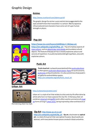
- 1. Graphic Design Anime http://www.crunchyroll.com/akame-ga-kill The graphic designforanime isveryrealisticbutexaggeratedtothe style anddefinitionthatitwouldbe ina cartoon.MainlyJapanese influencedandmostcharactershave some sort of superhuman strengthor physic. Pop Art https://www.tes.com/lessons/JebRZykp-iI_8A/pop-art https://en.wikipedia.org/wiki/Pop_art Popartemploysaspectsof mass culture,suchas advertising, comicbooksandmundane cultural objects.The featuresthatpopart has ismostlyexplosive colours and consistsof repetition.Itusuallyhasboldandbrighttypefaces,alsowith explosive colours. Punk Art Punk visual art isartworkassociatedwiththe punksubculture. It oftengraces punkrock albumcovers,flyersforpunkconcerts, punkzines andpunkwebsites.Itisalsosometimesshowcasedin art galleriesandexhibitionspaces. https://en.wikipedia.org/wiki/Punk_visual_art Urban Art http://urbanartassociation.com/ Urban art isa style of art that relatestocitiesandcitylife oftendone by artistswholive inor have a passionforcity life.Inthatwayurban art combines streetartand graffiti andisoftenusedtosummarize all visual art formsarisingin urban areas,beinginspiredbyurbanarchitecture or thematizingurbanlive style. Op-Art http://www.op-art.co.uk/ https://en.wikipedia.org/wiki/Op_art Op art, alsoknownas optical art, isa style of visual art that usesoptical illusions.Opartworksare abstract, withmanybetterknownpiecescreatedinblack andwhite.
- 2. Graphic Design Typically,theygive the viewerthe impressionof movement,hiddenimages,flashingandvibrating patterns,or of swellingorwarping. https://en.wikipedia.org/wiki/The_OF_Tape_Vol._2 Music: This would include things such as album art for music albums or the cover art for the CD. Itwould also consists of music videos, in the name of the song or the band’s name. Mostly bold, bright colours which are used to attract the audience into buying the product. http://www.digitalartsonline.co.uk/news/motion-graphics/san-andreas- method-studios-cinesite-bring-peril-destruction-big-disaster-movie/ Action: In things such as action films, you would see things such as explosions and building being destroyed wouldn’t be real it would be done by a graphic designer on a green screen. http://www.bloomsbury.com/us/fashion-and-textile-design-with- photoshop-and-illustrator-9781472578754/ Fashion: This type of graphic design would have things such as patterns from clothing or some sort of clothing design assigned to it. Usually, it usually does not consists of writing, but sometimes the image may have a piece of information on the corners of the picture or page to tell the audience about the product or clothing that is being worn. Also, bright colours would be used to attract the audience as well. http://www.123rf.com/photo_31946282_stock-vector-healthy- lifestyle-graphic-design--vector-illustration.html Lifestyle: In a lifestyle type face you would find serif type writing. A reason being for this is that, the designer would want to make the writing look fancy, posh and special. It would tend to contain
- 3. Graphic Design images that are based around the way people live their lives. http://www.blog.designsquish.com/index.php?/site/books_to_read_graphic_novels/ Novel: In graphic novels you tend to find both sans serif and serif type fonts. This is because, the style and design of the book would depend on the type genre it is. For example, if it a cartoon type genre the text and font used would tend to bolder and be serif type text. https://en.wikipedia.org/wiki/We_Can_Do_It! The imported logo in this postercampaign is a logo that was used to promote women doing manual jobs that men were doing before the war. The brand logo that was placed on this is known as Westinghouse Electric and the artist that
- 4. Graphic Design made the posterwas hired by the company. The layout of this poster is that it has used a San serif type face. We can tell this because, the writing does not have small projecting features know as serifs at the end of strokes. Also, in this posterthe writing, which is bold and standing out is in the top third of the page. The writing stands out because the colour it is placed on is dark. For example, the writing is white and bold and able to stand out on the dark blue background. The posteralso consists of writing in the bottom third of the image. The writing in the bottomthird is also a san serif type font, as it does not have any serif as well at the end of strokes. The writing is not in any columns, as the heavily bolded writing is displayed straight across the face of the poster. The image in this posterhas not been scanned, it has either been drawn or painted. http://www.bbc.co.uk/schools/0/ww1/25332968 The layout on this posteris very similar to that of the first poster design. For example, becausethey are both war poster, so they both promote people helping in war through propaganda. Also, the type face and font type is sans serif as the letters do not contain any serifs at the end of strokes. The text is in the top third and bottom third of the image. The text at the top of the posteris standing out because it is on a clear and plain background. The word “Britons” is the word that stands out because of the colour red is used. The red is thick and very bold and is in large writing to help get the point across. The colours on this posterare able to stand out because of the lifeless background used. There aren’t a many colours used in this posterbecause, this posterwas created during World War I and colours weren’t developed as much as they were today. The image in this posterhas not been scanned it has been drawn or painted. The point of focus on this poster is the image of the man point towards us. The reason why this is the point of focus is because, the
- 5. Graphic Design image is followed by the word “You” writing in a bold and hard type face. This makes the audience focus their attention towards this because they feel as if the posteris directing or talking to them through the slogan. There are no grids used, the writing is either at the top or bottom of the page. My Poster: The genre of my final poster design is very complex as it has different elements assigned to it. For example, the overall style is based on a prison/wanted poster design. First of all, to signal that is a prison type posterI have used the number 51339 to show the word sleep and this is used to interpret the prison card that prisoners get when they have been arrested. But, instead of showing real criminal offences, I have used things that can happen when you do not sleep. For example, stress and depression can be caused from not sleeping enough. My posterhas sans serif type font because there aren’t any serifs at the end of strokes. The font itself, is not bold, but it does stand out becauseof the colour choice on the poster. For example, I have used a white background with orange and black writing. The orange and black are easily able to stand out as white is used a canvas colour, meaning that any other colour is able to stand out boldly and bright on it. It also has an element of an urban style to it as there is cigarette to signify pain and how having sleepless nights causing pain, mentally and physically. It also links to an urban style art because, it something that loads of people are able to relate to. It also has elements of international style with simple messages on the poster. - This poster campaign has elements of a punk style posterwithin it. For example, the way the text is placed on the poster using strips of texts is similar to the way in which most punk posters are. The font type that is used in this postercampaign is serif and this is because there are serifs at the end of the strokes. But, in the bottomthird of the posterthere are elements of sans serif type fonts, because the words do not have serifs at the end of strokes. The writing in this posterin the top third of the image
- 6. Graphic Design and the bottom third of the image, leaving the middle third to be the main point of focus in this poster campaign. For example, the main message is explained through the illustration of the image explaining that one of these items in the image are banned to help protect children. The posterhas most likely been scanned and then edited to create the school/library background. Or the image may have been taken on a green screen and then edit with text and other pieces of text added after. http://blazepress.com/2015/07/33-shocking-adverts-that-will-make-you-stop-and-think-about-society/ http://www.talktofrank.com/ . This is an example of a website that promotes a campaign. This website has the element of using hyper-links. These can be words or images that can navigate or take you to other pages within the poster campaign. This is also links to the layout and structure of website. For example, most websites, with this one included would always tend to have built in hyper-links on images or words already. The structure of the websites are also linked the use of menus also. Most websites are designed to having the menu posted on top third of the website and the menus would drop down like it is shown in the image. The sub categories would be click-able or be highlighted when you hover above them like shown in the image also. This takes me on to my next point on the images that would be used on specific websites. For example, the images used on the Frank website are made to have an effect on the viewer or the person looking at the websites. The images used on this website are used to make the viewer feel as if they can relate to what is going on. I can imply that the use of teenage/young clothing can imply that a lot of young people have used or still do use or take drugs. The dynamic content used in this campaign is things such as animation and video. This is an example of the video that has usage of animation and hyper links within it. For example, once you click on choice shown on the screen, it will transition the video to next scene in the video.
- 7. Graphic Design Thisposteralsoconsistsof differentbehaviours.Forexample,thereishyperlinkonone the text boxesshownonthisimage.The textbox wouldreactthe mouse hoveringover the box.Thisis knownasa rollover.Thisisable toprovide interactivityforthe personviewingthe website.Rolloverscanalsobe done withimages,buttonsand text,like the one shownonthe left. This TV advert uses many different technical elements such timing rhythm, timing, keying, perspective and angle. In this image the television advert campaign uses an extreme close up. This is used to show sympathy and make the audience watching feel sorry for the child. This also creates a sense of empathy, because this make the audience also understand and feel the child’s pain. This image is also a close up camera shot and is used to show the emotion or facial expression of the child. This is also used to make the audience feel sympathetic for the child, because they able see directly how the child is feeling, through their face. The close up shot can also be used to show the importance of a person. For example, here it shows the child that is being talked about in a voice over, on a close up shot to signify his importance. The television campaign does not have any elements of compositing in it. The timing in the campaign is very affective as the speed of the cutting rate is very slow. It has been made to be slow on purpose, because the campaign is stressing important moments through slowing down time. Another thing which is important about this television campaign is the logo. The logo/contact details is used as a point of focus
- 8. Graphic Design because, it is the point in the advert where you are either able to help or contact the advertisers. The logo is stands out very well also, because it is on a plain white background. The colours that make it stand out are the bold black and the bright pink. These words are also have a specific type face and that is sans serif. This is because there aren’t any serifs at the end of strokes. The main image of the poster is in the top third of the contact page. The poster/logo is at the top to signify its importance. Also, the advert uses sad and sympathetic music to again make the viewers feel sorry for the child. The television advert and website that promotes a campaign both have elements that are similar and elements that are different from each other. For example, both have a logo and contact details that are either located at the top or bottom third of each of the campaigns. Another similarity between the two campaigns are that both use San serif type faces, because the words do not have serifs a the end of their strokes. Whereas, with Ask Frank website campaign is has use of a roll over. This isn’t used on the Cancer TV advert because it does not allow you, the viewer to interact with the advert as you watch it. But, with the website, it does allow you to interact with website, making it easy for roll overs to be used. Another thing is that, the Website has hyper links already placed on the page and on television advert you have to manually enter the link of the website from the television to your URL bar. Also, the website give you the freedom to navigate yourself around to different links and pages, on the other the television may allow you to navigate yourself around on the website but on its television advert it does not allow you to do that. First of all, the television advert campaign (Cancer UK) conveys to me that children, like the one used in the advert are suffering and need funding or support to help better there chances of surviving. The way that this television advert get its point across is by using elements of sympathy to make us, the audience feel like we need to help this child before it is too late and their life gets worst. For example, the use of the slow timing and cutting rate of the advert is used to help show everything seem more sad and gloomy. This is also links to the music being played, which also links to the slow timing making it even sympathetic. The way in the website (Frank) conveys its message to us the audience is that it uses images and scenarios that most people can relate too. For example, it uses scenes like parties or clubs, where there may be alcohol or drugs being used or on display. This is an affective way to a message across because, it makes the audience feel guilty and bad. It does that by showing the effects of drugs people may have taken or plan on taking. This is also linked to fear. The website uses fear to help prevent people from taking drugs/alcohol and get its message across. Lastly the website also, lets the viewers interact with the website making it more interesting and eye catching because of the fact that it allows you see the effects that drugs have on the body.