1. House style the overall
image of the double page
is consistent because the
colour pallet is applied
frequently. The colours
are predictable for this
genre of rock. This is
because red connotes
danger with is normally
reflected in there music.
And the white and black
introduce a contrast
There is a unique feel to
the magazine because
there is a higher ratio
from images to text.
Furthermore, the text is
places in the correct
place so the illusion of
the images is not
distracted.
The Gutenberg Design Principle this particular magazine follows the typical
codes and conventions that is expected for the rock genre. The dominating
image is displayed in the primary optical area with you are subconsciously
drawn to fist. This helps the target audience identify the artists and will keep
them intrigued. The text is in the strong fallow field and the extra images are
displayed in the terminal area. You look at the terminal area before the strong
fallow field.
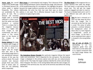
Main Image it is stereotypical rock imagery. This is because of the
heavy editing techniques used to distorted the image. Also because
of the predominate prop of a microphone. This highlights the genre
because the target audience associate rock artists with live music.
Additionally, the artist has their hair over their eyes so direct
address is not used. This is effective because it gets the target
audience to apply enigma codes.
The Mast Head on this magazine this is a
unique element that make the design.
The mast head is a pull quote from the
actual text. This will get the target
audience engaged and want to read on.
The fount is blocked bold and in serif. It
is also different sizes with add to the
effect f rock.
Text the text is minimal so it
dose not take away the focus
from the images. This is
mirrored by the fact the text
is small. The colour of white
presents a contrast between
the background colour of
black. Also in a rock magazine
it congenitally consist of
more images so the text is
not as important that is why it
is situated in the strong fallow
felid.
Use of rule of thirds the
dominating is on the
imaginary guide lines and
them text is on the other side.
It is a typical convention that
the band image follows the
rule of thirds.
Design balance the page
is clutters with images of
the artists in comparison
to text so there is a
higher ratio for images
than text. Also in the
dominating image there is
not symmetrical element
because of the way the
artists is stood. This could
connote rock because
people think rock artists
tend to break rules so
they are not following
what is expended.
Emily
Johnson
2. House style the colour
scheme is consistent over
both pages. The red
lighting effect on the
image of the artist is
mirrored by the red “J”
that is displayed on the
additional page. This give
the magazine a
professional feel and a
unique edge. The fount
from the article is also
consistent as it stays the
same throughout. The
ratio between text and
imagery is equally
balanced. This is because
the image of the artist
has been enlarged.
Design balance the
symmetry of the page is
effective because the
artist image has been
enlarged to match the
volume of text. This
makes the artist become
centre of attention. Also
this could identify the
genre of R&B because
artist of this partial genre
are stereotypically known
for there indivuality and
rule breaking. As there is
jus one image this is not a
typical convention for the
genre.
The Gutenberg Design Principle this particular magazine dose not follow the
typical codes and conventions that is expected for the R&B genre. However
this add a USP for the magazine and will make thaw target audience more
intrigued to read on. For example typically the is a mast head in the primary
optical area. However this is not the case in this particular magazine. The
predominate image of the artist is situated in the primary optical areas. This
makes the artist have control over the magazine as it is the fist place you look.
The text is in the strong fallow field so it does not take emphasis of the artists.
Main Image the main image is effective because it has been heavily manipulated in the editing proses. This is
evident because the colours of red and blue are very visible. This is a typical convention of this genre. Also the
camera shot is a head shot so this could suggest that he wants to be recognised. He is heavy gold jewellery this
shows he is wealth y and this also relates to the typical conventions of this genre. The artsiest is not displaying
direct address because he has sun glasses on. This could suggest that he thinks of him self as a higher status
figure and he think he is to quirky to engage in this target audience. This could make the target audience apply
an egnima code, for example; “why is he wearing the glasses? This could make them more interested.
The Mast Head. The mast
head is small and is situated
in the middle of the second
page. It is not in the primary
optical areas, this is not a
expected convention of this
genre. The font is a serif font
witch implies a masculine feel
and the name of the artist is
in a deep, vibrant red to
differentiates the artist and
the colour red typical
connotes danger. This could
be introduced by this music.
Use of rule of thirds. The
artist doesn't not use for of
third because he is the centre
of the image. This is breaking
the stereotypical expectations
of this genre. However, I don’t
think the use of thirds is
relevant to this particular
images because the artist
wants to make a dominating
statement.
Emily
Johnson