
Recommended
More Related Content
What's hot
What's hot (20)
Viewers also liked
Viewers also liked (15)
Similar to Analyse graphic design techniques used in posters and websites
Similar to Analyse graphic design techniques used in posters and websites (20)
Recently uploaded
Recently uploaded (20)
Analyse graphic design techniques used in posters and websites
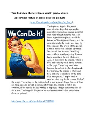
- 1. Task 2: Analyse the techniques used in graphic design A) Technical feature of digital desk-top products https://en.wikipedia.org/wiki/We_Can_Do_It! The imported logo in this poster campaign is a logo that was used to promote women doing manual jobs that men were doing before the war. The brand logo that was placed on this is known as Westinghouse Electric and the artist that made the poster was hired by the company. The layout of this poster is that it has used a san serif type face. We can tell this because, the writing does not have small projecting features know as serifs at the end of strokes. Also, in this poster the writing, which is bold and standing out is in the top third of the page. The writing stands out because the color it is placed on is dark. For example, the writing is white and bold and able to stand out on the dark blue background. The posteralso consists of writing in the bottom third of the image. The writing in the bottom third is also a san serif type font, as it does not have any serif as well at the end of strokes. The writing is not in any columns, as the heavily bolded writing is displayed straight across the face of the poster. The image in this poster has not been scanned, it has either been drawn or painted. http://www.bbc.co.uk/schools/0/ww1/25332968
- 2. The layout on this posteris very similar to that of the first poster design. For example, becausethey are both war poster, so they both promote people helping in war through propaganda. Also, the type face and font type is sans serif as the letters do not contain any serifs at the end of strokes. The text is in the top third and bottom third of the image. The text at the top of the posteris standing out because it is on a clear and plain background. The word “Britons” is the word that stands out because of the colour red is used. The red is thick and very bold and is in large writing to help get the point across. The colours on this posterare able to stand out because of the lifeless background used. There aren’t a many colours used in this posterbecause, this posterwas created during World War I and colours weren’t developed as much as they were today. The image in this posterhas not been scanned it has been drawn or painted. The point of focus on this poster is the image of the man point towards us. The reason why this is the point of focus is because, the image is followed by the word “You” writing in a bold and hard type face. This makes the audience focus their attention towards this because they feel as if the posteris directing or talking to them through the slogan. There are no grids used, the writing is either at the top or bottom of the page.
- 3. A) Technical features of web-based products - This postercampaign has elements of a punk style posterwithin it. For example, the way the text is placed on the poster using strips of texts is similar to the way in which most punk posters are. The font type that is used in this postercampaign is serif and this is because there are serifs at the end of the strokes. But, in the bottomthird of the posterthere are elements of sans serif type fonts, because the words do not have serifs at the end of strokes. The writing in this poster in the top third of the image and the bottom third of the image, leaving the middle third to be the main point of focus in this postercampaign. For example, the main message is explained through the illustration of the image explaining that one of these items in the image are banned to help protect children. The poster has most likely been scanned and then edited to create the school/library background. Or the image may have been taken on a green screen and then edit with text and other pieces of text added after. http://blazepress.com/2015/07/33-shocking-adverts-that-will-make-you-stop-and-think-about-society/ http://www.talktofrank.com/ . This is an example of a website that promotes a campaign. This website has the element of using hyperlinks. These can be words or images that can navigate or take you to other pages within the poster campaign. This is also links to the layout and structure of website. For example, most websites, with this one included would always tend to have built in hyperlinks on images or words already. The structure of the websites
- 4. are also linked the use of menus also. Most websites are designed to having the menu posted on top third of the website and the menus would drop down like it is shown in the image. The sub categories would be clickable or be highlighted when you hover above them like shown in the image also. This takes me on to my next point on the images that would be used on specific websites. For example, the images used on the Frank website are made to have an effect on the viewer or the person looking at the websites. The images used on this website are used to make the viewer feel as if they can relate to what is going on. I can imply that the use of teenage/young clothing can imply that a lot of young people have used or still do use or take drugs. The dynamic content used in this campaign is things such as animation and video. This is an example of the video that has usage of animation and hyperlinks within it. For example, once you click on choice shown on the screen, it will transition the video to next scene in the video. Thisposteralsoconsistsof differentbehaviours.For example,thereishyperlinkonone the textboxesshown on thisimage.The textbox wouldreactthe mouse hoveringoverthe box.Thisisknownasa rollover.Thisis able to provide interactivityforthe personviewingthe website.Rolloverscanalsobe done withimages,buttons and text,like the one shownonthe left. A) Technical feature of motion-based products This TV advert uses many different technical elements such timing rhythm, timing, keying, perspective and angle. In this image the television advert campaign uses an extreme close up. This is used to show sympathy and make the audience watching feel sorry for the child. This also creates a sense of empathy, because this make the audience also understand
- 5. and feel the childs pain. This image is also a close up camera shot and is used to show the emotion of the child. https://www.youtube.com/watch?v=FPnZbge3zvw Website Design Graphics: Comparing Fashion and News: If we compare a news website and fashion, we can immediately see that fashion websites use images to illustrate what they are talking about. Forexample, if they are talking about new pair of shoes, they will have text sitting around the bottom third of the page and the image will be the point of focus. Whereas, with a news website there would be less images and more text, as the purposeof a news website is to educate and inform and this is done through writing. http://www.pcadvisor.co.uk/news/internet/the-top-10-news-websites-3268235/ http://www.cstylejeans.com/fashion-websites-2016.html