1. MASTHEAD:
The masthead is a large
letter which is a V
representing the masthead
of the magazine which
was placed onto the front
cover of the article. This is
a feature which is common
to all vibe magazine which
is positioned at the top of
the page which gives the
magazine and consistent
look. This “v” also acts as
a logo for the company as
it allows it to be clearly
distinguished. Many of the
contents pages within Vibe
contain a monochrome
theme as it has been
included within this
magazine, the V which has
been included is a dark
grey colour so it conforms
to the house style of this
magazine.
CONTENTS TITLE:
The title saying “Contents£ is displayed at the top
of the page in a bold, sans serif font. However it is
not placed on one straight line, it is split up into
three and contrasts with the title making it stand out
from the crowd.Doing this is a commonthing which
is presented in many vibe contents page
magazine, conforming to the house style of the
magazine.
SUBHEADINGS:
Such as the title the sub
headings which were on the
page they are portrayed in a
bold style. However they are
of more of a joined up style
which makes the contents
page look much more
sophisticated. The font used
for this particular picture
links to the colour scheme
and Kanye’s clothes which
again makes all of the
aspects into the house style
of the magazine.
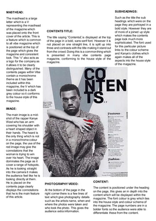
IMAGE:
The main image is a mid-
shot of the rapper Kanye
West who has an arm
covering his shoulder with
a heart shaped object in
their hands. The heard is
the only thing which is not
in a monochrome colour
on the page, the use of the
red image may give the
connotations that the
woman is trying to win
over his heart. The image
dominates the page as it
cover a range of hotspots.
As he is looking straight
into the camera it makes
the audience feel like he is
looking directly at them.
He is placed on the
contents page clearly
displays the connotations
that he is the main feature
of this article.
PHOTOGRAPHY VIDEO:
At the bottom of the page in the
right corner there is a few lines of
text which give photography details
such as the artists name, when and
where the photos were taken and
who took the photo. This gives the
audience extra information.
CONTENT:
The content is positioned under the heading
on the page, this gives an in depth into the
content which will be displayed within the
magazine. The font colour is grey which ties
into the house style and colour scheme of
the magazine. The page numbers are in a
bolder fonts so the audience were able to
differentiate these from the content.