Strategies for Landing an Oracle DBA Job as a Fresher
Magazine Analysis
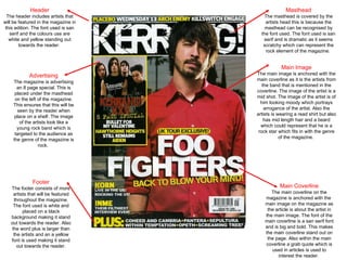
1. Header The header includes artists that will be featured in the magazine in this edition. The font used is san serif and the colours use are white and yellow standing out towards the reader. Masthead The masthead is covered by the artists head this is because the masthead can be recognised by the font used. The font used is san serif and is dramatic as it seems scratchy which can represent the rock element of the magazine. Main Coverline The main coverline on the magazine is anchored with the main image on the magazine as the article is about the artist in the main image. The font of the main coverline is a san serif font and is big and bold. This makes the main coverline stand out on the page. Also within the main coverline a grab quote which is used in articles is used to interest the reader. Main Image The main image is anchored with the main coverline as it is the artists from the band that is mentioned in the coverline. The image of the artist is a mid shot. The image of the artist is of him looking moody which portrays arrogance of the artist. Also the artists is wearing a read shirt but also has mid length hair and a beard which could represent that he is a rock star which fits in with the genre of the magazine. Footer The footer consists of more artists that will be featured throughout the magazine. The font used is white and placed on a black background making it stand out towards the reader. Also the word plus is larger than the artists and an a yellow font is used making it stand out towards the reader. Advertising The magazine is advertising an 8 page special. This is placed under the masthead on the left of the magazine. This ensures that this will be seen by the reader when place on a shelf. The image of the artists look like a young rock band which is targeted to the audience as the genre of the magazine is rock.
2. Title The title on the contents page is placed on the right of the banner. The title is also a repetition of the scratchy font of the mast head on the cover keeping the them consistent. The background of the banner is a red/black allowing the white font of the title to stand out towards the reader. Issue No./Date The issue no. and date are placed on the left of the banner. They are also placed on a red/black background and the colour of the writing is white. This makes them stand out towards the reader. Heading The subheading on the contents page is the like banner the title is placed on. The subheading is blocked in to its own section. The background of the section is black/red and the font of the subheading is the same white scratchy font on the cover and the title of the contents page. This keeps the magazine consistent. Images The images on the page are of the artists who are featured in the magazine. Within the image there is a quote to attract the reader and also a page number directing the readers to the article they are featured in. Advertisements The advertisements are separated and are found at the bottom of the page to left. The advertisements are subscriptions to the magazine allowing the readers to subscribe to past and present magazine. Page Details The article pages are separated under different subheadings. This makes it easier for the reader to find the articles that reader wants to look at. The subheadings are in san serif font and are coloured red. The page numbers and the article titles are written in the same consist font but black. This keeps the theme of the magazine consistent throughout giving it the rock effect due to the colours.
3. Headline The headline on the page is a big san serif font which really stands out to the reader. The headline is a san serif font that that is placed next to the main image allowing it to stand out towards the reader. Also under the headline a standfirst which uses a grab quote to describe the article. Images The main image is of a mid shot of the lead singer of the band who the article is about. The image is of the artist live at a gig singing, which is anchored with the article. Standfirst The standfirst uses a san serif font which is written in white. It is written in white to make the writing stand out towards the reader as the background is black. Copy The text on the page is separated into columns which are arranged and placed around the images on the page. The writing consists of white and red writing, the red writing picks out key words within the article. The white and the red writing allows the writing to stand out towards the reader against the black background but also keeps the rock theme consistent throughout. Byline The byline is used to credit the author of the article but also the photographer. Subheading The subheading is used to let the reader find the articles they would want to read. The same subheading is found on the contents page telling the reader where to find the article. The subheading is used against the red/black banner and the white scratchy font is used which stands out. The font is a repitition of the masthead on the cover. This keeps the theme of the magazine consist throughout keeping the rock effect. Images The images used on the page are linked/anchored within the article. The images are of the band at the gig they were playing allowing the artists to feel involved within the article.