Introduction to ArtificiaI Intelligence in Higher Education
Music magazine research 2
1. Music Magazine Research- Front Cover
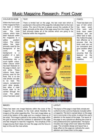
COLOUR SCHEME:
Within the front cover
of the magazine there
has been a limited
amount of colour
user. The main
colours which have
been featured within
the magazine is a
yellow gradient
colour. The colour
yellow has been
primarily used for the
background of the
cover, the
background is a
gradient of a dark
yellow colour
transitioning into a
much lighter colour.
Other colours which
has been featured on
the page is black, red
and white. These
colours have been
primary used for the
fonts, this is so the
side articles are able
to be read. The
colours complement
each other greatly,
they allow a clear
house style to be
carried through the
cover. The yellow
colour has been used
IMAGES:
There has been one image features within the cover of the
magazine, this correlates to the main article therefore the
image is of the artist regarding this. The main image takes up
most of the bottom of the page and is a medium close up of
the artist. The image is placed in the centre of the page within
the grid to ensure that the audience is attracted to the page
and feel intrigued to read the magazine. The simplicity of the
image ensures that it does not over the page and the focus is
kept on this and the main article.
LAYOUT:
The layout of the page is kept fairly simple and
conforms to the common features included within
a magazine. The text is spread about on the page
but is commonly in the centre, to attract the user’s
attention to this aspect of the page. The layout of
the page is very spaced out allowing the cover to
look professional and sophisticated. The layout
includes one image which over takes the whole
page. The simplistic design and layout has a
large effect on the page as it attracts the users
attention and draws them to the page.
TEXT:
There is limited text on the page, the text main text which is
positioned in the centre of the page this indicates that it is the main
article. The rest of the text is placed around the outside of the
page, primarily at the ides of the page away from the image. The
text primarily states all of the articles which are going to be
featured within the magazine.
FONTS:
There has been one
type of font which
has been used.
Only sans serif
fonts have neem
features and are
either bold or italic,
this makes the page
look effective as it
ensures that the
fonts used are not
too consistent. And
gave another effect
to the page
ensuring that the
features on the
page were not
repetitive.