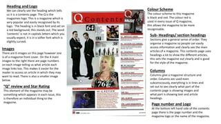
1. Heading and Logo
We can clearly see the heading which tells
us it is a contents page. The Q is the
magazines logo. This is a magazine which is
very popular and easily recognised by its
logo. The heading is in black font and set on
a red background, this stands out. The word
‘contents’ is not in capitals letters which you
usually expect, it is in a softer font which is
slightly curved.
Images
There are 6 images on this page however one
is of a magazine front cover. On the 4 main
images to the right there are page numbers
on each image telling us what article each
image links too. This makes it easier for the
reader to access an article in which they may
want to read. There is also a smaller image
below.
Page number and Logo
At the bottom left hand side of the contents
page there is the page number and the
magazine logo or the name of the magazine.
“Q” review and Star Rating
This element of the magazine may be
something which appears in each issue, this
is therefore an individual thing to the
magazine.
Sub- Headings/ section headings
Sections give a general sense of order. They
organise a magazine so people can easily
access information and clearly see the main
articles of a magazine. This contents page uses
headings a lot to show the different articles,
this sets the magazine out clearly and is good
for the style of the magazine.
Columns
Columns give a magazine structure and
order. Columns are used even
subconsciously, everything is in lines and
set out to see clearly what part of the
contents page is showing images and
what part is showing text and article
headings.
Colour Scheme
The colour scheme to this magazine
is black and red. The colour red is
used in every issue of Q magazine,
this allows the magazine to be more
recognisable.
2. Heading and Logo
The heading of this magazine is white, This
means due to the background being black
the heading ‘contents’ is clear to see
however, the text is rather small. Although
we expect the heading at the top of the
page it doesn’t stand out as much as it
could if the font was slightly larger. The
name of the magazine is also in a box to
the left of the heading, this is also small.
Colour Scheme
The colour scheme to this magazine contents
page is grey tones. This sets a more bleak
tone however it isn’t completely plain. The
font is black on the white backgrounds and
white on the black backgrounds, this shows a
sense of order. The main headings are in a
pink/purple colour, this clearly separates
them from the colour so you can clearly see
where each aspect of the magazine is held.
Sub-Headings and Sections
The sub-headings and sections make it
easier for the reader to access specific
information easier. They allow you to see
clearly the order of the magazine and the
structure. This allows the audience to
know the magazine is organised and
structured.
Images
This contents page only contains one main
image which we can clearly see is a young
girl/teenager. She is wearing what looks like
a skirt and just a plain white top, this shows
a relaxed feel to the magazine, however the
model is posing for the picture, the fact she
has her hand up close to her mouth may
show signs of lust and being seductive or it
may show signs of insecurity.
Page Number
The page numbers for this magazine are
clearly next to the title of each article
mentioned. They are in a different colour font
so they are set aside from the article name
and stand out.
Review
The fact there is a review means it may be
a continuous magazine which comes out
over a certain period of time, a week for
example, this could be something that
regular readers read and take part in. This
could also show the magazine had many
readers as each issue was able to present
a ‘review’ of some sort.
3. Layout
I think this magazine contents
page is not a stereotypical
contents page. It appears to
be over two pages with the
image spread across them
both. There is little text on
this contents page however it
is all down one side of the
magazine. There is little
evidence of sections and
subheadings as everything is
set together.
Heading
The heading of this image
is not a typical heading to
a contents page, it is
written down the side of
the left page, this shows a
difference and sense of
individuality.
Colour Scheme
The colour scheme of this
magazine is black and grey,
this goes against the usual
black and white. The font is
all the same colour meaning
nor the heading or the page
numbers are set aside
making it easy access for
the audience/reader.
Image
The image is a of a
black man looking
directly into the
camera. The fact he
has his hood up and
has a serious
expression on his
face may be slightly
intimidating. This
image makes the
whole magazine have
a dull effect as it
contrasts with the
grey font and
background.
Page Numbers
The page numbers are
set next to the article
description. Although
the font used for the
article number is large it
is the same colour as all
of the font on the page.
Sub-Headings, Sections and Columns
There are no sub-headings to this contents page, there are also no
use of columns or sections. I feel like this magazine is slightly thrown
together, I do not think it is a good example as there is no sense of
order.