1. Music Magazine Research - Front Cover
COLOUR SCHEME:
Within the front cover
of the magazine there
has been a limited
amount of colour
user. The main
colours which have
been used is pink,
this colour has been
features as the
background for the
text. There has been
a different colour
used for the text, the
colour black has
been used for the
description under the
headings. This is a
contrast to the colour
which has been used
for the headings, the
colour yellow has
been used for these
features. This allows
it to stand out from
the pink background.
Within the headline of
the cover the colours
blue and yellow have
been used to fill in the
‘a’ and ‘d’, I feel as if
the blue does not
contribute the colour
scheme and looks
random. If they were
both filled in yellow it
will make the page
more consistent.
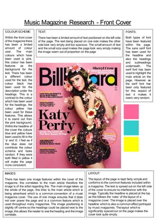
IMAGES:
There has been one image features within the cover of the
magazine, this correlates to the main article therefore the
image is of the artist regarding this. The main image takes up
the whole of the page, this links to the main article which is
being advertised which is a common convention of a music
magazine cover. The use of one image ensures that it does
not over power the page and is a common feature which is
used throughout many magazines. The image positioning is
slightly off centre so the headings could be placed next to the
image, this allows the reader to see the heading and the image
correlate.
LAYOUT:
The layout of the page is kept fairly simple and
conforms to the common features included within
a magazine. The text is spread out on the left side
of the cover to ensure no interference with the
image. Typically the headline is placed at the top
as this follows the ‘rules’ of the layout of a
magazine cover. The image is placed over the
headline which is also a common effect portrayed
by music magazines. The layout which is
significantly spaced out on the page makes the
cover look quite empty.
TEXT:
There has been a limited amount of text positioned on the left side
of the page. The text being placed on one side makes the other
side look very empty and too spacious. The small amount of text
and the small size used makes the page look very empty making
the image seem out of proportion on the page
FONTS:
Both types of font
have been featured
within the page.
The sans serif font
has been used for
the headline and
also the headings
and subheadings
underneath. The
serif font has been
used to highlight the
main article on the
page. However as
the serif font has
been only featured
for this aspect of
text it makes it
seem very random.