
Recommended
More Related Content
What's hot
What's hot (20)
Viewers also liked
Viewers also liked (20)
Similar to Media tools
Similar to Media tools (20)
Recently uploaded
Recently uploaded (20)
Media tools
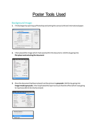
- 1. Poster Tools Used Background Image: 1. I firstlybeganbyopeningupPhotoshopandsettingthe canvastoA4 and internationalpaper. 2. I thenplacedthe image whichIhad savedwithinthe document,Ididthisbygoinginto file>place>andselectingthe document 3. Once the documenthad beenplacedIsetthe picture to greyscale I didthisby goinginto image>mode>greyscale.Ithenduplicatedthe layertoensure thatthe effectwhichIwasgoing to inputwasable to be clearlyviewed.
- 2. 4. Afterdoingthis Ifoundthat thiseffectwasnotdark enoughtoportray the resultwhichI was lookingfor.Itherefore foundthatIneededtoaddanothereffecttothe image,bylooking througheach effectIdecidedthat “Multiply” 5. Lookingat the image I foundthatthe edgesof the imageswere still toolighttherefore todothis I usedthe gradienttool andset the opacityto 87% so the gradientwasstill recognisable. 6. Once the image was finalisedIfounditwasappropriate tolockthe layersoit couldnot move. 7. I thenflattenedthe imagessoall the layerswill appearinone.
- 3. Title: 8. I thenneededtoinsertandcreate the title,todo thisI usedthe texttool.Selectingthe texttool I typedinthe title of the film“Woodend” 9. I thenchangedthe fontto Myriad Pro andcolour a deepred. 10. To make the font contribute tothe horror effectgiven Idecided tomimicthe effectof blood drippingbyusingthe smudge tool 11. NextIchose to add a shadowand a slightstroke tothe picture,todo I double clickedthe text layerand firstlywentintothe dropshadow whichappearedinthe new window onthe side,Iset the drop shadowto an opacityof 80%, the distance to20px, spreadto 1% and size to3px.
- 4. Advertisement: 12. I theninsertedthe ‘advertisement’above the title,todosoI usedthe same texttool andtyped in“from the producersof parkside poltergeist” 13. Once thiswas done I changedthe fontto Trajan pro and the colourto white 14. I thenfoundthat the fontlookedquite plaintherefore Ifounditwasappropriate toadd a slight drop shadow.Todo thisI followedthe same stepsasbefore bydoubleclickingthe layerand addingthe drop shadowat an opacityof 75% 15. FinallyIplacedthistextabove the title and centreditsoit didnotlookout of place. Credits: 16. To create the creditswhichwere insertedwithinthe posterIbeganbyonce again selectingthe texttool and enteringall of the informationregardingthe credits. 17. I thenchangedthe fontso it was consistenttothe advertisementandtitle,alsochangingthe colourto white ensuringthatitcouldbe visible overthe blackbackground.Ididnot feel itwas essential toadda dropshadowas it wasthe credits. 18. I editedthe fontto Trajan pro thiswasso it didnot overpowerthe page andthe attentionwas kepton the image andtitle andleftthe size at 24
- 5. 19. HoweverIreducedthe size of the wordsexcludingthe namesto 12 I didthisas it was a common conventionusedinhorrorpostercredits Sponsors: 20. Whenlookingtoimprove myposterI foundthatit lookedquite empty,thereforeIresearched intootherpostersandfeaturesincludedwithinthis. 21. I decidedtoplace an image ontothe page of a range of sponsors,Icroppedthisimage soit was onlythe firstthree logos. 22. Howeverthe logosthemselveswere blackandthe backgroundwaswhite,insertingthisontomy postermade it lookveryunprofessional,toresolvethisIopenedthisintoanew documentand invertedthe colours. 23. To remove the backgroundIusedthe magic wandtool to remove this.