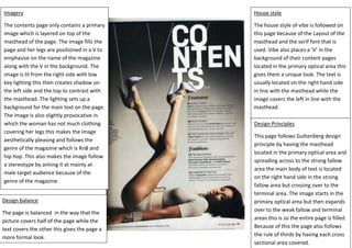
1. Imagery
The contents page only contains a primary
image which is layered on top of the
masthead of the page. The image fills the
page and her legs are positioned in a V to
emphasise on the name of the magazine
along with the V in the background. The
image is lit from the right side with low
key lighting this then creates shadow on
the left side and the top to contrast with
the masthead. The lighting sets up a
background for the main text on the page.
The image is also slightly provocative in
which the woman has not much clothing
covering her legs this makes the image
aesthetically pleasing and follows the
genre of the magazine which is RnB and
hip hop. This also makes the image follow
a stereotype by aiming it at mainly at
male target audience because of the
genre of the magazine.
Design balance
The page is balanced in the way that the
picture covers half of the page while the
text covers the other this gives the page a
more formal look.
House style
The house style of vibe is followed on
this page because of the Layout of the
masthead and the serif font that is
used. Vibe also places a ‘V’ in the
background of their content pages
located in the primary optical area this
gives them a unique look. The text is
usually located on the right hand side
in line with the masthead while the
image covers the left in line with the
masthead.
Design Principles
This page follows Guttenberg design
principle by having the masthead
located in the primary optical area and
spreading across to the strong fallow
area the main body of text is located
on the right hand side in the strong
fallow area but crossing over to the
terminal area. The image starts in the
primary optical area but then expands
over to the weak fallow and terminal
areas this is so the entire page is filled.
Because of this the page also follows
the rule of thirds by having each cross
sectional area covered.