ENGLISH 7_Q4_LESSON 2_ Employing a Variety of Strategies for Effective Interp...
Music magazine research
1. Music Magazine Research- Front Cover
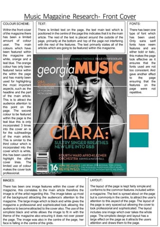
COLOUR SCHEME:
Within the front cover
of the magazine there
has been a limited
amount of colour
user. The main
colours which have
been featured within
the magazine are
white, orange and a
teal blue. The orange
colour has only been
featured twice within
the within the page
and has mainly been
used for highlighting
the most important
aspects, such as the
headline and the part
of the main article.
This is to attract the
audience attention to
this point on the
page. The second
colour to be featured
within the page is the
teal blue this is only
incorporated 3 times
into the cover an is
for the subheadings
of the main article.
This is similar to the
third colour which is
incorporated into the
cover which is white,
this has been used to
highlight the other
cover lines. The
limited use of colour
makes the cover look
professional.
IMAGES:
There has been one image features within the cover of the
magazine, this correlates to the main article therefore the
image is of the artist regarding this. The image takes up most
of the background attracting the audience’s attention to the
magazine. The large image which is black and white gives the
magazine a professional and sophisticated look allowing the
audience to becomeattracted to the cover also. The use of the
simplistic black and white allows the image to fit in with the
theme of the magazine also ensuring it does not over power
the page. The image was also in the centre of the page, her
face is falling in the centre of the grids.
LAYOUT:
The layout of the page is kept fairly simple and
conforms to the common features included within
a magazine. The text is spread about on the page
but is commonly in the centre, to attract the user’s
attention to this aspect of the page. The layout of
the page is very spaced out allowing the cover to
look professional and sophisticated. The layout
includes one image which over takes the whole
page. The simplistic design and layout has a
large effect on the page as it attracts the users
attention and draws them to the page.
TEXT:
There is limited text on the page, the text main text which is
positioned in the centre of the page this indicates that it is the main
article. The rest of the text is placed around the outside of the
page, primarily at the bottom and top of the page not interfering
with the rest of the features. The text primarily states all of the
articles which are going to be featured within the magazine.
FONTS:
There has been one
type of font which
has been used.
Only sans serif
fonts have neem
features and are
either bold or italic,
this makes the page
look effective as it
ensures that the
fonts used are not
too consistent. And
gave another effect
to the page
ensuring that the
features on the
page were not
repetitive.