Swan(sea) Song – personal research during my six years at Swansea ... and bey...
Double page spread features interview questions in purple boxes
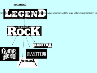
1. MASTHEAD
here there is a gap. The bold, serif font in white grabs your attention and the large letters make it more in you
2. OTHER FEATURES
ew of the stories and artists inside. My banner is at the bottom however, because of the irregularity of the letters in my ma
between the names and snippets to separate them. The stories in the banner add more to the cover and help show the rang
atching feature and closes it in without making a box. I also used a black box/background around the heading for the main a
the accent colour of the cover
Both using accent colour as background for banner, links with the whole cover and draws audience's attention
which I have similarly used.
3. CONTENTS
ed the masthead from the cover in the contents page at the top left, like NME, because I feel it looked more professional and gave it a house
bold and the description in the thinner font underneath. The page numbers are on the left with the accent colour from the cover. Using this
he same social group as NME they are the same age range, so it calmer, more serious version of the NME contents, which i
the page using the samefront cover. the rest of the magazine, and using a mini image of the front cover. This will appeal to my audience bec
and same feel as the colours from
4. CONTENTS IMAGES
e image shows the whole body and outift, and the group have a relaxed neutral pose. The images are both in black and white, which show th
dience for my magazine enjoy going to gigs and parties as they are younger than the audience for Classic Rock. NME often use live shots in th
he cover), it is a mid shot, they have a relaxed and normal pose and are wearing similar clothing which appeals to the audience.
mage in the contents shows more about what the article will look like. The audience are drawn in by the fashion sense which represents them
5. nchorage for the page, and changed the opacitySPREADoverly bold and overtaking, and you can still see the background through it so yo
DOUBLE PAGE so it wasn't
r which just quickly catches the readers attention if their flicking through, and tells the reader what's in there because you read from left to r
er images and represents the audience with the young and interesting clothes like the boots, coloured jeans and leather jacket, and on the m
ke it stand out to the audience and introduce the article alongside the image. I used a quote because a lot of articles both in indie m
site for my magazine in the left corner of the page, with the number in bold. This is the same as Classic Rock do theirs.
6. purple colour for the questions as its less bright than the green and doesn’t stand out too much from the article but is enough to catch the audience's a
ence than the simple layout of Classic Rock's article, which is why I've incorporated some of the styles used, like the box behind the
ocus point. I also used the lines and “words by” and “photos by” in-between the article and headline to add a more professional fin