Pre Engineered Building Manufacturers Hyderabad.pptx
Magizenes
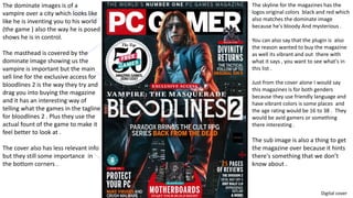
1. The dominate images is of a
vampire over a city which looks like
like he is inventing you to his world
(the game ) also the way he is posed
shows he is in control.
The masthead is covered by the
dominate image showing us the
vampire is important but the main
sell line for the exclusive access for
bloodlines 2 is the way they try and
drag you into buying the magazine
and it has an interesting way of
telling what the games in the tagline
for bloodlines 2 . Plus they use the
actual fount of the game to make it
feel better to look at .
The cover also has less relevant info
but they still some importance in
the bottom corners .
The skyline for the magazines has the
logos original colors black and red which
also matches the dominate image
because he's bloody And mysterious .
You can also say that the plugin is also
the reason wanted to buy the magazine
as well its vibrant and out there with
what it says , you want to see what's in
this list .
Just from the cover alone I would say
this magazines is for both genders
because they use friendly language and
have vibrant colors is some places and
the age rating would be 16 to 38 . They
would be avid gamers or something
there interesting .
The sub image is also a thing to get
the magazine over because it hints
there's something that we don’t
know about .
Digital cover
2. The conventions are fairly normal but still challenging it because it does’t
have a barcode or the date it was issued on the cover but everything else
follows codes and conventions of a gaming magazine . It also doesn't’t
have a price on the cover this is also challenging codes and conventions
The purpose of the magazine is to entertain and inform the reader on how
to do certain things for there computer like protect it from viruses and
malware to building a motherboard .
The effectiveness of the codes and conventions of this magazine are the
reason these magazines do so well there flashy and get straight to the
point on what the magazine is about and what is included .
3. This double page looks normal its got pictures and a lot
of text its simple to read and shows they don’t want to
over flow them with information about this certain game .
The images the have used are good because they show
what the gameplay is like in the game, they want to tell
“hey get this game it looks really good " . They use
captions on the images to help explain what the images
are.
They also uses a lot of easy to read words but some are
confusing if you don’t know what type of game it is or you
don’t play games they try to explain what the are which
helps you understand .
The codes and conventions are challenged because
there's more pictures than words but they might be
doing this to show off how good the game looks .
4. Digital
• Easy to access - can be read
anywhere and can read on on
electronic devices like phones and
tablets (iPad ). The younger
generation can get them more
easily .
• Can never loose any of the
magazines – they are all on the
internet so that’s its never lost
• Can download the magazines – can
put them on phones so that you
can read without internet
• Can not be damaged – can not be
damaged because it on the internet
and not on paper
• Can only access if have
internet or electric to
charge the electrical device
you read on
5. The Skyline try to grab your attention
with competitions and talks about a
new console and what is going to be
on it, show there not afraid of to give
away things to make you buy it
suggesting that the audience for the
magazine is going to be young adults
or kids .
The masthead is smaller than usually
for this magazine showing that the
name of the magazine is not
important to this issue and the
dominate collage is the main focus .
This is also challenging codes and
conventions for that there is no single
dominate image .
Plus there's no barcode or issue
number because it might assume that
you’re a avid fan and know what issue
that it is this Is just some of the print
magazines .
The audience of this magazine would
be young adults or teens who like to
game or want to get into gaming or
just like to what's in the magazine the
. They would tend to be explores and
c in demographic .
The purpose of this magazine is to
inform and entertain because they
sometimes show you how to make
things or show you want other
people have done .
Print
6. In this double page is interesting because of the way
they have not used gameplay scenes but have used
concept art instead granted that this is a preview so
their might not be that much gameplay available but
helps you understand why might people will be
excited for this games.
The language they use is complicated but they try to
explain what they mean so this also helps us
understand who reads this magazine might be young
or just does not know what the words mean
The codes and conventions are pretty standard here
there's more words than pictures but there not that of
putting for younger readers and there's and interesting
way the put how thrilled they are for this game .
The simplistic design of the spread helps the audience
Understand what's happening on the page its not
overflowed with images and words it has even
amount of both words and pictures (in terms of space
on the page ) this helps us understand that they didn’t
want to confuse the audience .
7. Pros
• Easy to read for older people
• More accessibly for older people because
you can get them any where
• Easy to carry round
Cons
• Can get easily damaged like tearing or folded
• Can get lost
• Not eco friendly – printing a lot of paper and making the shiny
cover is not good for the environment
8. Print vs digital purpose
• Print magazines would be for the older generation or little kids
because they would have toys in them or something . For older
people the would have print because the might not be able to use
new technology .
• Digital would be used for the younger generation who would be used
to the technology .
9. Distribution of print and digital
• Digital
• The distribution of this would be easy , the company would have to
make the magazine and then upload it to the website or app .
• Print
• The distribution of digital would be hard because they would have to
make the magazines , then print them out through a machine , make
sure they had enough printed and then sent way to the shops to sell .
10. Technical considerations
• Print considerations would be to see what size you would need a4 or
a5 , the machines had the right settings on it , the magazine looks
good enough to read and the words are spelt right .
Digital would be to see what size you would need a4 or a5 , the magazine looks good enough to read
and the words are spelt right and the website doesn't’t need maintenance or needs fixed , and that it
would be supported on a lot of devices like tablets or phones and doesn't’t exceled different brands of
phones .