Viman Nagar $ Call Girl in Pune | Starting ₹,5K To @25k with A/C 8005736733 E...
Assignment empire han solo
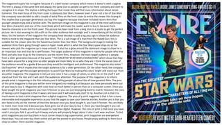
1. The magazine Empire has no tagline because it’s a well known company which means it doesn't need a tagline.
The title is always in the same font and always the same size so people can get to no there company and start to
recognize it in shops. The skyline is telling the buyer that inside they will find more information about James
Cameron. The main focus of this front cover is obviously Star Wars, however even if your not a fan of Star Wars
the company have decided to add a couple of extra films on the front cover to entice the viewer into buying it.
This implies that a younger generation can buy this magazine because they have included recent films that
younger people enjoy and a familiar with. The dominant image on this magazine is one of the most well known
Star Wars characters and one of the most liked, which will make the reader want to buy it, because there
favorite character is on the front cover. The picture has been took from a long shot in a studio to get the perfect
picture. He is also wearing his old outfit so the older audience feel nostalgic and is remembering all the old Star
Wars. On the bottom of the magazine the company have decided to add a big plus sign to show the audience
there is more to the magazine than just Star Wars. The is a sub image of a man from the Naked Gun, this is
suitable for the viewer who like the Naked Gun better than Star Wars. The background image is making the
audience think there going through space in hyper mode which is what the Star Wars space ships do so the
viewers who pick the magazine up is more enticed. It also has a glow around the dominant image to show he is
an important man and that he is well known. The target audience of this magazine is mainly for people who love
films and who love to go to the cinema to see the recent films. However, the main target audience is people
from a older generation because of the quote “ THE GREATEST STAR WARS CHARACTERS” which show that they
have been around for a long time so older people are more likely to no who they are. I think the social class of
the audience would be a grade B because they would be intelligent and professional. The magazine also states “
Old Favorites” which implies that the target audience is for a older generation. On the other hand, the company
are still trying to get the younger generation to watch Star Wars by making the colors' bright and stand out from
any other magazine. The magazine is not just one color it has a range of colors, so when its on the shelf it will
stand out from the rest and it will catch the audiences attention. The purpose of this magazine is to inform
people what is happening in the film industry and it telling people all about the all time greatest films. The pros
of this print magazine is that you will be more intrigued into reading it all because you have personally went out
of your way to buy it. Magazines with color look so much better in person than on a computer screen. Once you
have bought the print magazine you have it forever so you can just keep going back to read it. However, the cons
of having a print magazine is that it wears and tears and it will eventually start to rip. Another con is that it is
much easier to lose a print magazine than a digital magazine. The pros of a print magazine is that is has a more
memorable and enjoyable experience as you fold the pages to save your favorite articles. Another pro is that you
don have to rely on the internet all the time because once you have bought it, you have it forever. You are likely
to invest more time into it because you have gone out of your way to buy it. Once you have bought it you can
read it instantly. Finally print is much easier to read than digital. However, the cons of print is that once you have
read it once you fold it up and tuck it away and you will properly forget about it also it will wear and tear. To but
print magazines you can buy them in local corner shops to big supermarket, print magazines are everywhere
these days. You can even buy them online and get the posted to you house. People enjoy walking to there local
shop to collect there wanted magazine.
2. The title uses the color scheme of black on white, the fort style
is bold and therefore appeals to the audience, the banner also
informs the audience of when the film was on location being
shot. They use the color red to symbolize Ant Man that’s why
the main color on these pages is red. The use of a long shot
image captures the audiences attention and introduces the
antagonist of the film to the audience. It also entices the
audience because Ant Man is standing in a bath tub which is
unusual because its not a normal thing to. In the background of
this picture is very plain and bland to make sure Ant Man is the
audiences main focus. They have also made Ant Man the only
person in the shot to make sure the viewers that he is the main
character in the film. The dominant image is standing in a
‘ready to fight’ manner which shows power and authority. The
dominant image shows a part of the film which creates
excitement for the audience. Ant Man has a glow around him
off the natural light to show that he is important in the film.
The dominant image takes over 1 page and a half which shows
that this film is going to be a big hit. The picture has been took
on set to make the audience more excited for the movie. They
have used a drop cap to catch the audiences eye, so that will
make them read it and be intrigued.
There is a world map which has a pin point of where they filmed this movie to intrigue the audience, so the audience will look further into the page. They have
used a speech bubble to show you want date they started filming to inform the viewers of how it took them to make the film. All the writing in the speech bubble is
in a different font to make it more interesting for the viewer to read. It quotes ”Marvel thinks small for its next big adventure” this will make the audience think
that it is going to big a marvelous film because Marvel is calling it a “big adventure”. This will entice the audience because they will want to see this film because
Marvel is hinting on that there might be many more films for this series of Marvel films. The target audience for this kind of page would be anyone who likes
Marvel films, however the main target audience I think would be late teens and up. I think younger teens would’t want to read all the writing that is provided on
the page. The purpose of this double page is to review the movie so the audience can have a overview of what is going to happen. The strap line quotes “YOUR
TICKET TO THE MOVIES THAT MATTERS” this is a way of how they get money from you because you will buy the movie tickets. It also promotes there movie. The
byline has the page numbers on and the website to find out more about the Ant Man, it also has the date the magazine was published.
3. Digital magazine is more up to date because more people use the
internet to check the news than going to the local shop to buy a
magazine. The pros of a digital magazine is that it is always on your
device because you have permanently bought it. It also can be
assessed from where ever you are because its always on your device.
Another pro is that is much easier to buy it because you only have to
go on the internet and purchase it, where as if you were to buy a print
magazine you would have to go to your local supermarket to buy it. By
buying a digital magazine it will be eco friendly and they are cheaper to
make than making a print magazine. However, the cons of digital
magazine is that not everyone has a device which they can access the
newspaper on and people are paying for there membership and they
are not getting anything extra from a print magazine. Another con is
that you might not be able access it all the time because you might
not have any internet or 4G all the time. When you are viewing the
magazine you will be just scrolling through the pages and wont actually
pay full attention to the magazine. You will have to rely on your
internet to download it and view and you will have to zoom in and
scroll so it will be more effort. There is arrows at the side of the page
to flick through the page to give it that extra digital touch to it. There is
a sub image to show you that they are talking about more things that
just filming. The purpose of digital magazines is so people who are
more up to date can access magazines online instead of walking to the
shop to get a print magazine.
Its quite interesting this digital magazine cover because it focus on the lens of the camera instead of the actual camera. They have used hermeneutic code to create mystery and make the
reader wonder why they have done that. This magazine is making it quite obvious of what they are telling the audience. The rhetorical question “ MAKING A MUSIC VIDEO?” will intrigue the
audience because if people re making a video it will entice them to buy the magazine and have a look what its all about. They have made the writing yellow to make sure the audiences eye
defiantly gets drawn to it. Also by making ”FILMING ON A BUDGET” quite large for the audience to clearly see will make the audience curious of how to film on a budget and save money.
The color scheme of this cover it mainly blue. The background hasn’t got much going on because they want people to focus on the camera. The background and the front on the camera is
blurred out to make the lens stand out because they want the audiences eye to catch on the lens. The additional sell-line - is intriguing the audience by saying ”PLUS” this will show the
audience that there is more in the magazine than just filming. The title FILM MAKER is the biggest thing on the page so the audience can tell what the magazine is called. The writing FILM
MAKER is always in the same font and same position so people who regularly buy the magazine will recognize the magazine and will be intrigued into what is going on. It is unusual how
they have placed the title because they could have just don’t it straight, however they have cut chunks out to make themselves a unique and recognizable magazine company. At the side of
the title the word “digital” is vertical to make it there own and it also links back to being a unique company. I think the target audience for this magazine is people who are interested into
making films and for people who want to become directors and producers. I also think it is suitable for beginners who are just starting there career in the film industry. The sell line says “10
SECRETS OF THE INDUSTRY” this is intriguing because people will want to find out the secrets so this will make the audience buy the magazine. Underneath the sell line it quotes about
becoming a director which is showing the audience that they will be talking about aspiration's in the magazine.
4. This is part 1 of a digital magazine double page. When the audience is
flicking through the pages they will come across this page and will be
immediately intrigued because the title is bold and right in your face.
They have made the title big so the audience will be enticed straight
away and they will want to read it to find our the 10 secrets. The title
is a use of hermeneutic code to make the reader think about the 10
secrets. They have included a picture on half of the page of a famous
director so people will see him and recognize him and aspire to be
him. They have took a picture whilst he is working to create the sense
of realism, they have used a eye level shot so the audience will feel
like they can do what he is doing and achieve there goals. You can tell
he is in the middle of working because he has eye phones around his
neck and some notes in his hands. If people see him and aspire to be
him they will want to read the article to find out what it says. They
have stated that he is a director by saying “Director Matt Bloom takes
us on a tour” this quote immediately intrigues the reader because
they will want to find out what information they are going to receive.
The quote “Director Matt Bloom takes us on a tour” is a use of
proairetic code to create tension towards the audience. They have
chose the color of the title by matching his outfit, everything is either
black, blue or white. I think the target audience for this page would
be older people because there is quite a lot of writing and quite a lot
to take in. The man’s hand has been placed in a certain way to make
it look like he means business and to show the audience that he gets
things done. He is wearing a smart suit to show that he is
professional and good at his job.
5. This is part 2 of a digital magazine double page. This page has a lot going
on. The images on this page are showing you people what happens on set
and behind the scenes. This is important for people to see because its not
always all glamour. There is a lot of writing on this page so I think an older
audience would be suitable for this page. This page is informing the
audience about building and making your own film. The color scheme all
links back to the color of the directors clothing. The target audience of this
page would definitely be for older people because there is a lot of writing
on this page. They have been set out in a quite professional and basic way
because there are just 3 normal columns. This could suggest that this
magazine is made for quite serious older people. They could of used any
image but they have chose these specific images, the large image is a wide
shot so the audience can see everyone in the shot and what people are
wearing. From the quality of the image it might suggest they are trying to
make the audience feel nostalgic. However, in the bottom left corner we
having a long shot so you can see everyone in this scene and see what
roles people have. This picture suggests that they are trying to show the
audience that this is the people now and what they look like and how they
have changed. The bottom right picture is in black and white and took at
an eye level angle to draw an older audience in. The picture is of a famous
actor called Nicola Kidman, they have used her so people will recognize
her and want to read it because she is in it. There is numbers on the page
( 1, 2, 3) they have used them to create mystery and to make the readers
want to reader on. It is written in a formal manner for example “then…..
after you have made the film” this is written so the audience can feel a
connection with the magazine. To buy digital magazines you must have
access to the internet, because that is the only way to purchase them. If
you don’t have access you wont be able to purchase them.