1. Salford City College
Eccles Centre
AS Media Studies
Foundation Portfolio
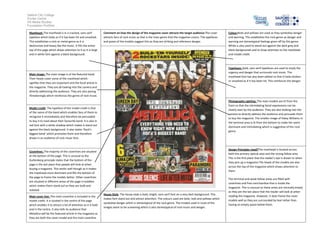
Masthead: The masthead is in a cracked, sans serif
typeface which looks as if it has been hit and smashed.
This establishes a rock or metal genre as it is
destructive and heavy like the music. It fills the entire
top of the page which draws attention to it as it is large
and in white font against a black background.
Comment on how the design of the magazine cover attracts the target audience:The cover
attracts fans of rock music as that is the main genre that the magazine covers. The typefaces
and poses of the models suggest this as they are striking and reference danger.
Typefaces: bold, sans serif typefaces are used to imply the
urgency and danger that surrounds rock music. The
masthead font has also been edited so that it looks broken
or smashed as if it has been hit. This reinforces the danger.
Main image: The main image is of the featured band.
Their heads cover some of the masthead which
signifies that they are important and the focal article in
the magazine. They are all looking into the camera and
directly addressing the audience. They are also posing
threateningly which reinforces the genre of rock music.
Photography Lighting: The main models are lit from the
front so that the intimidating facial expressions can be
clearly seen by the audience. They are also looking into the
camera to directly address the audience and persuade them
to buy the magazine. The smaller image of Haley Williams in
the terminal area is lit from the bottom to make her seem
dominant and intimidating which is suggestive of the rock
genre.
Model credit: The typeface of the model credit is that
of the name of the band which enables fans of them to
recognise it immediately and therefore be persuaded
to buy it to read about their favourite band. It is also in
red font with a white shadow which makes it stand out
against the black background. It also states ‘Rock’s
biggest band’ which promotes them and therefore
draws in an audience of rock music fans.
Design Principles Used?The masthead is located across
both the primary optical area and the strong fallow area.
This is the first place that the reader’s eye is drawn to when
they pick up a magazine.The heads of the models are also
across the top of the magazine which draws attention to
them.
Coverlines: The majority of the coverlines are situated
at the bottom of the page. This is unusual as the
Guttenberg principle states that the bottom of the
page is the last place that people will look at when
buying a magazine. This works well though as it makes
the masthead more dominant and fills the bottom of
the page to frame the models better. Other coverlines
are situated in different areas of the page in bubbles
which makes them stand out as they are bold and
isolated.
Main cover line: The main coverline is included in the
model credit. It is located in the centre of the page
which enables it to attract a lot of attention as it is bold
and in the centre. It also tells its audience that
Metallica will be the featured article in the magazine as
they are both the cover model and the main coverline.
Colour:Reds and yellows are used as they symbolise danger
and warning. This establishes the rock genre as danger and
warning are stereotypical feelings given off by this genre.
White is also used to stand out against the dark grey and
black backgrounds and to draw attention to the masthead
and model credit.
House Style: The house style is bold, bright, sans serif font on a very dark background. This
makes font stand out and attract attention. The colours used are bold, reds and yellows which
symbolise danger which is stereotypical of the rock genre. The models used in most of the
images seem to be screaming which is also stereotypical of rock music and danger.
The terminal and weak fallow areas are filled with
coverlines and free merchandise that is inside the
magazine. This is unusual as these areas are normally empty
as they are the last place that the reader will look at when
reading the magazine. However, it does frame the cover
models well as they are surrounded by text rather than
having an empty space below them.