Just Call Vip call girls Wardha Escorts ☎️8617370543 Starting From 5K to 25K ...
Magazine front cover analysis
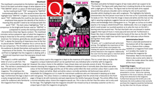
1. Masthead-
The masthead is presented on the bottom right corner in
front of the black and white image of what appears to be
“THE SMITHS” which is a piece of information given to us
by the masthead itself. “THE” compared to “SMITHS”
tremendously differ in size. This would've been done to
highlight how “SMITHS” is higher in importance than the
word “THE”. Additionally this could’ve also been done to
emphasize how popular the identify of the Smiths is
meaning they wouldn’t need to be introduced with the
word “THE”. The dark colour highlighting “THE” in
comparison to the bright pink format used on “SMITHS” is
juxtaposed to convey the exciting and positive
characteristics these two figures conduct. The masthead
connotes various polysemic signs of what the magazine is
trying to show due to the various methods used to make it
stand out. For instance, generally you would suggest that
“THE” is above the hierarchy of importance due to the fact
its placed above “SMITHS” However this is untrue due to
the size comparison. This therefore could be done to allow
the audience to decide themselves and question the real
importance of the Smiths. The masthead follows a sans
serif font to highlight that the magazine is dealing with a
formal and important issue that everyone should read.
Colour-
The colour choice used in this magazine is kept to the maximum of 4 colours. This is a smart idea as it gives the
magazine a unique trademark which can be spotted from any individual who is familiar with Q magazine.
However the colour choice in the addition I have chosen does not normally consist of pink. This drew me
towards choosing this magazine as it follows a different trademark than it normally does (the black and white
colour of the full bleed image and the use of the colour pink) Infect the most common colour that is used in the
magazine is black and white. Black and white colours normally symbolise old fashioned news which is
remarkable for Q Magazine as it is made for mainstream audiences who are interested in keeping up to date
with new gossip. The colour choice is a indexical sign that suggests that the article that is featured on the front
page is things to do with memories and past experiences the Smiths have gone through. The article differs from
a normal everyday colour choice the magazine would use. This is due to the fact that the colour red is only used
for the logo. This highlights how the magazine shouldn’t be missed out by an everyday customer as this is a
unique type of style the magazine are going for.
Main Image-
The black and white full bleed imagine of two males which we suspect to be
“The Smiths” The figure with spiky black hair is looking directly at the camera
with a slight grin on his face. The figure next to him has both arms rapped
around the first persons shoulder and is resting his chin on his partners
shoulder whilst shading his eyes with sunglasses. This highlights the fatherly
characteristics the first person must have on the man as he is practically resting
his body on him. The fact that the image is black and white and the man on the
right is wearing sunglasses suggests how we are empowered by the lack of
colour and knowledge that is being given to us. This gets us curious as to what
exactly is he trying to shield himself from. Additionally this is an enigma code
which could answer our puzzled question as to why the man on the left is
leaning onto the second man. The fact that both men are dressed in leather
suggests their type of music is more pop and rock and roll. Furthermore a
flower like chain is held between both the hands of the man on the left. This
suggests that they might have had the typical 60’s style pop culture theme
during their music career.
Supporting images-
In the middle page of the left hand corner
there is a miniature imagine of Lilly Allen
presented in a circle. Due to her uprising
reputation in the music industry, she would
bring more attraction to the magazine.
Furthermore because the Smiths are a old
fashioned, the niche audience that normally
purchase the magazine would be familiarised
by Lilly Allen than the 30 year old band.
Slogan-
The slogan is a white capitalised
letter of a Q in a safir font. The
white Q is surrounded by s large red
box. The red box is presented at the
top left hand corner of the
magazine. This emphases the
importance and significance of the
logo. Furthermore the logo is kept in
a easily recognised place, which is
useful for audiences who familiarise
the magazine from the logo.
Cover Line-
“30 years...ect” is underlined with white bold
writing. This highlights the importance of this
statement which draws most people into
reading this specific article rather than the other
articles featured in the magazine. Additionally
the cover line has been given a new font which
conveys the articles unique features.
Administrative Detail-
There is a barcode positioned on
the bottom left of the magazine.
This is a feature that is always
needed on a magazine front cover
as it enables the reader to
purchase the magazine for
themselves. Next to the barcode
there is also a price and a date to
inform the reader about the statics
of the music magazine
2. Masthead-
The masthead is placed in the middle of the title page in a long, white font
saying “Miley Cyrus” The individual letters are equally spread out in each
word which reflects a relaxing and professional atmosphere that the
reader is indulged with. The relaxing effect is strengthened by the
background (a light purple) in which Miley Cyrus is stood in front off.
Additionally the masthead is vaguely striking as it is positioned in front of
a brown, wooden letter M. This could symbolise how natural and real
Miley Cyrus is as a person and a figure which gives us a trustworthy and
supportive relationship towards her. The ‘L’ and ‘u’ have one side that is
in line with the massive M to highlight the relationship between each
tittle.
Full Bleed Image-
The full bleed image connoted of Miley Cyrus
dressed in pitch black clothes. The only skin
that is showing is her head and face which
highlights how the rest of her real self is
covered and hidden from reality TV. This gets us
intrigued as we would want to know why she's
covered her body because its traditionally
natural for a celebrities, like Miley Cyrus, to be
more open and flashy in the way they present
themselves on magazines. Instead Miley is
simply clenching the outer sides of the letter M
with her hands and looking directly towards the
camera with her chin positioned symmetrical to
the middle of the m. In fact, if you were to draw
a line down the page horizontally, it would
seem like an identical mirror image being
shown. This highlights how Miley has been
hiding many secrets and is now ready to reveal
them to Billboard magazine. The fact that her
eyes are squinting and almost tempting us to
look and read her story tells us that the story is
deeper and more serious topic into her life.
Additionally Miley Cyrus's hair also blends in
with the colour of the letter “M” she is holding
which highlights how she naturally connects
with nature. Her blood is linked in with it.
Colours-
The colours portrayed on the front page are mostly dark and natural colours like white, black and brown. These colours are mainly
consisted with the full bleed image to show off Miley Cyrus's natural beauty and personality. The colours could also highlight her
country life childhood in which we are all well aware of due to her hit show “Hannah Montana” Highlighting how that little girl we
saw on screen is still inside her. However this is also an indexical sign as we can also interpret it as her breaking free from her
childhood character and fulfilling another person completely differently. The way she is gripping the letter M as if she were to break
it could be connoting her breaking free of that heavy painted image. The light purple colour behind Miley adds to the vibrant and
eye-catching atmosphere the magazine gives off. Additionally its a very bold and bright colour which fits in well with Miley
personality and effect the magazine is trying to achieve by the colour choice.
Cover Lines-
The cover line illustrated below the masthead is in a bright yellow casual
font stating that Miley is going to kick start a new career. The rest of the
cover lines are portrayed in the same colour however are smaller than
the cover line below the masthead, This highlights the descriptions
importance in the hierarchy and encourages readers to view that article
first before reading the other featured articles.
Supporting images-
There are no supporting
images present in this
front cover as the main
focus should be all on
Miley Cyrus as this is
her spot light.
Button-
There is a cross like button features at the bottom left hand corner of the
magazine, This cross can also be interpreted as a plus sign which shows
extra information that the magazine wouldn't normally have. Additionally
the bold font the cross is showed drags your eyes towards it.
Administrative Detail-
There is a barcode positioned on
the bottom right of the magazine.
This is a feature that is always
needed on a magazine front cover
as it enables the reader to purchase
the magazine for themselves. Next
to the barcode there is also a price
and a date to inform the reader
about the statics of the music
magazine
3. Masthead-
There is no real masthead being illustrated on the particular front
cover as most of the fonts and writings being presented are about
the same size. Furthermore there is no writing in the middle of
bottom of the article apart from the magazine title “Vibe” which is
portrayed at the very top of the magazine. This could be done to
highlight that there is no hierarchy being presented in this magazine
symbolising that each article being featured is as important as
others. The fact that Ushers head covers the letter “b” in VIBE
highlights that because the music magazine is so popular, readers
would easily be able to interpret which music magazine this is.
Furthermore the masthead also gives of a respectable feel to the
artist featured on the front cover as it allows the artist to have the
spot light rather than the masthead itself. This gives of a good image
for the magazine as it shows that the magazine is focussed entirely
on the artists being featured in the magazine rather than advertising
itself out. The masthead is also very simple and thick which
highlights how the context of the magazine is more attractive rather
than the looks of the magazine. This differs from what other music
magazines would try and convey from their own front covers.
Fullbleed-
The full bleed image is of a the famous and well known singer Usher.
He is portrayed as tilting his head towards the right to highlight he
agrees with our views of the music industry in general. Furthermore
he is portrayed as wearing sunglasses which hides half of his face
from the camera. This could be done to symbolise how his eyes have
seen things that he would rather not share with his fans, but on this
special occasion he would reveal it on this special addition featured in
the article. Furthermore we are attracted to this magazine as Usher is
signalling his hand in a pose niche audiences would normally be
aware with and class as “cool” or as the article states it... “swag”
Ushers face is positioned titled to the right. In fact it is quite an
effective pose as it looks like his face is sticking out of the cover lines
that are surrounding him which looks really cool from a distance. This
would be a pose that I would like to re make once I do my own photos
hoot for my magazine
Colours-
The colours mainly used in this front cover are black and
yellow. This highlights the typical rap music mainstream
viewers would listen to, due to yellow representing gold
chains you would normally see black rappers wear.
Additionally the blue presented in the magazine is
flashy and eye catching compared to the other colours
illustrated in the magazine. “swagger” is illustrated in
bright pink colour which puts it at the top of the
hierarchy as the font looks like its been handwritten on.
This sets am example for the reader and almost
encourages them to be more like Usher and be “swag”
Additionally the colours portrayed on this magazine are
very vibrant and blend in with the theme that the music
is trying to convey (cool and swag)
Buttons-
At the bottom right corner is a button advertising the
magazines website. This is a smart way of getting people to use
technology as well to access their work and products.
Furthermore its presented in a shad, ghost like grey font which
highlights that it is something that should be checked out by
fans of the Vibe magazine because it may not be receiving as
much attention as it should.
Cover lines-
There are 8 different cover lines being presented in this
front cover. The different fonts and size determines to
us which is the most and least important category we
should view each article. In this case, Usher is the big
talk of this article as he has appeared on the front page
and has an article being featured in the largest and
boldest font being portrayed apart from the magazine
title.
Administrative Detail-
There is a barcode positioned on the bottom left of the
magazine. This is a feature that is always needed on a
magazine front cover as it enables the reader to
purchase the magazine for themselves. Next to the
barcode there is also a price and a date to inform the
reader about the statics of the music magazine. We are
also given the music magazines website in transparent
white writing to the right of the bottom page. This is
done to advertise the magazines other media networks
that gain them publicity.