1. FRONT COVER ANALYSIS 2
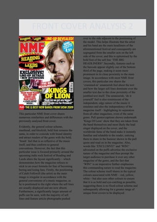
This particular NME front cover shares
numerous similarities and differences with the
previously analysed front cover.
Evidently, the general colour scheme,
masthead, and blockish, bold font remains the
same, in order to coincide with brand identity
and attract readers of the genre with the bold,
‘brash’ feel that is so reflective of the music
itself, and thus conform to general
conventions. However, the fact that this
particular issue is focused primarily around the
upcoming indie rock festival of Reading and
Leeds alters the layout significantly – which
demonstrates how the magazine refuses to
stick to an exact formula for fear of becoming
boring and losing fans. Firstly, the positioning
of Caleb Followill (the artist) as the main
image is irregular in accordance with the
general conventions of a music magazine, as
he is positioned to the right where the sell lines
are usually displayed and are now absent.
Furthermore, a significantly larger amount of
puffs can be seen, with the majority of sell
lines and feature article photographs pushed
over to the side adjacent to the positioning of
the model. This helps illustrate that the artist
and his band are the main headliners of the
aforementioned festival and consequently are
segregated from the smaller acts on the left
side of the cover, and this is epitomised by the
bold font of the sell line ‘THE BIG
HEADLINERS!’.Secondly, features such as
the barcode appear slightly out of the bottom
third of the page, making it seem more
prominent in its close proximity to the main
image. In accordance with most NME front
covers, this particular one shares the
‘crammed-in’ amateurish feel about the text
and how the larger sell lines dominate over the
smaller text due to the close proximity of the
jumbled text itself. The amateurish, ‘do it
yourself’ feel is also reminiscent of the
independent, edgy nature of the music it
emulates and also the independency of the
magazine itself – highlighting its separation
from all other magazines, even of the same
genre. Pull quotes/captions shown underneath
‘Kings Of Leon’ show that they are taken from
the band themselves and most likely the lead
singer displayed on the cover, and the
worldwide fame of the band make it instantly
familiar and relatable to the reader, enticing
them to share in the humour shown in the pull
quote and read on in the magazine. Also,
words like ‘EXCLUSIVE!’ and ‘WIN!’
advocated on the puffs advertise the exclusive
nature of the magazine and thus prompt the
target audience to purchase it over any other
magazine of the genre, and the fact that
‘WIN!’ is an imperative further emphasises
this commanding nature to read the magazine.
The colour scheme itself shares in the typical
colours associated with NME – red, yellow,
white – but also uses other colours to ensure
that it is as bold and eye-catching as possible,
suggesting there is no fixed colour scheme and
subsequently allowing for a greater range of
unique front covers to be displayed.