Transcript: New from BookNet Canada for 2024: BNC BiblioShare - Tech Forum 2024
task 3 cover
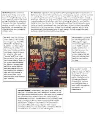
1. The Masthead “metal hammer” Is
clear to see in the top center of the
cover, it’s the biggest piece of writing
on the page and is a colour thatstands
out significantly fromthe background.
The reason they make the masthead
stand out so much is so that it catches
people’s eye and people who arefans
of that particular genreor magazine
will seeit better.
The Main Image is a medium closeup of a famous heavy metal guitaristKerry Kingdressed up as
the famous movie demon Hellraiser,thereason a medium closeup is used is so that the audience
can see his facial expressions,his beard is also very longwhich means that a medium closeup
would need to be used in order to see all of it. Directaddress is used in the main image, this is to
involvethe audienceand make them seem likehe is lookingrightatyou. The use of both the
Hellraiser theme Kerry Kingis so that the target audience of metal music listeners,the reason
Hellraiser is used is becausepeoplewho listen to this genre of music areoften interested by
horror films likeHellraiser and so arethe band that Kerry Kingis associated with. His facial
expressions seem almostangry and bitinghis teeth together, this links back with the target
audience, as people associatemetal music with anger.
The Cover Lines areon both
the left and righthand side
of the page, the bigger,
more interesting cover lines
are on the left hand side
together and the others on
the right. Each cover line
has its main heading
written in big, bold,bright
letters, this is so that these
headlines stand out from
the page.
The Main Cover Line is located
on the left hand sidebesidethe
main image, itsays “How Metal
Shocked The World starring…
SLAYER the riseof the kings of
hell”this stands out from the
other cover lines becauseitis so
much bigger, italso introduces
the colour red in the words
“Shocked” and “Slayer” this is
because both of those words are
hard hitting, and also “Slayer”is
the band that Kerry Kingplays
for. It anchors the main image
because its talkingaboutthe
band which the person in the
main image is in,also where it
says “the riseof the kings of
hell”reinforces the use of
Hellraiser in the main image as it
says “from hell”.
Buzz words areused all
around the cover like“plus”,
“exclusiveand “and more”
these types of words are
used to attract attention to
the magazine and also to
almosttrick the audience
into thinkingthat there is
lots of stuff in this magazine
that you can’t find
anywhere else.
The Colour Scheme is primarily black with hints of white and red, the
use of black is importantin this genre of magazine because itattracts
the target audienceof metal music fans,as the genre is associated with
that colour.The colour of white is really only used becauseitis a
contrastto the colour black and when white is used itstands out from
the black background.Red is used becauseit also stands outwhen
placed over the background but also becausethe colour red has
connotations of things likeenergy and power which are also
connotations of metal music,but also red has connotations of blood
and death which also is often associated with this genre.