SlideShare a Scribd company logo
1 of 3
The front cover of this magazine seems quite plain yet is still appealing to its target audience.  The masthead is bright red writing with a white outline in capital letters making it attention grabbing. This magazine is very well known and this masthead allows any regular buyers to easily recognize it. It is slightly covered by the main image which is quite a common technique (particularly in music magazines) as it emphasizes the main image dramatically. The main image is of an extremely famous artist of whom the magazine’s target audience is basically guaranteed to recognize. It takes up almost all the space on the front cover, meaning any person who sees the magazine can instantly see what this issue of the magazine will be about and whether or not they are interested in reading it. The background is plain hence not taking attention/emphasis away from the main image. -209550-466725<br />The masthead in this magazine has a slightly battered affect which fits the context and makes it more appealing to the target audience. The main image is of a well known musician, and this also contributes to the attraction of the magazine as a whole. There are subheadings all over the cover which use different aspects of language and imagery in order to draw attention; some examples of these are slang, exclamations marks, capitals, bold font etc. The background is quite plain which simply allows all attention/emphasis to be on the main image.-20955015875<br />This magazine is very different from the previous two as it is much more elegant and has an entirely different target audience. However, it still shares some of the same techniques; like a plain background to allow emphasis to be on the main image; the main image to take up almost all the room and overlap the masthead; and a very large recognizable masthead.  The woman in this magazine looks very elegant and is holding a violin, which will obviously appeal to a mature audience interested in classical music.-190500184150<br />This magazine is aimed at an audience interested in darker forms of music like heavy metal. For this reason the image in the background is an extreme close up of a well known member of “papa roach”. The image is very dull and almost scary, this is due to the fact that the music magazine is based on is very dark, controversial and heavy, meaning this image will appeal to the target audience.The masthead is quite different from the rest of the magazine as both the name and the style do not seem to particularly fit the dark context/atmosphere of this magazine. However, the masthead stands out dramatically due to the blue fade to white affect and the fact that the “o” is in the style of a bright white light. The subheading of “papa roach” is in the usual, interesting style of this band’s writing to allow any of the fans to instantly recognize it.  It also has their logo to allow the band to easily be recognized. -209550284480<br />The masthead in this magazine is reversed out and the two words are in different colors; to allow it to look interesting. The main image is a wide shot of quite a cool look man playing electric guitar in an interesting pose. Anyone interested in playing guitar will instantly be drawn to this due to the fact that this person is a well known recognizable guitarist, and he is also in a very interesting pose and looks like he is shredding like a beast. The background of this magazine is a sort of yellow washed out, faint image of a cartoon man surfing; and this fits with the heading of “Surfing with the alien” and is also original as most magazines choose to use quite a basic background. -314325-781050<br />-314325314960<br />The masthead in this magazine is reversed out and the two words are in different colours; to allow it to look interesting. The main image is a wide shot of quite a cool looking man playing electric guitar in an interesting exaggerated pose. Anyone interested in playing guitar will instantly be drawn to this due to the fact that this person is a well known recognisable guitarist, and he is also in a very interesting pose and looks like he is shredding like a beast; which will obviously attract the magazines target audience. The background of this magazine is a sort of yellow washed out, faint image of a cartoon man surfing; and this fits with the heading “surfing with the alien” and is also original as most magazines choose to use quite a basic background. <br />The background of this magazine is extremely basic compared to the rest of the magazines.  The masthead is in a slightly original, interesting font which catches the audience’s eye and is also the typical font that this particular band writes their name in as it is a sort of logo/trademark for them; as with most bands. The most dominant feature about this magazine’s front page is obviously the close up image of a well known band member’s face. The reason the producers chose to do this is likely to be because they are fully aware of how popular this person is; meaning they known that having his very recognisable face taking up almost all the surface area of the magazine will mean anyone walking past it is almost guaranteed to see his face; and if they like him (which a lot of people do) they are likely to be tempted to buy the magazine; meaning widening your audience and more annual buyers; thus more profit.  -342900149225<br />This magazine’s masthead is actually covered by main image of Lily Allen- a very popular mainstream music artist- and this is likely be to make the main image much more dominant and obvious for any potential buyers, as they can see it without any of it being hidden behind the masthead.  The way Lilly Allen actually looks in this photo helps make the magazine more appealing; her expression is quite black and gormless and her skin colour is extremely white contrasting with her very black hair. All of these features contribute to making any target audience question and take interest in the magazine.The front cover uses a quote and the letters are unaligned with one another; which makes it stand out more and possibly is to reflect the nature of what is actually being said in the quote.  The heading of “Lily Allen Takes on The World” is written in a sort of newspaper headline style which simply emphases it as it is black and white which stands out from the reasonably colourful rest of the magazine. <br />-35941059690<br />“Fireworks” is evidently significantly different from the rest of the magazines as it is has a very different target audience (despite still being a music magazine). It is aimed at the elder generation of males who are into the older rock bands like “Thin Lizzy” etc, (typically Dads). However, it still follows the same conventions of the other magazines which is covering most of the area on the front cover with an image of a famous band/person that will appeal to the target audience. It also has a separate image of a woman in an interesting pose in the bottom left hand corner which will attract attention especially when combined with the clever subheading that has “sex” added in with an arrow to make it seem cheeky and make the audience feel mischievous.-352425-381000<br />The image in this magazine is very striking as it is of the lead singer of the band “Red hot chilli Peppers” in a very unconventional feminine pose which could get people to ask why he is in this pose and get interested in the magazine.The image is a medium long hot meaning you can see his entire body which is quite affective as it allows people to clearly see the way he is dressed which is like a schoolgirl. This is obviously very bizarre; but unusual things people have seen before are usually extremely good ways to generate revenue as ordinary things that conform to society and people have seen hundreds of times before can be extremely uninteresting and boring. I believe this to be the most affective magazine front cover of all 10 because it is -35242524765<br />
Striking RHCP Front Cover Draws Attention with Lead Singer's Unconventional Pose

More Related Content

What's hot

Coursework for media
Coursework for mediaCoursework for media
Coursework for mediasimpleplanfan
 
Magazine analysis
Magazine analysisMagazine analysis
Magazine analysiscansu12
 
Pop music magazine cover annotations
Pop music magazine cover annotationsPop music magazine cover annotations
Pop music magazine cover annotationsxv_Identity
 
Presentation1
Presentation1Presentation1
Presentation1bethmagic
 
Analysis of Music Magazines
Analysis of Music MagazinesAnalysis of Music Magazines
Analysis of Music MagazinesLace Ormrod
 
Analysis of professional magazine front cover
Analysis of professional magazine front coverAnalysis of professional magazine front cover
Analysis of professional magazine front coverjacobcrossley37
 
Music Magazine Research
Music Magazine ResearchMusic Magazine Research
Music Magazine Researchlewis galloway
 
Contents page analysis
Contents page analysisContents page analysis
Contents page analysisEloiseMackreth
 
magazine cover, analysis 1
magazine cover, analysis 1magazine cover, analysis 1
magazine cover, analysis 1Jennifermegan93
 
Semiotics in Magazine Covers
Semiotics in Magazine CoversSemiotics in Magazine Covers
Semiotics in Magazine Coversabigaillmedia
 
Analysis Of Magazines
Analysis Of MagazinesAnalysis Of Magazines
Analysis Of MagazinesLace Ormrod
 

What's hot (14)

Coursework for media
Coursework for mediaCoursework for media
Coursework for media
 
Magazine analysis
Magazine analysisMagazine analysis
Magazine analysis
 
Pop music magazine cover annotations
Pop music magazine cover annotationsPop music magazine cover annotations
Pop music magazine cover annotations
 
Task 3a
Task 3aTask 3a
Task 3a
 
Presentation1
Presentation1Presentation1
Presentation1
 
Mood board
Mood boardMood board
Mood board
 
Analysis of Music Magazines
Analysis of Music MagazinesAnalysis of Music Magazines
Analysis of Music Magazines
 
Analysis of professional magazine front cover
Analysis of professional magazine front coverAnalysis of professional magazine front cover
Analysis of professional magazine front cover
 
Music Magazine Research
Music Magazine ResearchMusic Magazine Research
Music Magazine Research
 
Contents page analysis
Contents page analysisContents page analysis
Contents page analysis
 
magazine cover, analysis 1
magazine cover, analysis 1magazine cover, analysis 1
magazine cover, analysis 1
 
Media studiessss
Media studiessssMedia studiessss
Media studiessss
 
Semiotics in Magazine Covers
Semiotics in Magazine CoversSemiotics in Magazine Covers
Semiotics in Magazine Covers
 
Analysis Of Magazines
Analysis Of MagazinesAnalysis Of Magazines
Analysis Of Magazines
 

Similar to Striking RHCP Front Cover Draws Attention with Lead Singer's Unconventional Pose

Front cover analysis.
Front cover analysis.Front cover analysis.
Front cover analysis.AmyShields00
 
Magazine Cover Analysis
Magazine Cover AnalysisMagazine Cover Analysis
Magazine Cover AnalysisMegan98
 
Magazine analysis
Magazine analysisMagazine analysis
Magazine analysisasmediag13
 
Analysing of front cover, double page spread and contnents page
Analysing of front cover, double page spread and contnents pageAnalysing of front cover, double page spread and contnents page
Analysing of front cover, double page spread and contnents pageJessicaPethrus
 
Magazine analysis
Magazine analysisMagazine analysis
Magazine analysisasmediag13
 
Magazine analysis
Magazine analysisMagazine analysis
Magazine analysisasmediag13
 
3 Magazine front cover analysing
3 Magazine front cover analysing3 Magazine front cover analysing
3 Magazine front cover analysinglaylakeegan
 
Music magazine analysis
Music magazine analysisMusic magazine analysis
Music magazine analysisJamieAllen8
 
Magazine analysis- Media Coursework
Magazine analysis- Media CourseworkMagazine analysis- Media Coursework
Magazine analysis- Media Courseworklozsheriston
 
Music magazine analysis.pptx (2)
Music magazine analysis.pptx (2)Music magazine analysis.pptx (2)
Music magazine analysis.pptx (2)Sam White
 
Magazine analysis
Magazine analysisMagazine analysis
Magazine analysisasmediag13
 
Magazine Analysis
Magazine AnalysisMagazine Analysis
Magazine Analysissarahbonita
 
Analysis of magazines
Analysis of magazinesAnalysis of magazines
Analysis of magazinesasmediag13
 
Cover deconstruction
Cover deconstructionCover deconstruction
Cover deconstructionchlozeebo
 
Magazine cover analysis3
Magazine cover analysis3Magazine cover analysis3
Magazine cover analysis3heatherjanew
 
Analysis of graphic elements
Analysis of graphic elementsAnalysis of graphic elements
Analysis of graphic elementsLewisCusker
 
Preliminary Research
Preliminary ResearchPreliminary Research
Preliminary Researchbeckyjay26
 
Analysis of magazines
Analysis of magazinesAnalysis of magazines
Analysis of magazinesasmediag13
 

Similar to Striking RHCP Front Cover Draws Attention with Lead Singer's Unconventional Pose (20)

Front cover analysis.
Front cover analysis.Front cover analysis.
Front cover analysis.
 
Magazine analysis
Magazine analysisMagazine analysis
Magazine analysis
 
Magazine Cover Analysis
Magazine Cover AnalysisMagazine Cover Analysis
Magazine Cover Analysis
 
Magazine analysis
Magazine analysisMagazine analysis
Magazine analysis
 
Analysing of front cover, double page spread and contnents page
Analysing of front cover, double page spread and contnents pageAnalysing of front cover, double page spread and contnents page
Analysing of front cover, double page spread and contnents page
 
Magazine analysis
Magazine analysisMagazine analysis
Magazine analysis
 
Magazine analysis
Magazine analysisMagazine analysis
Magazine analysis
 
3 Magazine front cover analysing
3 Magazine front cover analysing3 Magazine front cover analysing
3 Magazine front cover analysing
 
Music magazine analysis
Music magazine analysisMusic magazine analysis
Music magazine analysis
 
Magazine analysis- Media Coursework
Magazine analysis- Media CourseworkMagazine analysis- Media Coursework
Magazine analysis- Media Coursework
 
Music magazine analysis.pptx (2)
Music magazine analysis.pptx (2)Music magazine analysis.pptx (2)
Music magazine analysis.pptx (2)
 
Magazine analysis
Magazine analysisMagazine analysis
Magazine analysis
 
Magazine Analysis
Magazine AnalysisMagazine Analysis
Magazine Analysis
 
Analysis of magazines
Analysis of magazinesAnalysis of magazines
Analysis of magazines
 
Cover deconstruction
Cover deconstructionCover deconstruction
Cover deconstruction
 
Magazine cover analysis3
Magazine cover analysis3Magazine cover analysis3
Magazine cover analysis3
 
Analysis of graphic elements
Analysis of graphic elementsAnalysis of graphic elements
Analysis of graphic elements
 
Front cover analysis
Front cover analysisFront cover analysis
Front cover analysis
 
Preliminary Research
Preliminary ResearchPreliminary Research
Preliminary Research
 
Analysis of magazines
Analysis of magazinesAnalysis of magazines
Analysis of magazines
 

Striking RHCP Front Cover Draws Attention with Lead Singer's Unconventional Pose

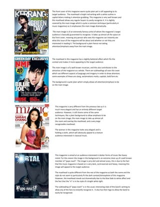
  • 1. The front cover of this magazine seems quite plain yet is still appealing to its target audience. The masthead is bright red writing with a white outline in capital letters making it attention grabbing. This magazine is very well known and this masthead allows any regular buyers to easily recognize it. It is slightly covered by the main image which is quite a common technique (particularly in music magazines) as it emphasizes the main image dramatically. The main image is of an extremely famous artist of whom the magazine’s target audience is basically guaranteed to recognize. It takes up almost all the space on the front cover, meaning any person who sees the magazine can instantly see what this issue of the magazine will be about and whether or not they are interested in reading it. The background is plain hence not taking attention/emphasis away from the main image. -209550-466725<br />The masthead in this magazine has a slightly battered affect which fits the context and makes it more appealing to the target audience. The main image is of a well known musician, and this also contributes to the attraction of the magazine as a whole. There are subheadings all over the cover which use different aspects of language and imagery in order to draw attention; some examples of these are slang, exclamations marks, capitals, bold font etc. The background is quite plain which simply allows all attention/emphasis to be on the main image.-20955015875<br />This magazine is very different from the previous two as it is much more elegant and has an entirely different target audience. However, it still shares some of the same techniques; like a plain background to allow emphasis to be on the main image; the main image to take up almost all the room and overlap the masthead; and a very large recognizable masthead. The woman in this magazine looks very elegant and is holding a violin, which will obviously appeal to a mature audience interested in classical music.-190500184150<br />This magazine is aimed at an audience interested in darker forms of music like heavy metal. For this reason the image in the background is an extreme close up of a well known member of “papa roach”. The image is very dull and almost scary, this is due to the fact that the music magazine is based on is very dark, controversial and heavy, meaning this image will appeal to the target audience.The masthead is quite different from the rest of the magazine as both the name and the style do not seem to particularly fit the dark context/atmosphere of this magazine. However, the masthead stands out dramatically due to the blue fade to white affect and the fact that the “o” is in the style of a bright white light. The subheading of “papa roach” is in the usual, interesting style of this band’s writing to allow any of the fans to instantly recognize it. It also has their logo to allow the band to easily be recognized. -209550284480<br />The masthead in this magazine is reversed out and the two words are in different colors; to allow it to look interesting. The main image is a wide shot of quite a cool look man playing electric guitar in an interesting pose. Anyone interested in playing guitar will instantly be drawn to this due to the fact that this person is a well known recognizable guitarist, and he is also in a very interesting pose and looks like he is shredding like a beast. The background of this magazine is a sort of yellow washed out, faint image of a cartoon man surfing; and this fits with the heading of “Surfing with the alien” and is also original as most magazines choose to use quite a basic background. -314325-781050<br />-314325314960<br />The masthead in this magazine is reversed out and the two words are in different colours; to allow it to look interesting. The main image is a wide shot of quite a cool looking man playing electric guitar in an interesting exaggerated pose. Anyone interested in playing guitar will instantly be drawn to this due to the fact that this person is a well known recognisable guitarist, and he is also in a very interesting pose and looks like he is shredding like a beast; which will obviously attract the magazines target audience. The background of this magazine is a sort of yellow washed out, faint image of a cartoon man surfing; and this fits with the heading “surfing with the alien” and is also original as most magazines choose to use quite a basic background. <br />The background of this magazine is extremely basic compared to the rest of the magazines. The masthead is in a slightly original, interesting font which catches the audience’s eye and is also the typical font that this particular band writes their name in as it is a sort of logo/trademark for them; as with most bands. The most dominant feature about this magazine’s front page is obviously the close up image of a well known band member’s face. The reason the producers chose to do this is likely to be because they are fully aware of how popular this person is; meaning they known that having his very recognisable face taking up almost all the surface area of the magazine will mean anyone walking past it is almost guaranteed to see his face; and if they like him (which a lot of people do) they are likely to be tempted to buy the magazine; meaning widening your audience and more annual buyers; thus more profit. -342900149225<br />This magazine’s masthead is actually covered by main image of Lily Allen- a very popular mainstream music artist- and this is likely be to make the main image much more dominant and obvious for any potential buyers, as they can see it without any of it being hidden behind the masthead. The way Lilly Allen actually looks in this photo helps make the magazine more appealing; her expression is quite black and gormless and her skin colour is extremely white contrasting with her very black hair. All of these features contribute to making any target audience question and take interest in the magazine.The front cover uses a quote and the letters are unaligned with one another; which makes it stand out more and possibly is to reflect the nature of what is actually being said in the quote. The heading of “Lily Allen Takes on The World” is written in a sort of newspaper headline style which simply emphases it as it is black and white which stands out from the reasonably colourful rest of the magazine. <br />-35941059690<br />“Fireworks” is evidently significantly different from the rest of the magazines as it is has a very different target audience (despite still being a music magazine). It is aimed at the elder generation of males who are into the older rock bands like “Thin Lizzy” etc, (typically Dads). However, it still follows the same conventions of the other magazines which is covering most of the area on the front cover with an image of a famous band/person that will appeal to the target audience. It also has a separate image of a woman in an interesting pose in the bottom left hand corner which will attract attention especially when combined with the clever subheading that has “sex” added in with an arrow to make it seem cheeky and make the audience feel mischievous.-352425-381000<br />The image in this magazine is very striking as it is of the lead singer of the band “Red hot chilli Peppers” in a very unconventional feminine pose which could get people to ask why he is in this pose and get interested in the magazine.The image is a medium long hot meaning you can see his entire body which is quite affective as it allows people to clearly see the way he is dressed which is like a schoolgirl. This is obviously very bizarre; but unusual things people have seen before are usually extremely good ways to generate revenue as ordinary things that conform to society and people have seen hundreds of times before can be extremely uninteresting and boring. I believe this to be the most affective magazine front cover of all 10 because it is -35242524765<br />