
Recommended
More Related Content
What's hot
What's hot (15)
Viewers also liked
Viewers also liked (18)
Similar to House style improved
Similar to House style improved (20)
More from matt perki
More from matt perki (20)
Recently uploaded
Recently uploaded (20)
House style improved
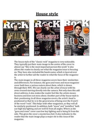
- 1. House style The housestyle of the “classic rock” magazineis very noticeable. They typically puttheir main image in the centre of the cover to almost say “this is the most importantperson this week” it also allows the reader to clearly see what the magazineissue is focusing on. They have also included the bandsname, which is layered over the artist to further aid the reader in what the focusof the magazine is. The main images in all three magazinecovers have their similarities and differences. For instance, the gunsand roses and musemagazine cover both have a seriousnatureabout them, which is shown through there NVC. We can clearly see the artist of musewith his arms crossed starring directly into the camera. Not only does this add direct address, it also makesthe reader feel like the artists means businessand does not mess about. Another part of the house style is their positioning. In all three magazinecovers, the artist’s head is positioned so that he is in the generalarea of being over the O and C of the word “rock”. This helps with other magazines, as they will all be similarly positioned. In addition, both “muse” and “metallica” both use high key lighting and are well lit from all angles. Where as the “gunsand roses” cover useslow key lighting and is being lit from the side. This gives the cover a mysteriousfeel. It also indicates to the reader that the main image playsa major ole in this issueof the magazine.
- 2. The magazinealso consistently usesthe same logo for their magazine. This allows them to layer the main image of the artists over their masthead, without the reader not knowingwhat the magazineis. This is because the masthead has become second nature to regular readerswho will be able to notice the magazine even if it is slightly covered. The colour of the backgroundsgenerally black or grey, this is used to as rock musicis commonly associated with darknessand also allows the text on the magazinecover to stand outto the reader and the morecolourfulparts, such as the puffs, immediately attract the attention of the reader before anythingelse. The word classic on this magazinehas never been covered by the main image. This is because they are trying o connotean old vintage vibe and one way in which that they can do this is by leavingthe word ‘classic’ untouched. In addition, the main cover line covers all of the artist’s chests, which shows the reader that they are partof that band and may be the mot importantaspect of it. The cover line may help the reader understand thetype of rock that the band plays. For instance, the word ‘Metallica’ is in a font, which comes across as very sharp and brings a heavy metal feel with it. However, the fontof the cover linedoes change dependingon who is starring on the front cover of the magazine. They change in a way, which portraysthe bandsstyle and music. For example, the word “Muse” is written in large thin letters which bring a clean and calm feel compared to he “gunsand roses” namewhich seems t have wisps comingoff of the letters which may portray fireand depict their fiery natureand tendency to go crazy on stage.