
Recommended
More Related Content
What's hot
What's hot (16)
Viewers also liked
Viewers also liked (12)
Similar to Music magazine research
Similar to Music magazine research (20)
Recently uploaded
Recently uploaded (20)
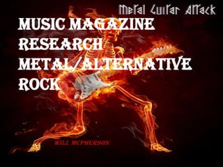
Music magazine research
- 2. Magazine Analysis 1 Title of mag is broken, or damaged by someone. This is represents the chaos and violent behaviour that is seen in most forms of rock /metal music. Main image of famous rock musician , linking with the theme of the magazine. Image looks striate at consumer, intimidating, appropriate for the genre. Models colour, all black, suggest the rock genre is dark and violent. Also the image is a close up shot, whilst slightly incorrect, this captures the intimidation and dark emotions that the rock genre is seen for. The magazine cover mentions other artists related to the rock genre, as content for the magazine. Also worth mentioning that the names of the other artists, relating to this magazine, sounds intimidating and niche, to other mainstream music genres and artists. Other photos of artists, shown as a free poster prize, also advertising the content of magazine The fonts used on the magazine cover, stands out from the darker background, and is also readable. The text itself sounds like a ritual, relating to the darker regions of the rock/ metal genre. The barcode is essential for all magazines, as it enables them to be purchased.
- 3. Magazine Analysis 2 Title of the magazine is presented in bold letters, and is fairly larger that the other fonts on the magazine. A reason to why the word ‘Rock’ is shown to stand out, is to represent how loud the genre is, therefore it stands out from other genres. The magazine displays the title of a classic rock band ‘Guns N’ Roses’. The band has reinvents to both the music genre, and the content that this specific magazine provides for it fan base/ audience. This content has also been labelled as exclusive, which will indulge the audience. The main image of the magazine is seems intimidating and arrogant, relating to the music genre. The darkness of the image also relates to the genre been dark, however it backs up the models images, enhancing his arrogates . The fonts and other text on the cover, have some alteration between them. This is used to make them standout, but also adds variation to the cover.
- 4. Magazine Analysis 3 In comparison to the previous titles, shows little details in showing what the magazine is about. The title of the magazine, gives no scenes of excitement, and this isn’t helped with the bland white colour scheme. The two main models on the cover, are shown to look unintelligent, from my perspective. This again is a bad representation, as this image does have some intimidation, it does have the traditional colours associated with the genre. Other Photographs are shown on the magazine, to further advertise the content of the magazine. Different coloured text, stands out on white background, making it easier for the audiences to read. The significants of the plus sign, is to advertise the content within the magazine, and makes it easier for consumer to read.
- 5. Magazine Analysis 4 Title stands out in bold black font, showing that the music genre is loud. The title ‘Hard Rock’ can also imply that this magazine is for the hardcore audience, or niche, which can limit the fan base. Text on the cover of the magazine, is coloured differently, to standout from the dark clothing on the model. Also this has been done to match the colour scheme of the magazine, Image is very intimidating, suitable for smaller fractions of the music audience. Masked model looks down upon reader, for further intimidation, and the mask itself provides the fear and dark nature of metal and rock. The different text fonts, are part of Slipknot’s image and the title to one of the songs, give a variation to the magazine. This also show how catastrophic and sinister the genre can be.
- 6. Magazine Analysis 5 Title of magazine is named after a construction tool, which can indicate that the magazine is meant for the hardcore experts of the genre. The use of the word metal before Hammer, indicates to the audience the music genre to the consumer, but also backs up the already intimidating name. Cover image displays the two iconic members of ACDC. Whilst the image show no signs of intimidation, however they're iconic within the metal genre. Mentions the web address, to allow the consumer to further investigate and explore the magazine’s content. The text has been presented in different colours, to match the colour scheme of magazine. Also advertises the rest of the magazine content.
- 7. Coursework Ideas/Requirements Target Audience- Young rebellious teens, fairly angry people, relating to the music genre and songs Titles of Magazine- Loud Sounds, the sound of death, the metal galleries, the rock of pages, Conventions- Title of magazine, full cover image( mid shot/ close up), advertising for the for further content in the magazine, variations of text on the front cover, extra photos to further advertise content in the magazine, barcodes, time released on market/published Codes- Free prizes related to the music genre, exclusive content