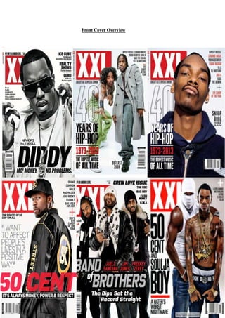
2. All of the six music magazines displayed above are of the same music genre, „Hip-hop‟.
„XXL‟ is one of the leading music magazine brands which celebrate Hip-hop in every way,
from its use of iconography to its use of the usual hip-hop conventions such as the „dominant
male‟. The fact that all of the issues above maintain continuity and brand identity helps the
readership to recognise the magazine and become familiar with it. Across the six front covers,
the artist(s) featured remains dominant and rebellious which is a common stereotype for hiphop artists. The audience would certainly be able to familiarise themselves with this feature
as this is what they would expect to see.
Firstly, the masthead (placed on the top left hand corner) of the magazine instantly grabs the
audience‟s attention. Not only is it displayed in an uppercase, thick bold font, reinforcing
masculinity, but it is also displayed directly next to the artist showing its relevance and
importance to the audience as a magazine brand. The masthead also attracts the audience as it
screams attention with its bright colours of white and red. In addition, you can see the
masthead from afar which is effective and eye-catching and we are able to identify that the
magazine is purely aimed at men.
Moreover, the masthead „XXL‟ is presented in a type of box to separate it from the rest of the
features on the front cover. Again, this shows the importance of the masthead for the
readership. As mentioned previously, the uppercase font of the magazines brand „XXL‟
reflects who the magazine is aimed at; young, rebellious, strong masculine males‟. We tend
to associate to use of heavy, bold and uppercase large fonts with males, as this represents
their dominance of females and also their power to take over the industry.
The magazine maintains its brand identity well, as across its six issues, the positioning of the
masthead and artist(s) are displayed in the exact same position, colour scheme and font. The
fact that part of the artist‟s head seems to cover a part of the masthead shows their
rebelliousness and presence. It also shows that they are the most important feature of the
magazine. Secondly, most of the main cover lines across all six front covers are placed along
the left-hand side of the page which is also where the masthead is placed, reinforcing their
importance. The main cover lines are displayed either on the image of the artist of around the
artist which is very effective as the audience would be able to further recognise that the artist
is the main feature of the magazine. Also, most of the sell-lines are associated with the artist
displayed, again reinforcing the dominance of the artist. They are big, bold and “in your
face”, reflecting the artist presented to us.
The cover lines appear to be dominant and bold. Again, the use of it being presented in
uppercase highlights masculinity and strength. The colour used also reflects masculinity as
we associate these bold colours with them. The masculine colour schemes of reds, blacks,
greys and whites reinforce the target audience of this magazine. Some of the cover lines
above directly address and link with the hip-hop culture. One the cover lines displayed on the
50 Cent edition reads „ITS ALWAYS MONEY, POWER & RESPECT.‟ This allows the
audience to familiarise themselves with the magazine the genre celebrates and further draws
them into the magazine. The mode of address (the way the magazine speaks to its audience)
is quite casual and friendly, reflecting the magazine‟s personality and the brand itself.
3. Thirdly, the sell-lines are bold, direct and quite informal. The edition of „XXL‟ which
displays 50 cent on the front cover features a pull-quote. Pull quotes are an excellent way to
draw the reader in it allows them to feel more intimate with the artist and also allows them to
get an insight about what features in the magazine. They signify to the audience the genre of
the magazine as well as the target audience. The sell-lines (hence the name) are the main
selling points of the magazine as the audience are largely attracted by the contents of the
magazine and the sell-line give a snippet of what it contains which is effective for the
audience.
The other sell-lines mostly feature a collection of successful hip-hop artists who compliment
the genre. For example, the edition with SOULJA BOY and 50 CENT, features a range of
artists placed underneath each other, in an uppercase, slanted black font. They seem less
obvious and are inconspicuously placed as they a less important feature as oppose to the
masthead and main artist who dominate the frame. Above the „featuring artists‟ is a „plus‟
symbol‟ to highlight their involvement to the magazine. It is not presented with letters which
may reflect the magazine‟s creativity and uniqueness. By using the symbol „+‟ also makes the
magazines look more sophisticated and stylish.
The images on the six front covers are truly dominant and intimidating. The use of direct
address from the artists makes the audience feel more intimate with them as they are facing
them. The use of direct address is very clever of the magazine to use as it instantly attracts the
audience and creates more realism to the magazine. From looking at a range of the „XXL‟
magazines the same type of shots seems to be used, creating continuity. The use of medium/
medium close up shots shows off the artist‟s masculinity and also shows them clearly and
effectively to the audience.
The artist is always positioned on the middle of the page, highlighting their importance and
dominance. The fact that they are placed at the centre of the page allows the audience to
concentrate on them and this gains their attention straight away. Furthermore, the use of
composition is fantastic! The sell/cover lines are displayed mainly around the artist‟s figure
which is very creative of the magazine to do. The magazine doesn‟t allow the text to overtake
the page which creates a professional and appealing look as the main image still dominates
the frame. The barcode across the multiple from covers is displayed inconspicuously at the
bottom of the page, allowing the audience to focus specifically on the main features on the
front cover.
Mise-en-scene elements also play a significant role on the magazine front cover. The front
covers are not rammed full of text or image heavy. Instead the brand cleverly uses mise-enscene elements including, lighting, props and clothing to deliver a professional, unique,
sophisticated an eye-grabbing magazine which captures its target audience and gets their full
attention.