
Recommended
More Related Content
What's hot
What's hot (19)
Viewers also liked
Viewers also liked (20)
Similar to Double page spread analysis
Similar to Double page spread analysis (20)
Recently uploaded
Recently uploaded (20)
Double page spread analysis
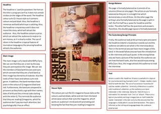
- 1. Headline The headline is‘cash forquestions’ the fonton the title isusingsansserif as itdoesnot contain strokesonthe edgesof the word.The headline coloursuitsQ’s house style asitcontains coloursredand black.Also,the headline is immense andboldwhicheye iscatching.Also, the headline ismysteriousand itdoesnot reveal the story;whichwill attractthe audience. Also,the headline containsaprize, whichcan attract the audience toreadon to winmoney,asit isclearlyvisible. The use of idiominthe headline istypical feature of Journalese languageasthe amusingheadline attracts the audience. Main Image The main image isof a bandcalledBiffyClyro. We can see thattheyare a rock bythe way theyare portrayedonthe image.We can see the membersof bandwithbruisesandscars whichconnote thattheyare a hard band as theirimage haselementsof violence.Alsothe looksof theirfacesand tattoos suitsrock genre.Inaddition,the bandmembershave jeansinthe colourof Q magazine blackand red.Furthermore,the bandare comparedto prisonersastheyholda signwiththeirnames, date of birthand the criminal code starting withthe letterQ.Thisremindsthe audience that theyare readingQmagazine,which he audience don’tpaytoomuch attention;but psychologicallyithasan effect. Text Idiomis used in the headline.Ellipsisisused which is typical for journalesewriting.Example‘aren’t’; itkeeps readers more familiarwith the text. The use of assonance‘razzledazzle’ catches readers attention. Similarly,alliteration isused to catch audience’s attention as the audience are more interested in the interview. Semantic field of music is noticeable.For example ‘rock’ ‘trio’ or ‘album’. These are a typical journalisticwritingin magazines as itwill makethe reader interested in the text and also the ensures that the languageis chatty which causes familiarisation. The styleis informal as the colloquial languagekeeps the audience entertained. DesignBalance The page isformallybalancedasitconsistsof six columns(three onone page).The artistsonare formally balancedastheyare in a straightline which demonstratesarule of three.Onthe otherpage the writingisalsoformallybalancedasthe page issplitin half,the firsthalf hasa space for headline andthe kicker.The otherhalf has the questionsandanswers. Therefore,thisdouble page layoutisformallybalanced. The GutenbergDesignPrinciple Firstly,the audience lookatthe primaryopticareawere the headline (idiom) islocatedasitstandsout andthe audience are able tosee whatis the interviewabout. Thenin the terminal areawe have more imagesof the band.In the weakfallowareawe have the introduction to the interviewandapull quote.Inthe strongfallow area we have a picture of the bandas the audience can see howthe band looks,alsofanswouldenjoyseeing BiffyClyro.Also,the image attractsthe audience toread the interview. House Style The coloursare suitthe Q’s magazine house style asthe coloursusedare black,white andred.Even the band artistswearcoloursthat suitsthe magazine,which workson audience’smindandstill promotingand keepingthe factthattheyare readingQ magazine.