
Recommended
More Related Content
What's hot
What's hot (20)
Viewers also liked
Viewers also liked (18)
Similar to Magazine conventions
Similar to Magazine conventions (20)
Recently uploaded
Recently uploaded (20)
Magazine conventions
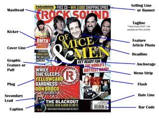
- 1. Masthead Selling Line or Banner Tagline Kicker Cover Line “new music first” not posted on this article. Feature Article Photo Headline Graphic Feature or Puff Plug Secondary Lead Caption Anchorage Menu Strip Flash Date Line Bar Code
- 2. CONVENTION NOTES. The magazine fits in kickers and cover lines down the side of the magazine to indicate extra information on what‟s inside and leaves the bottom left free on almost every cover to list more bands that are included inside. This means that the frequent buyers can easily find which bands are focused on quickly. There is almost always a tagline in the centre of the page, often with the band name of the feature article photo being used, it will often be followed by a sentence (anchorage) on why they‟re that months focus but not as bold (e.g.. “GREEN DAY return with their new album”). Rocksound are well known for their plug. With consideration that their magazine focuses more on getting new bands some recognition rather than posting article after article on the same „popular‟ bands that a lot of magazines do within that magazines‟ genre. Due to this, they offer a free CD with each issue, they post often 2-3 well known bands new tracks and then around 10 more tracks of unsigned/upcoming bands. The language used in this magazine is all fairly simple, which means readers don‟t need a high understanding of complex vocabulary when reading the magazine. It will often talk about live performances but used simplified words to explain quality and sound levels for example so the reader can understand easily and feel like they are part of a community with other readers (no ones left behind unknown to what was meant by an articles choice of vocab), it means that the magazine is more targeted at people with a middle-class status (majority of the population). I think the most important part of the magazine is the feature article photo, this is the first thing you see when looking at the magazine/what draws you in. A good front page photo can decide if you buy a magazine or not.
- 3. HOUSE STYLE & DESIGN NOTES. The masthead used in “Rocksound” has been very similar for a long time now, they used a font which was very bold and tall, but lately changed the title to a new font with the „R‟ in the word Rocksound as their logo. They don‟t stick to a tight colour scheme like some other magazines do (eg. NME always uses the red title) but Rocksound fit their colour scheme around the feature article photo on that month‟s issue. The magazine also includes their famous tag line on the bottom right hand side of the masthead (“new music first”) on almost every issue but if that area of background is taken up by the focus image for example, it will often be placed somewhere else. Colour association can often be used in the magazine for example, issues which were published with metalcore band „August Burns Red‟ on the cover had a mainly red colour scheme, this was done again with famous rock band „Green Day‟ and variations of greens. Fonts in „Rocksound‟ are very important, they often fit the font to suit the band on the cover, similar to the colour scheme idea. If it‟s a pop-punk band, the font will often be bubbly and have lots of personality, where as if a metalcore/post-hardcore band is on the cover for example, the font will often be bold and have extra effects like the appearance of cracks to emphasise the „brutality‟ of the band for example. The style of the magazine is fairly simple but effective. The cover image is very important, the magazine often erases the background of the image so there is no extra distractions aside from the main image being presented. The image taken is almost always from a shoot and the band are almost always in a direct mode of address, this often causes the image to be in your face and creates a more inviting and serious image. The magazine does not really stick to a theme so much to create a look in which many magazines do, they don‟t dress the band up in eccentric clothes to make them appear something they‟re not, they just put them in their ordinary clothes and let the bands express themselves instead of creating a band on a false image. The use of space is used well, in almost every image of bands, the lead vocalist/front man is in the centre column of boxes. The other members usually surround the front man in the surrounding boxes (left and right columns). The masthead is always in the top row of boxes, usually the very top of the page filling all the space from the left to the right, the bands head are usually photoshopped so they are in front of the text, making it look like the title is in the background. There is never really any wasted/dead space. I think the magazine reinforces the typical convention for this kind of genres magazine but brings it to life with how “in-your-face” the style is.