The byproduct of sericulture in different industries.pptx
Magizine anylsis
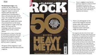
1. The dominant image is the
number 50. The number 50
dominates the front over of the
magazine. It give it a sense of
mystery with will make the
audience buy it thinking why is
there a 50 and what does the 50
mean. The number 50 is written in
gold. The connotations of the
colour gold are royalty and a scene
of accomplishment as the heavy
metal sub-genre is huge in the rock
genre. The main sell line
challenges codes and convention
which stands out for a unique
edition.
The magazine also has a list of A list band
that are huge in the heavy metal industry such
as Metallica. This would draw the audience in
by showing the readers that they are the
going to reading about the history of the
bands and why they are important to the
reader as they are hear to learn about the 50
years of heavy metal. The 5 main band are
inside the gold ring of the 50. this shows that
they are legendary and protected by all the
other upcoming heavy metal genre to come in
the future as they hold the throne. The 5 band
are structures like a hierarchy to show who is
the best with Metallica being the top as it is
one of most famous bands in the world.
There is a skyline to show that this
particular magazine is unique to attract
the audience to buy it as is has
everything a magazine has and more.
The colour ties in with the 50 years of
heavy metal to show that they are
important and relevant.
There is no photograph on the
front of the magazine and that
breaks codes and convections
because most classic rock
magazines have a dominant
image of a famous band.
The background is in black to help hide
the other heavy metal bands. This used
to overshadow the gold to show that’s
they are less important. It could also
foreshadow the contents to come in the
magazine. The connotation's of the color
black are hidden or neglected.
Print
The genre of the magazine is rock.
Heavy Metal is the main focus for this
magazine.
2. The masthead “classic rock” is
written in white to make it seem
that it is the least impotent
future in the magazine as
everything else is written in gold.
The connotation's of the colour
white are bland and boring. Its
almost like the masthead is
irrelevant to the whole front
cover as the audience is
immediately drawn to the gold
writing.
The tagline show that the rock n roll is crossed
out for metal. This shows that this is not about
rock n roll, its heavy metals tie to shine. The
high voltage tagline shows the nature of rock
in general nature of rock, its loud, its colorful
and its striking just like lightning. Rock n roll is
crossed out in gold and rewrote metal in gold
to show that heavy metal is golden, its better
then all the other rock sub-genre and gold is
metal and then sub-genre is heavy metal. The
font looks like it was hand written to show
that someone has vandalized and makes look
messy and informal which is associated with
heavy metal.
The barcode is essential to this
magazine because it tells the
audience how much this particular
magazine is.
The plug is written in white with a red
background to show the audience where
it is an will make the audience buy
because it give heavy metal fans another
CD for their collection and also give
newcomers a taster of what to expect.
The purpose of this magazine is to inform the
audience about the 50th of heavy metal and its one
of the most popular sub-genres in the rock industry
and is a huge achievement for the sub-genre. Its
also for entertainment for people who are new to
the magazine and to people who like rock all
together.
The target audience for this magazine is for 15+. It
can be for any gender but its mainly more the male
gender as it appeals to them more with heavy
metals slick, grimy tone and messy personality. The
psychographics for this magazine are for reformers
and strugglers. The reason its for strugglers is
because heavy metal is all about the hard life such
as alcohol and unhealthy foods. Heavy metals tone
and music makes it stand out from all the other, its
almost as if its an outcast and escaped from all the
other rock sub-genres. The reason why its for
reformers is because heavy metal is celebrating it
50th anniversary, so the sub-genre is seeking growth
is the magazine makes you aware that heavy metal
is celebrating.
Print
3. This front cover is effective
because, because it shows the
audience directly that its the 50th
anniversary and heavy metal and
this is effective in pulling the
audience and heavy metal fans
into buying this magazine. Its also
something diffident in terms of
codes and conventions. For
example there no dominant
image and this will attracts the
audience because they’ll will
want to know why there is no
dominant image and this will
make them think that this
magazine is going to be different.
4. The pull quote by Ozzy
Osborne is written
informally witch show that
he is informal and the band
Black Sabbath lyrics and
tone is rude, slang and
grimy to show that they
are a heavy metal band.
Most heavy metal bands
lyrics have that edgy tone
to it and plenty of slang
and swearing.
The headline “In the
beginning” add a sense of
mystery that will pull the
reader in as they will want
to know what “In the
beginning” could mean. It
also has some religious and
scientific connotations. For
example “In the beginning ,
there was nothing” is a
reference to the big bang
when the universe was
created and a long side it,
Black Sabbath.
The Dutch tilt on the
dominant image could tell
us that the band is that
edgy and off putting tone
to it as most photos of
band are usually have eye
level angles to give them
that normal and simple
style to them. The
dominant image is filtered
in black and white to show
the audience that the
photo was taken a very
long time ago to make the
audience think that Black
Sabbath have been around
for a very long time and
possibly way before they
were born. They band
member are standing
outside a church and that
ties in with the “In the
beginning” quote. Its
challenges codes and
conventions by not having
captions under the band
members names.
Print
The distribution channels for a print magazine can range from various shops such as
newsagents and supermarkets. You can also subscribe to Classic rock to get the magazine
delivered to your house. One issue with distribution magazine is the decline in print as
everything is moving to digital so that mean print wont sell very well.
5. The Strapline is used
to give us a little
taster on what this
particular double
page spread is going
to be about. It is a
marketing tool to
further engage the
audience.
There is 3 columns of text to show the audience that this is going to be an in depth article
about the history and story about Black Sabbath and how they are a house hold name in
the heavy metal sub- genre. You can tell by the font size that this is going to be a long read
for the audience.
Black Sabbath is in
a bold font to show
the audience that it
is clearly about
Black Sabbath and
it will be the first
thing that they will
see when start to
read the strapline.
There is a drop cap to
indicate that this s the
start of the article and
the drop cap is in gold
to show that this article
should be treated like
royalty and should be
treated with respect.
The kicker is used to get
the audience going on
what the article is about
and what to expect as
they read on. This is
conforming to codes and
conventions and would
help the audience
navigate through the
article.
Print
The Dominant image
takes up half of the
double page spread to to
show that they are most
important part of the
double page spread and
we have a direct mode of
address as they are
looking directly at the
audience and that has a
connection to the
audience by being a low
angle shot so the
audience hove to look up
to the group. This shows
that the audience has to
treat them with respect.
6. The reason why they
choose Black Sabbath
for this double page
spread is because they
were one of the first
heavy metal bands in
rock history and left a
heavy influence in the
music industry and this
will attract the audience
as they will want know
what did they do have
that big influence in
heavy metal and music
as a whole. Also at the
time, Black Sabbath
were outrages when
they were at their peak
and this gave heavy
metals reputation as
outrageous and edgy.
This magazine is
effective because the
Dutch tilt will attract the
audience because the
Dutch tilt will show them
that this double page
spread is very far from
normal and this this
article is going to be wild
and this will the make
the audience read if as
they will want something
different then just an old
boring article.
7. The dominant image of the 4
band members starts with John
Lennon with a mid- shot of him
to Ringo Starr with a long shot.
You have got a visual hierarchy of
the 4 bad members with john
Lennon being the most popular
band member and Ringo Starr
being the least popular. They all
have a blue outline around them
to male them look like they are
animated witch is very unusual.
The fact that they are overlapping
the masthead shows us that this
is the main reason why someone
is going to buy this magazine. It
challenges codes and conventions
with the blue outline witch makes
it look like a comic book.
The plug has a black background
to show the audience where it
is. The band names are written
in white. The connotations of
the colour white are bright and
hopeful. It is as if the bands are
the light to darkness and they
have escaped from the darkness
because they are better then
the dark.
The Masthead has the
biggest font size to
show that that this
magazine is owned by
that format and it
should be treat with
respect.
The main sell line is the 50th
anniversary of The Beatles
album “Abby Road.” “Abby
Road at 50” has a red ribbon
around it to show that its
achieved something
incredible and deserves a
ribbon. The connotations of
the colour red are
challenging as Abbey Road is
considers one the greatest
albums in the world and its
hard to surpass.
Digital
The pull quote by famous
record producer George Martin
is used to attract the audience
by giving is opinion on “Abby
Road” and by showing that he
as said something in the
magazine and that his fans will
want to carry on reading the
magazine.
8. The skyline tells us the
even though the beetles
and the main reason why
the audience is going to
buy this magazine, there's
is still other big A-list rock
bands in the magazine if
people don’t like The
Beatles, so there is
something for everyone in
the magazine.
The sub- image of Tom Petty
right next to his name is used to
show the audience who he is if
the audience don’t know his
name but know the name or
know the face but don’t know
the name.
The feature cover lines are
used to show the audience
that there is more then just
one band to talk about then
just The Beatles.
The dominant image of The
Beatles challenges codes and
convention by taking photos of
each band member separately
as the band become more and
more informal with the cloths
they are wearing.
The purpose of this magazine is to inform the
audience that it’s the 50th anniversary of The
Beatles’ “Abby Road” as it is considered one of
the greatest rock albums of all time and one of
the greatest albums of all time and it has had
a huge influence to not only rock, but music as
a whole. For people who are not a fan of The
Beatles, the purpose of this magazine is also
for entertainment for genuine rock music fans
as there is something for everybody. The
target audience for this magazine is for all
gender 13+ as rock is normally for the young
teens up to elder demographic because band
old bands such as The Beatles have been
around since the 60s but it also has a big part
in the teen demographic who like the old
fashioned rock n roll genre. The
psychographics for this magazine is for
successors because The Beatles is one of if not
the greatest band in the world as they
dominated the 60s with their music and many
inspirers want to be just like The Beatles and
many other A list rock bands.
Digital
The genre of this magazine is
Rock and the focus of this
magazine is mainly Soft Rock.
9. This front cover is effective because
it shows the audience directly what
this magazine is mainly going to be
about this will attract many Beatle,
Rock and music fans into reading this
magazine and they will want to
know why the album “Abby Road” is
that important to get an
announcement on its 50th
anniversary.
This magazine is also effective
because shows the audience exactly
what is the main focus of the
magazine as The Beatles are
considered the band rock band of all
time and the band members are the
biggest images on the front cover to
show the audience that they are the
main focus of the magazine because
they are there best band ever and
that they need to be on the front
cover as they are basically the king
rock and this will attract the
audience as it will make them think
that they need to treat it with
respect and they need to buy this
magazine.
It also has different photos of all
the other band members
wearing different cloths from
other album they made and this
will attract the audience
because it will make them this
that this magazine is going to
talk about the other albums by
The Beatle but mainly its going
to be about Abby Road.
10. The headline “Wild
Ounce's” font is
stylised to look wild as
well to show the
audience that this
particular article and
double page spread is
going to be wild as
well.
Digital
The strapline tells
the audience the this
article is going to be
about Crobot which
is written in bold. It
talks about then
being “back in
business.” This pulls
the audience in by
making them wonder
why they are back in
business and what
happened to them
before hand.
The drop caps are used to show the audience where the article starts and then the next paragraph is
going to start. The two drop cap together to spells ME. This could show that one of the band
members have written this article themselves to make it seem that they are once to write it and the
fact that's this is about the band. There is also three columns of text to show that this going to an in-
depth article.
The pull quote says “Crobot’s definitely a band that’s hungry.” this shows that the bands is ready to
brow and audiences minds now they are starting to preform again.
The dominant image
show the band
members with a
shopping trolley. It
looks like they have
stolen the trolley and
are now messing
around with it. This
links in with the
headline “Wild Ones” as
they are acting wild In
the photo. The
dominant image is a
medium shot to every
band clearly and the
shot is a low angle shot
to make audience feel
like they are a part of
the band as the lesser
known band members.
Like they are at the
bottom of the hierarchy.
The sub-image
show all the band
members recording
their songs. This
image show proof
that they are
preparing for their
comeback.
11. For The distribution channels for a
digital magazine. You can buy them on
amazon. However, if you buy it on
amazon, you have to use other
distribution software's such as Mobe
and Barnes to read the magazine. This
can limit the creativity of the
magazine and make you lose your
USP.
This double page spread is effective
because in the rock genre, Crobot is
usually overshadowed by all the other
big rock bands the are considered
some of the best in music history. This
will attract the audience to read
about this band and they will also
want to know why they made a
double page spread about this this
band and why they choose band
instead of all the other bands they
could talk if Crobot is as well known
as all the other big rock bands.
Digital
12. Pros and cons for a print and digital magazine
• The pros for a print magazine are that you can read them without being disturbed by various advertisements as digital
magazines do that a lot. Print magazine can also be collectable for readers if they like to stack things up in collection to
make them serve a purpose before they can be thrown out. Another pro for a print magazine is that it can be read by
people who can’t afford the technologies to be read in digital. Also you don’t need to connect to the internet to read the
magazine as its in its physical form and not on a screen.
• The cons of a print magazine are the fact that digital media is more mainstream then print and that could make various
publishers lose their jobs due to lack of sales of print magazines. Another con of a print magazine is the fact that it’s a very
disposable format as it can very easily be thrown away. Another con for print magazines is the fact that it is also expensive
to print each copy of the magazine witch can lead to profit loss. Also, the ink could me messed up on one page.
• The pro of a digital magazine are the fact its more available to a wider audience as every is moving to digital. Another pro
is the fact that when you finish a magazine you don’t have to through it out, its always on digital to read again at any time
so its eco friendly. It also cheaper as it is all online. You also don’t have to worry about the paper quality being bad as its
on digital, it lives up to quality standards.
• The cons of a digital magazine is the face that you have to zoom in and out of the magazine to see thing that are to far
away to see or takes up an entire page. Another con is the fact that you cant read the magazine with advertisement
popping up constantly as it ruins the experience. Also, some people just prefer print over digital.
13. Technical considerations
• The technical consideration for a print magazine is that you got to make sure that the pages
should be the right size for example A4 or A5. You also have to make sure that the font it suitable
and the right size. Make sure that each image and and acritical and is on the right page to make
stand out and have an impact by using a bleed line. You can use a gutter line to make your
columns and make sure the the audience can navigate the magazine easily.
• The technical considerations for a digital magazine is the fact that you have to make sure that you
have got to make sure that an app or a website can support digital magazines and that it runs
smoothly. Also you have got to make sure the the app or website can support the colour schemes
and fonts so that they translate properly. You also have to make sure that the audience can read it
properly depending on which device they are using. For example, Zooming in and Zooming out to
read text or to see a sub- image.